

Brand Guidelines
Vol. 01
October 2026
00.1
Contents
Everything you need to make Better Together look, sound and feel like itself.

Logo
Wordmark · colourways · family · skies · specimens · space · size
006

The handshake
Master · neon · materials · crowd · stamps
017

Colour
Five skies · gatherings · palette · accents
021

Typography
Typefaces · hierarchy · the page
026

Micrographics
Two voices · families · strips · icons · stamps · spec plate · programme
030

The room
The room · lids · sack · posters · table · toppings
042

Photography
Still life · together · people · places · treatments
054

In the world
Signs · screens · paper · packaging · merchandise
062
How to read this book
Every page carries a code (01.3) and a number. Full-bleed pages show the work in the world. Photographs of people and places are used as direction; the still lifes and mockups are direction frames for a real shoot.
Better Together · Brand Guidelines
00 · Introduction
Vol. 01 · October 2026
002
00.2
The concept
Better Together lives between an inscription and a sky. By day, ink on paper. By night, light on the sky.


01 · The name is carved

02 · One line of light


Sky 01 · Sunset Dust
Gathering 01
Spring 2027 · The story of sound
03 · Its own sky
Better Together · Brand Guidelines
00 · Introduction
Vol. 01 · October 2026
003


00.3 · Rooms for Creatives
Better Together · Brand Guidelines
00 · Introduction
Vol. 01 · October 2026
004
00.4
Our words
We write the way we talk to a friend at the long table: in the first person, warmly, in full sentences. A few lines come back on everything we make.
The lines we keep
Remember how to stay human.
We exist to unlock the artist within us all.
Rooms for Creatives.
We trade breadth for depth.
The community is never the audience.
We keep the record and build an archive.
Better Together is a home for you.
We punctuate with commas, colons and full stops, and we write numbers the same way every time.
Better Together · Brand Guidelines
00 · Introduction
Vol. 01 · October 2026
005


Logo
The wordmark
007
Anatomy
008
Colourways
009
The family
010
On the six skies
011
Specimen, linen
012
Specimen, felt
013
Stacked and one line
014
Clear space
015
Size
016
Better Together · Brand Guidelines
006
01.1 · The wordmark, Milk on Dusk Bloom
007
01.2
Anatomy
The Inscription is drawn, not typed. One idea carries it: the two T's of BETTER stand taller and share one bar. Everything else stays quiet, so that idea reads.
01 · One shared bar over two tall T's
02 · The G closes on a beaked bar
03 · TOGETHER stays at one height
Drawn Roman capitals, a third lighter than the first cut, with more air between the letters. The stack is centred by eye: BETTER sits a hair right of the box centre, where TOGETHER's weight falls.
Better Together · Brand Guidelines
01 · Logo
Vol. 01 · October 2026
008

01.3.1 · Plum on Milk · the day: print, stamps, letters

01.3.2 · Milk on Night Aurora · every gathering's night


01.3.3 · Ink on Sunset Dust · Gathering 01's own sky
009
01.4
The family
Wordmark
The name. Lead with it wherever there is room.

BT mark
The name in two letters, for small and square places.

Handshake
The original line, redrawn at one even weight.
Better Together · Brand Guidelines
01 · Logo
Vol. 01 · October 2026
010
01.5
On the six skies
Every gathering gets its own sky, and the name changes ink by the measured rule: Ink on Sunset Dust, Aura, Lagoon Grain and First Light; Milk on Dusk Bloom; Gold on Night Aurora after dark.
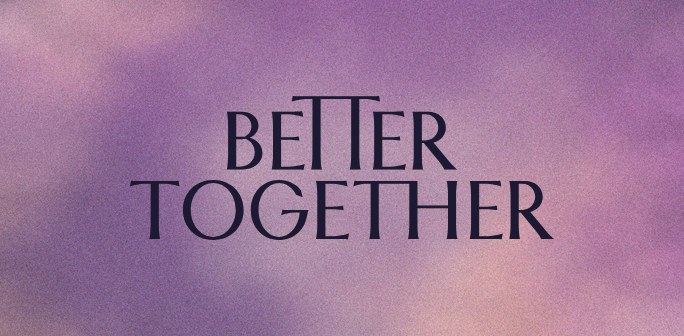
Sky 01 · Sunset Dust
Ink · 5.3 : 1
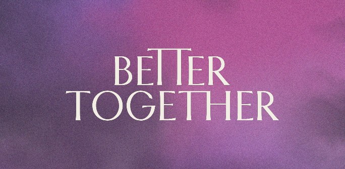
Sky 02 · Dusk Bloom
Milk · 4.4 : 1
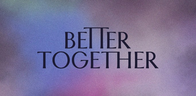
Sky 03 · Aura
Ink · 4.7 : 1
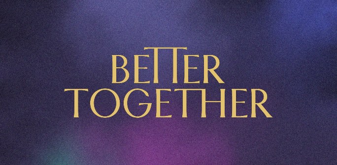
Sky 04 · Night Aurora
Gold · 6.1 : 1
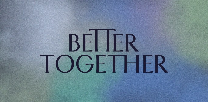
Sky 05 · Lagoon Grain
Ink · 5.1 : 1
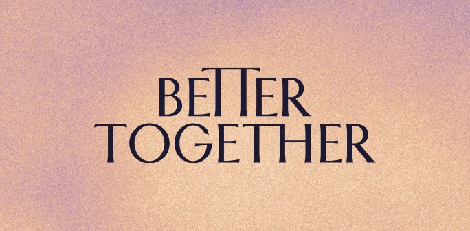
Sky 06 · First Light
Ink · 9.8 : 1
Better Together · Brand Guidelines
01 · Logo
Vol. 01 · October 2026
011
I · Inscription · drawn Roman capitals · Plum on linen
01.6
Better Together · Brand Guidelines
01 · Logo
Vol. 01 · October 2026
012


I · Inscription · gold foil on Night felt
01.7
Better Together · Brand Guidelines
01 · Logo
Vol. 01 · October 2026
013
01.8
Stacked and one line
The stacked name is the hero. The one-line name is for narrow places: spines, signs, rails and the foot of a page.
01 · Stacked · the hero

02 · One line · narrow places
Better Together · Brand Guidelines
01 · Logo
Vol. 01 · October 2026
014
01.9
Clear space
Keep a clear field around the name equal to x, the cap height of TOGETHER. Nothing enters it: no type, no edges, no other marks.
x
x
x
x
x = the cap height of TOGETHER, about 14 percent of the stack's width. On the one-line name, x is its cap height too.
Better Together · Brand Guidelines
01 · Logo
Vol. 01 · October 2026
015
01.10
Size
Above a 24 px cap height, use the master. From 24 px down to 10 px, use the small-size master: its hairlines and shared bar are thicker so they hold. Below that, use the BT mark.
Master · cap height 24 px and up · print 30 mm wide and up

Small-size master · 24 to 10 px · print 12 to 30 mm
BT mark · below that · never smaller than 16 px or 6 mm
Better Together · Brand Guidelines
01 · Logo
Vol. 01 · October 2026
016


The handshake
One line, drawn once.
The primary and the neon
018
In every material
019
The crowd pattern
020
Better Together · Brand Guidelines
017
02.1
The primary and the neon
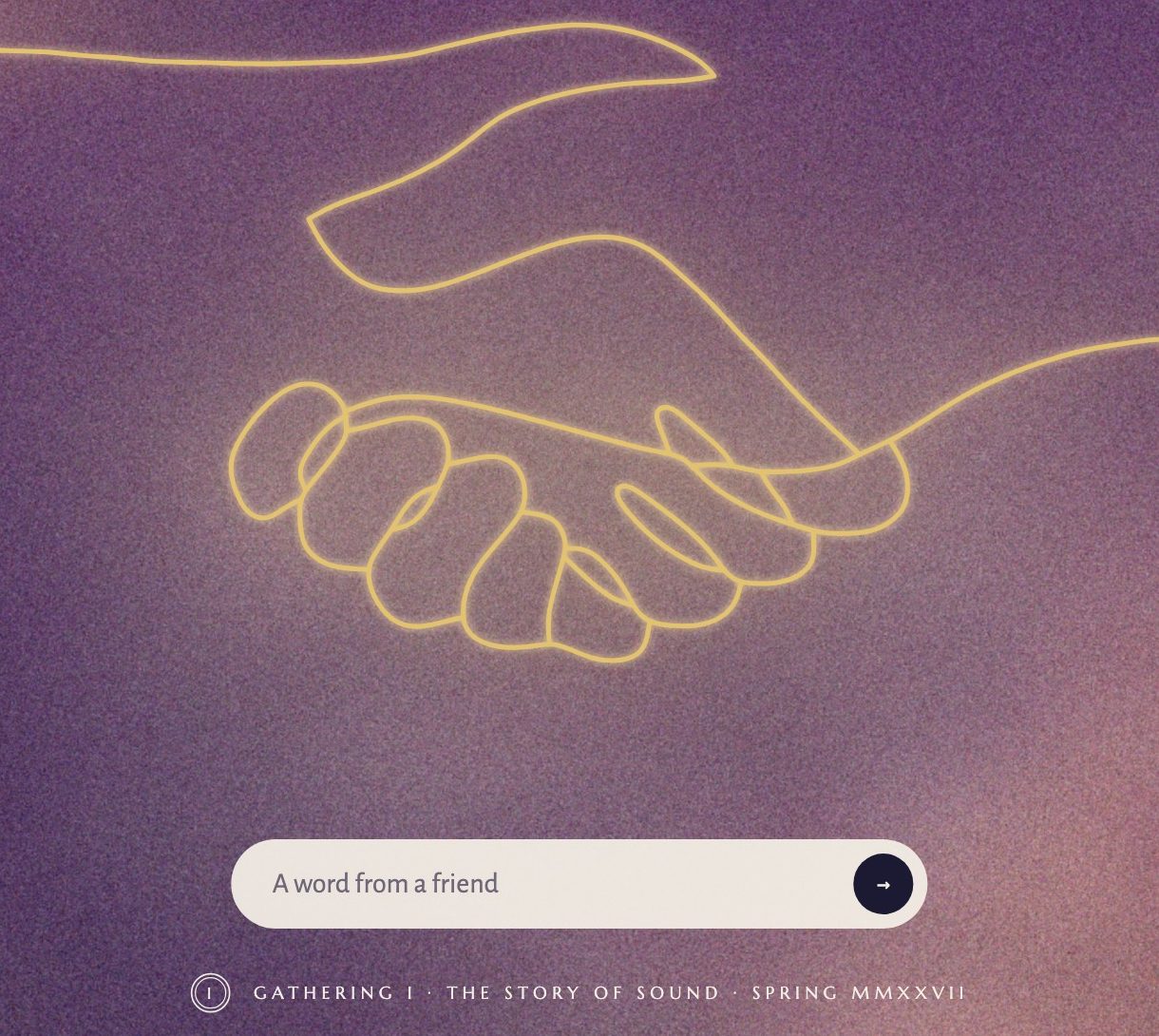
The handshake is the brand's original line, drawn once. By day it is a fine line in ink; after dark it is the same line bent into one gold tube.
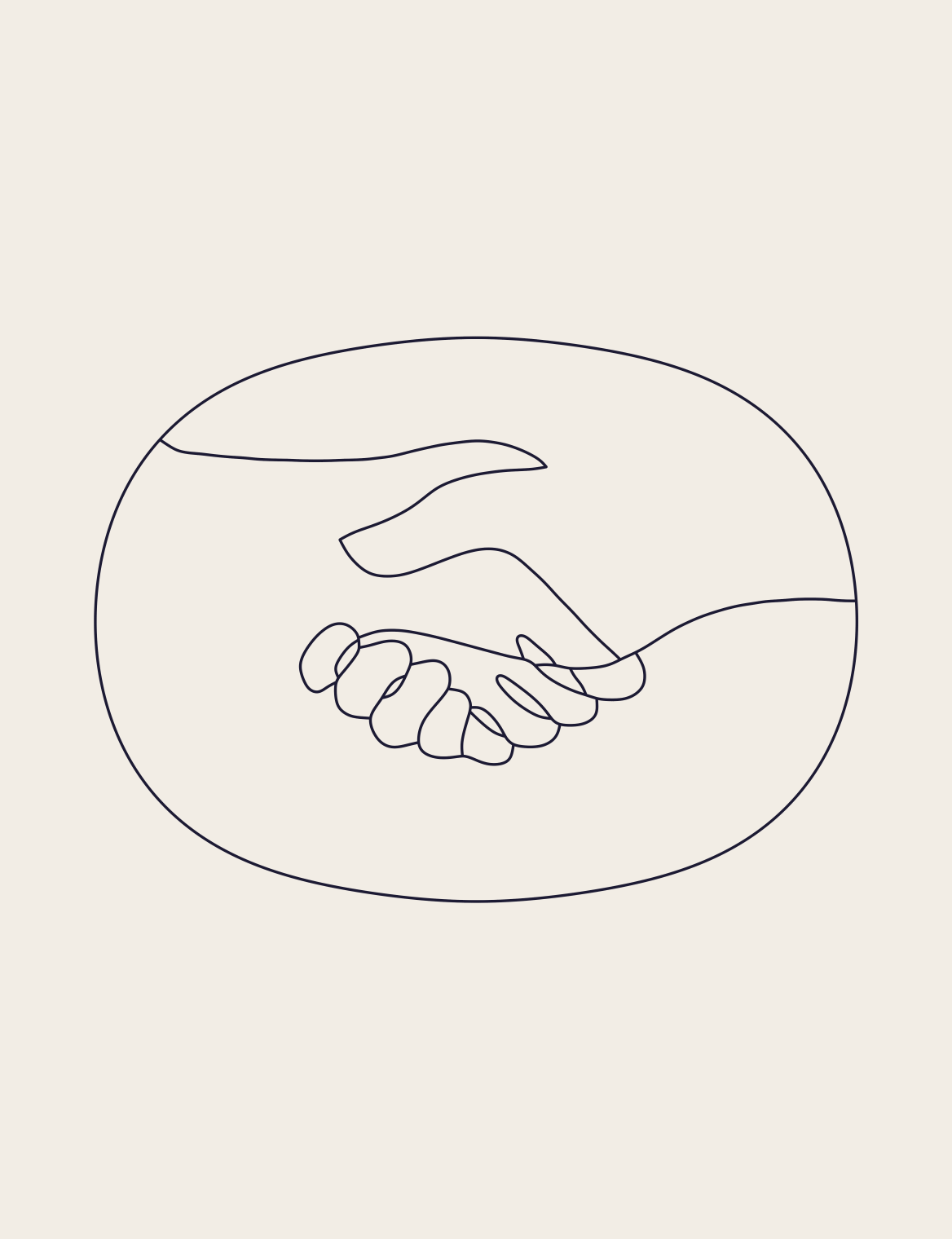
01 · The primary · 120 px wide and up
02 · The neon · after dark
Below 120 px the bold cut takes over and holds down to 24 px tall: the favicon, wristbands, the patch.
Better Together · Brand Guidelines
02 · The handshake
Vol. 01 · October 2026
018
02.2
In every material
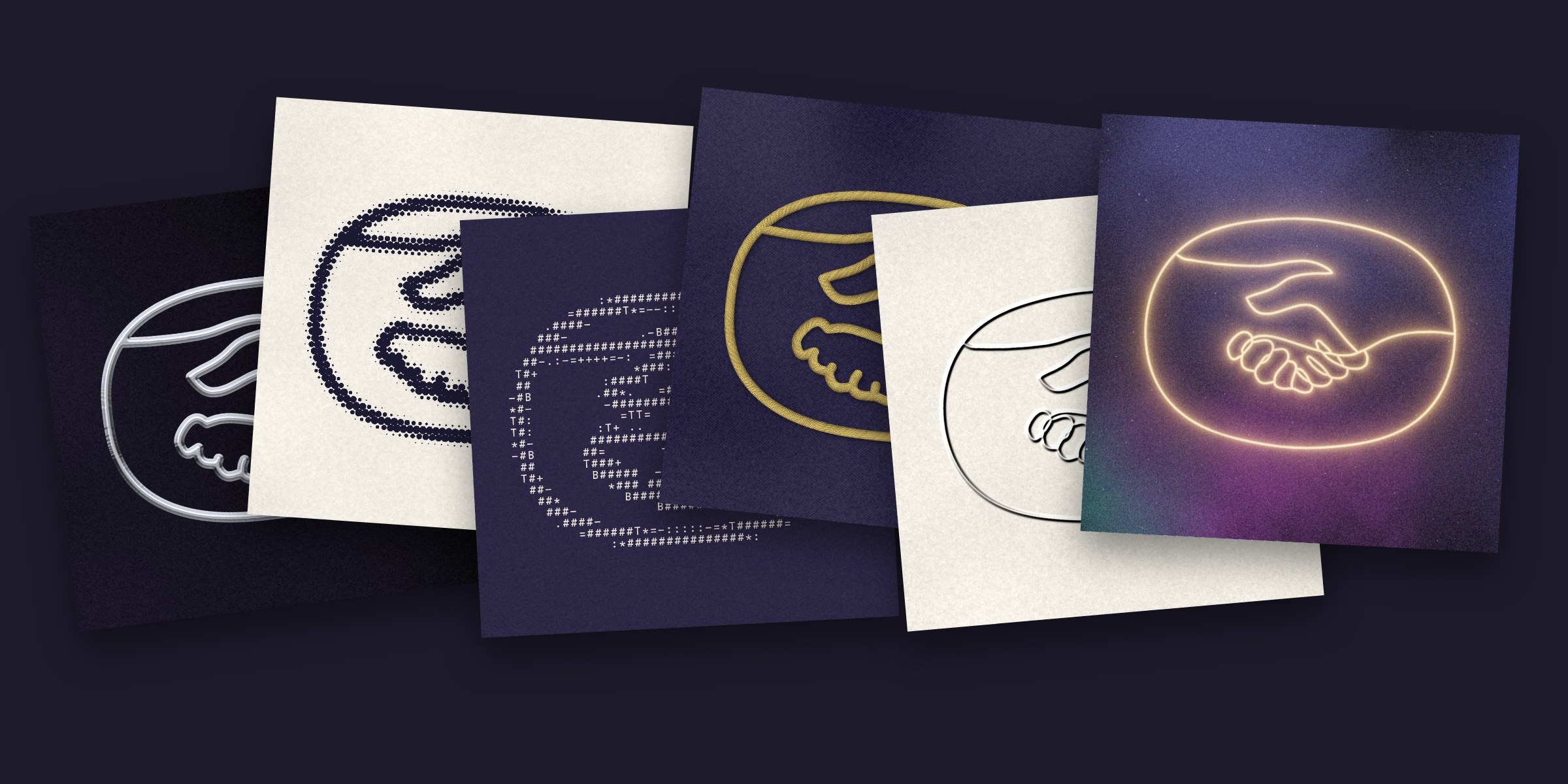
Chrome, halftone, ASCII, embroidery, emboss and neon. The same line survives every material: the bold cut carries the textured ones, the primary the fine ones.
Better Together · Brand Guidelines
02 · The handshake
Vol. 01 · October 2026
019
02.3
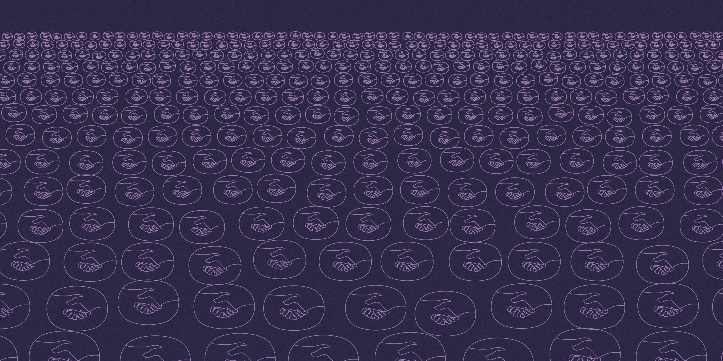
The crowd pattern
Tiled until it reads as an audience. A receding crowd for walls and posters, a seamless field for ticket backs, and a band for the wristband. Lavender marks on Night for the crowd and the field, Gold on the wristband.

Better Together · Brand Guidelines
02 · The handshake
Vol. 01 · October 2026
020


Colour
Every gathering gets its own sky.
The five skies
022
One sky per gathering
023
The palette
024
Accents and inks
025
Better Together · Brand Guidelines
021
03.1
The five skies
Each sky has a day and an after dark: the same sky with its exposure lowered and its colour held, so Milk and Gold read on it.

Sky 01
Sunset Dust
After dark
Gathering 01 · the story of sound


Sky 02
Dusk Bloom
After dark
Gathering 02 · to come


Sky 03
Aura
After dark
Gathering 03 · to come


Sky 04
Night Aurora
After dark
Gathering 04 · to come


Sky 05
Lagoon Grain
After dark
Gathering 05 · to come
Better Together · Brand Guidelines
03 · Colour
Vol. 01 · October 2026
022
03.2
One sky per gathering
A gathering's sky is printed full bleed on everything it touches: the poster, the ticket, the wristband, the phone pass and the site that evening.
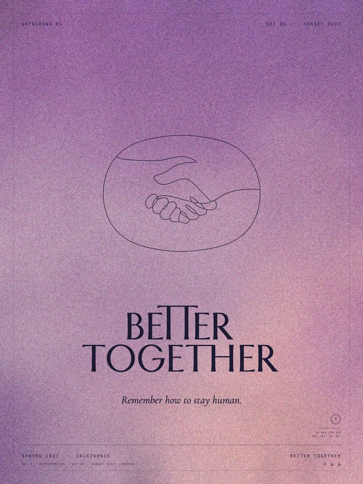
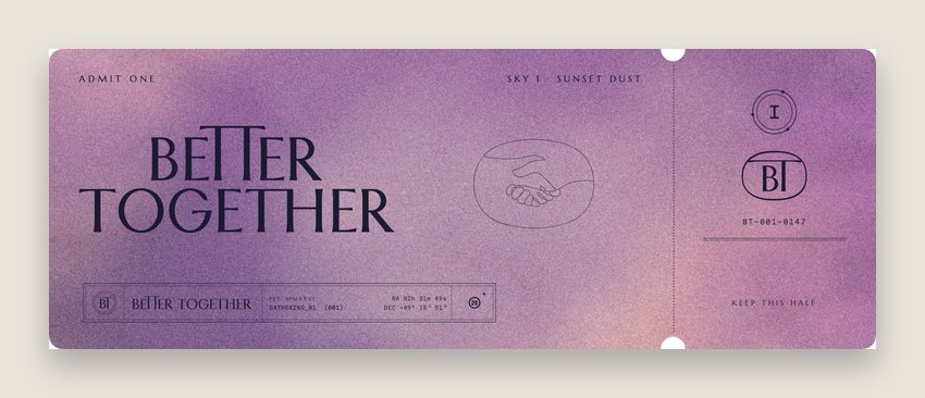

Sky 01 · Sunset Dust · Gathering 01
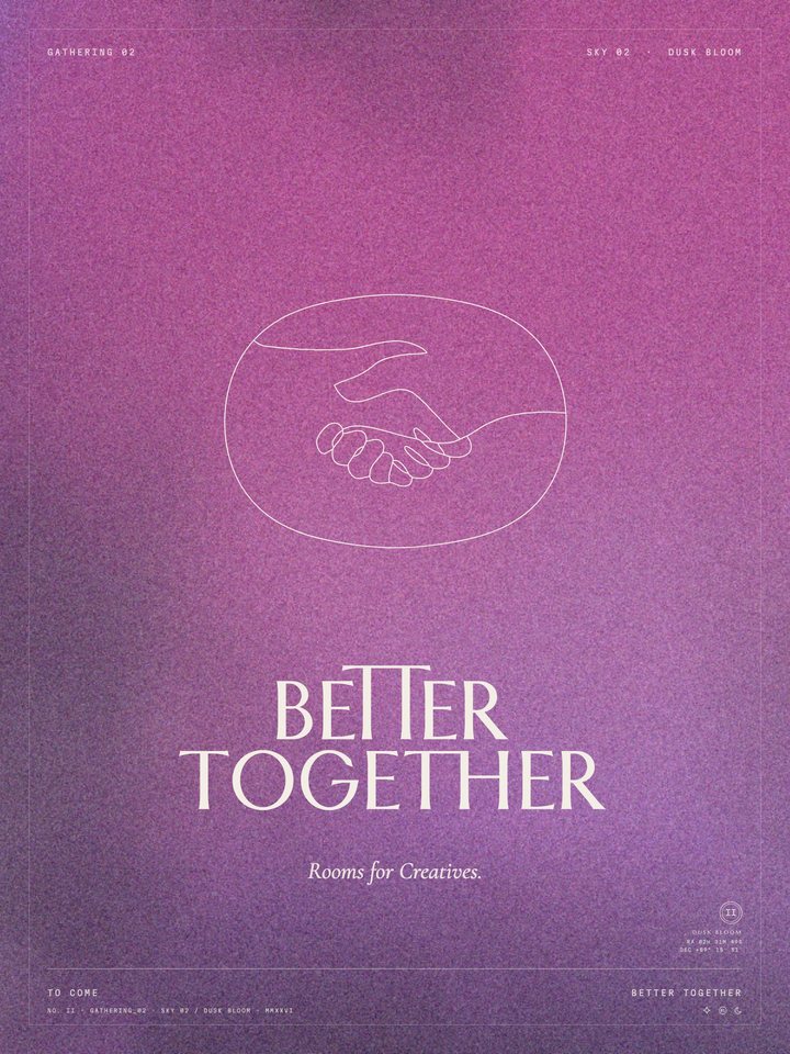
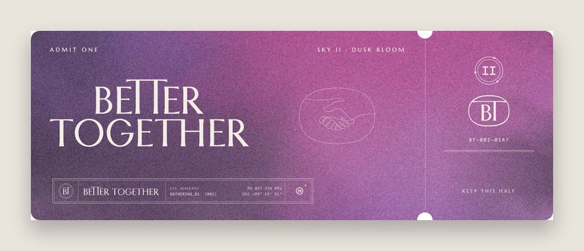

Sky 02 · Dusk Bloom
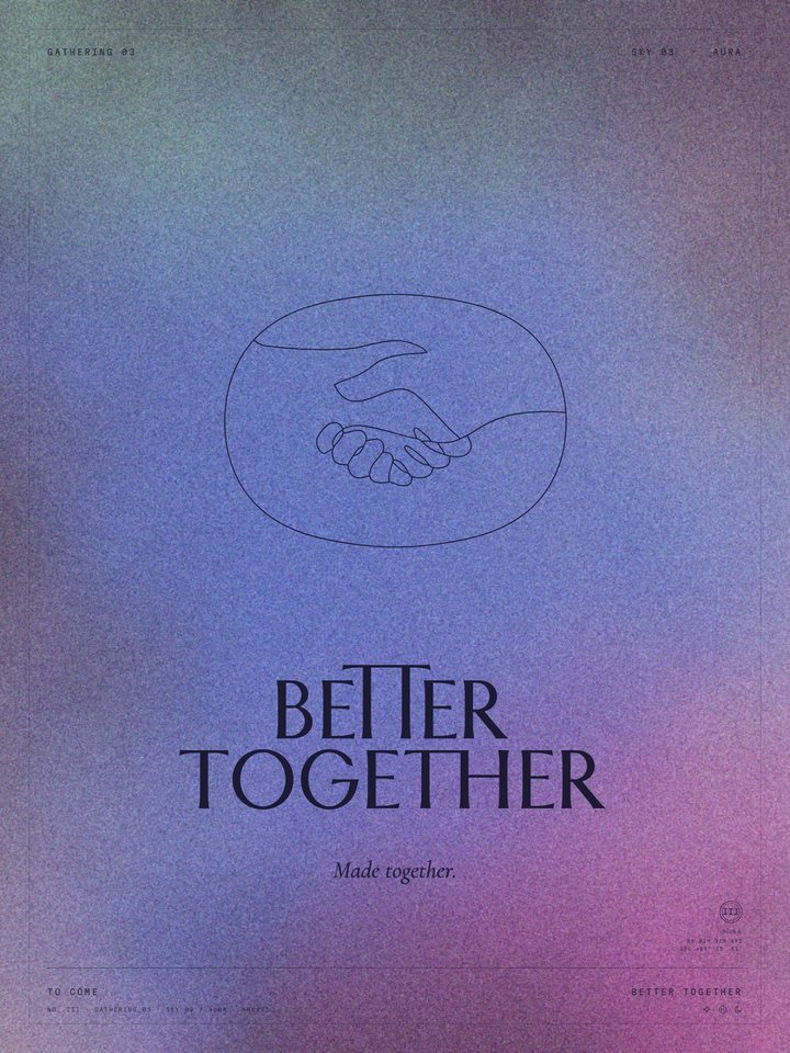
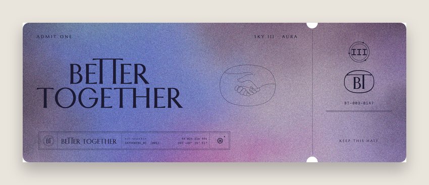

Sky 03 · Aura
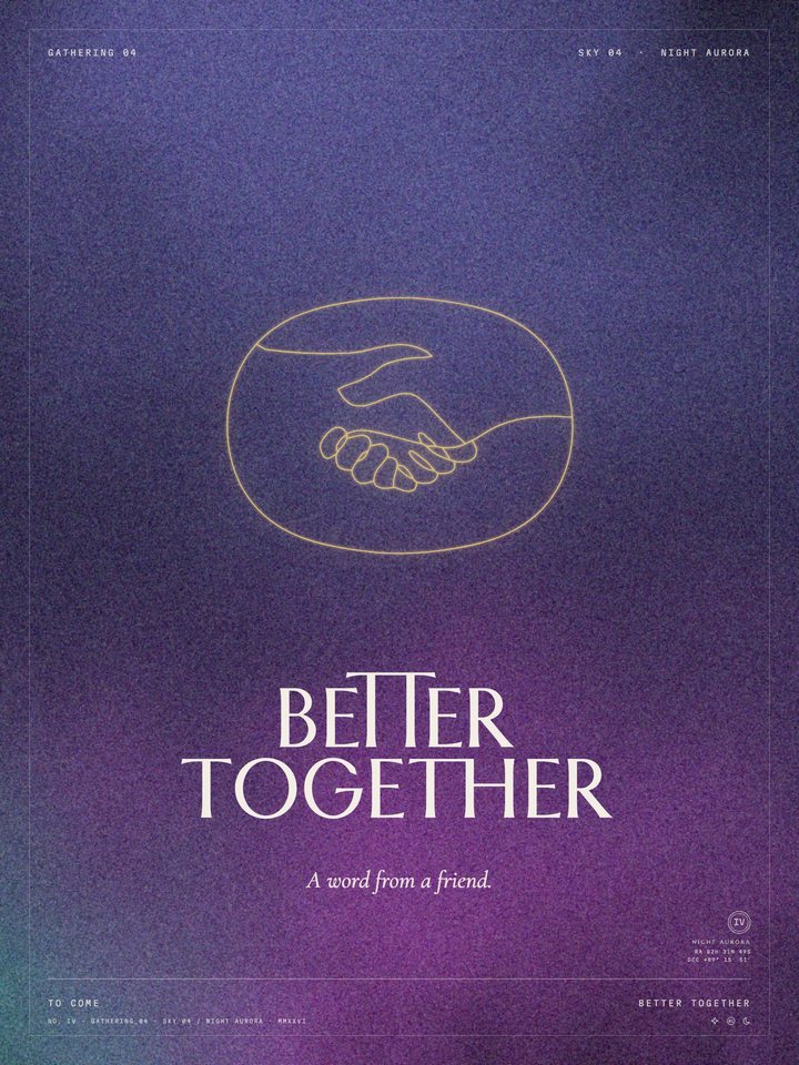
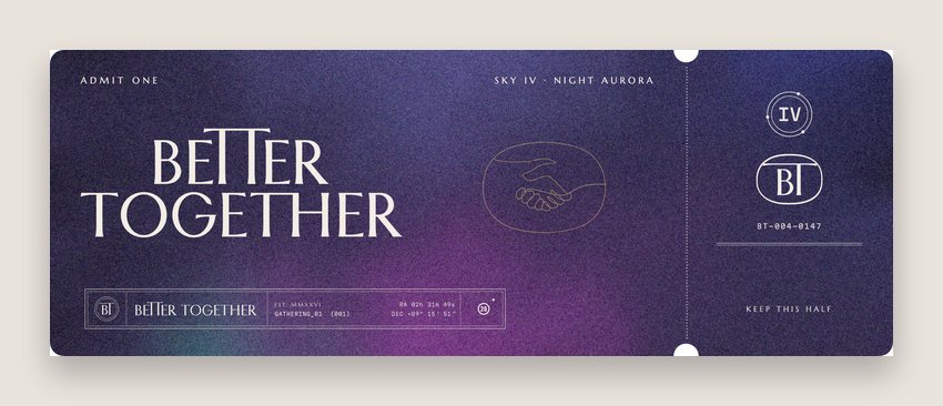

Sky 04 · Night Aurora
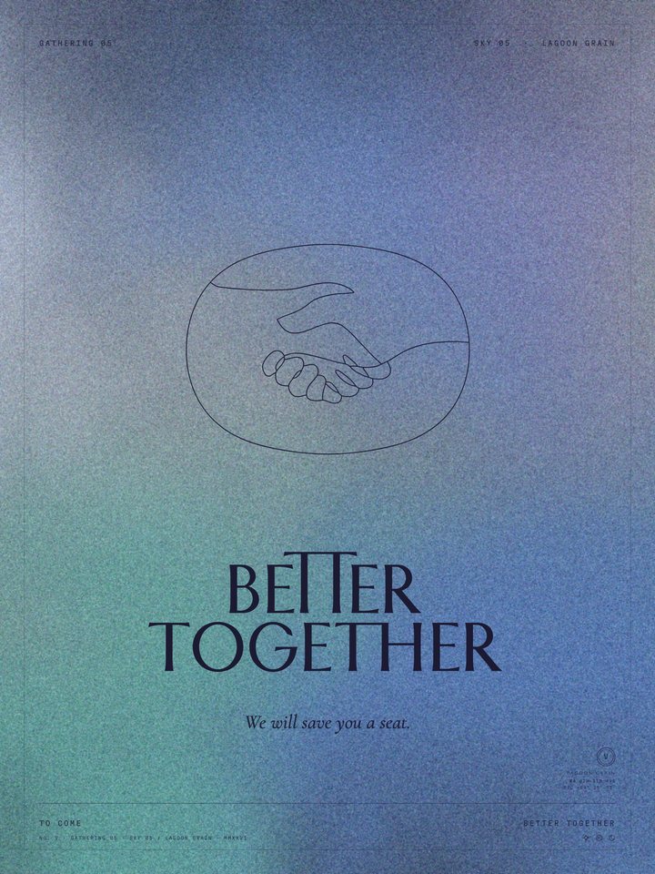
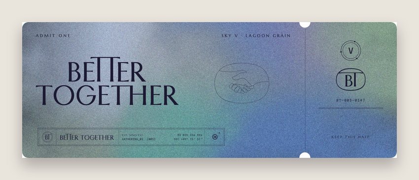

Sky 05 · Lagoon Grain
Better Together · Brand Guidelines
03 · Colour
Vol. 01 · October 2026
023
03.3
The palette
Five core colours do almost everything. One ink on a warm ground by day; Night and Gold after dark. Two colours per printed piece, plus the sky.
Plum
#4E3A5E
RGB 78 58 94
CMYK 17 38 0 63
The name by day. Floods, the room, the van.
Milk
#F2EDE5
RGB 242 237 229
CMYK 0 2 5 5
The paper. Every light ground.
Night
#2C2845
RGB 44 40 69
CMYK 36 42 0 73
After dark. Felt, posters, the site at night.
Ink
#1C1A33
RGB 28 26 51
CMYK 45 49 0 80
Text, and the name on light skies.
Gold
#E2C26E
RGB 226 194 110
CMYK 0 14 51 11
Light only: foil, neon, the line after dark.
In use, roughly
Milk 46%
Plum 22%
Night 16%
Ink 9%
Accents 5%
Better Together · Brand Guidelines
03 · Colour
Vol. 01 · October 2026
024
03.4
Accents and inks
The accents come from the skies. Use them as a second ink, never as grounds of their own: in riso pairs, in the programme lockups, on a tee.
Orchid
#B05694 · RGB 176 86 148 · CMYK 0 51 16 31
Rose Dust
#D4AAB4 · RGB 212 170 180 · CMYK 0 20 15 17
Mauve
#B58EA8 · RGB 181 142 168 · CMYK 0 22 7 29
Heather
#95659D · RGB 149 101 157 · CMYK 5 36 0 38
Klein
#002FA7 · RGB 0 47 167 · CMYK 100 72 0 35
Lagoon
#5E9898 · RGB 94 152 152 · CMYK 38 0 0 40
Riso pairs
Night + Orchid
Plum + Rose Dust
Klein + Lagoon
Better Together · Brand Guidelines
03 · Colour
Vol. 01 · October 2026
025


Typography
Five voices, one page.
The typefaces
027
Hierarchy
028
The page
029
Better Together · Brand Guidelines
026
04.1
The typefaces
Names and signs
Marcellus · tracked +16
Numbers and tickets
Index numerals · drawn




Text
Alegreya Sans · 300 to 700
Labels, times, places
Martian Mono · tracked +18
The line we remember
Cormorant Garamond Italic
Better Together · Brand Guidelines
04 · Typography
Vol. 01 · October 2026
027
04.2
Hierarchy
Three sizes and nothing in between: giant, headline, and micro. Tiny type in big empty space, one focal point per page.
(001) Gathering 01 · Spring 2027
The story
of sound
Rooms for Creatives.
Three days of the story of sound, a few hundred of us under one sky. We bring the music, the long table and the fire; you bring a friend.
Arrive Friday before sundown. Nights 01 02 03. The gate opens at four, the long table sits at seven and the barn lights up after dark.
RA 02h 31m 49s · Dec +89° 15′ 51″
Display · Marcellus 96/98 · +10
Voice · Cormorant Italic 52/60
Lede · Alegreya Sans 24/36
Body · Alegreya Sans 17/26
Label · Martian Mono 10.5/16 · +17
Better Together · Brand Guidelines
04 · Typography
Vol. 01 · October 2026
028
04.3
The page
Every page sits on one grid: 80 px margins on a 1920 by 1080 page, twelve columns with 24 px gutters, labels in the corners and the page number in a pill.
Header label
Section
Kicker
Title
Lede
Image · cols 7 to 12
Footer label
Page
1920 × 1080 · margins 80 · 12 columns · gutters 24
Labels sit 46 px from the top and bottom edges. Titles hang from the same line on every page, 152 px down. Images take whole columns, never a part of one.
Better Together · Brand Guidelines
04 · Typography
Vol. 01 · October 2026
029

Micrographics
The detail you notice second.
031 Two voices
032 The Inscription family
033 The Index family
034 Strips
035 Icons
036 Micrographic stamps
037 In use
038 The BT spec plate
039 The plate in use
040 Programme lockups
041 The call-sign ticket
Better Together · Brand Guidelines
030
05.1
Two voices
Micrographics are the detail layer: tiny, dense labels, the thing you notice second. The Inscription speaks as a classical spec plate; the Index as a technical label.
I · Inscription · the arch
I · Inscription · the ring
II · Index · the star chart
II · Index · the ruler
Better Together · Brand Guidelines
05 · Micrographics
Vol. 01 · October 2026
031
05.2
The Inscription family
The classical spec plate: arches with the line set on the curve, double rings, ruled rows, Marcellus capitals tracked wide. For the gate, the invitation and the stamp sheet.
01 · The ring
02 · The arch
03 · The half dome
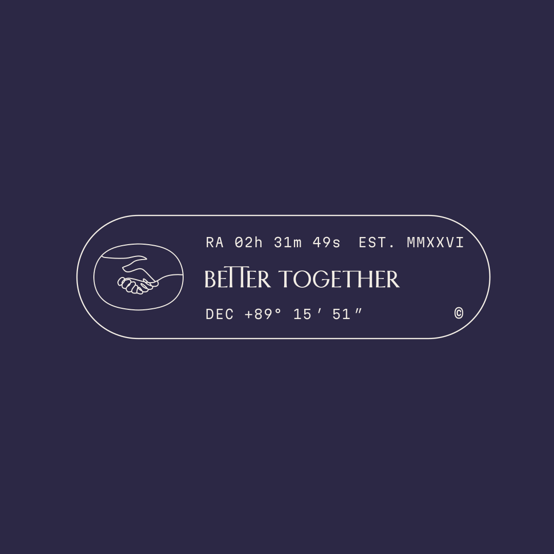
04 · The pill
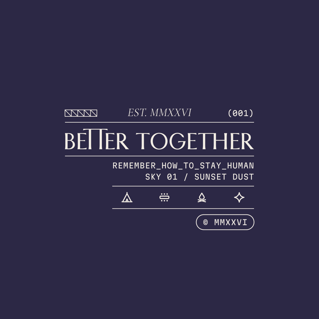
05 · Between rules
Better Together · Brand Guidelines
05 · Micrographics
Vol. 01 · October 2026
032
05.3
The Index family
The technical label: pills with serials, rulers, a barcode, dot-ended lines and the (001) tab. For wristbands, tickets, the van's door plate and the website's footer.
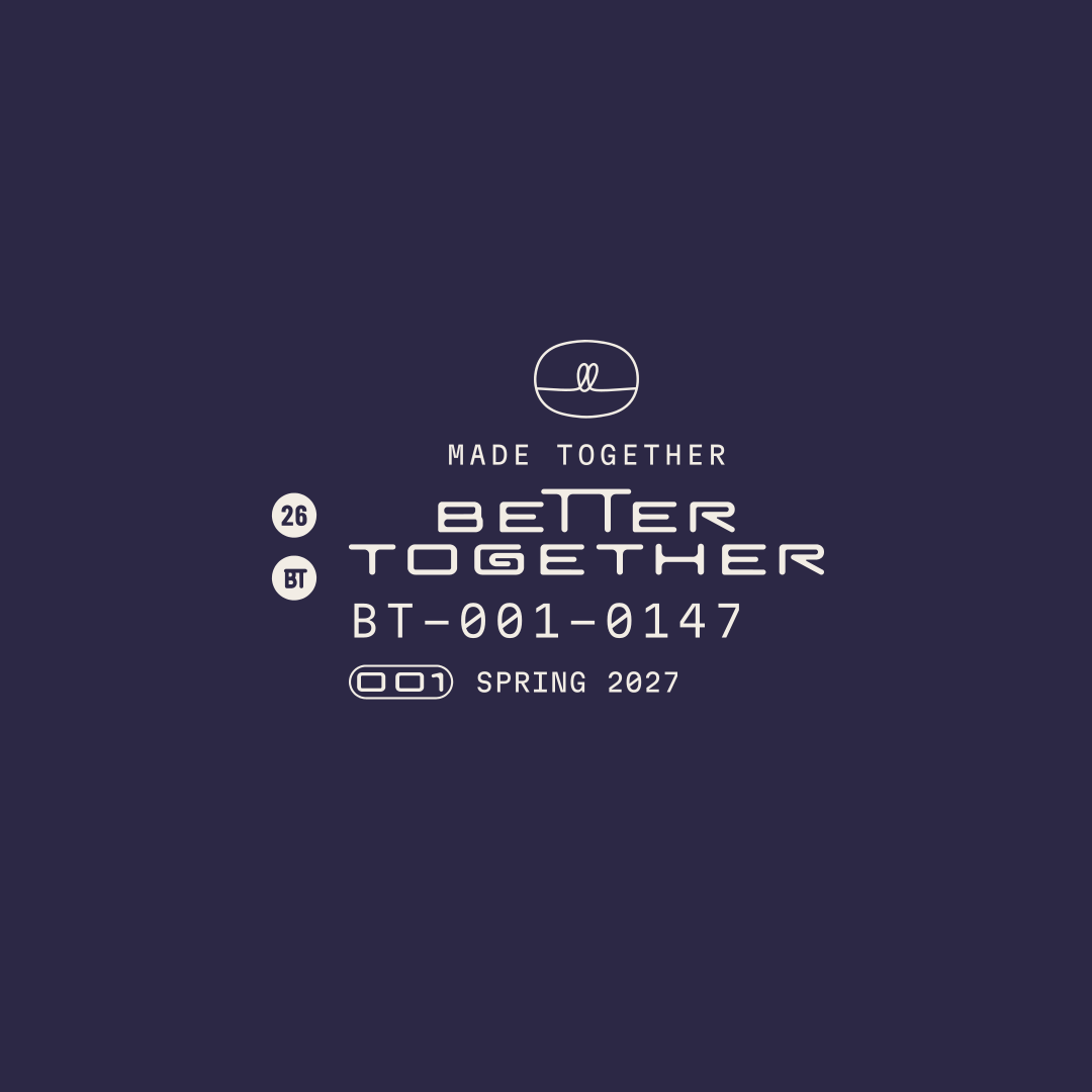
01 · The stack
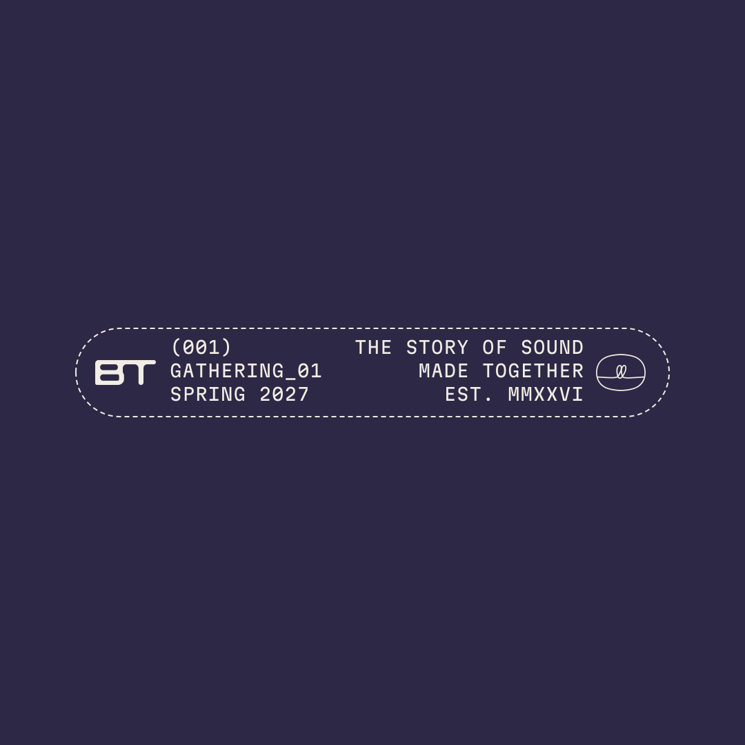
02 · The dashed pill
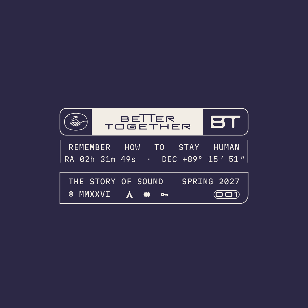
03 · The label card
04 · The ruler
05 · The star chart
Better Together · Brand Guidelines
05 · Micrographics
Vol. 01 · October 2026
033
05.4
Strips
One strip per voice, for woven labels, the website footer and wristbands, carrying the same data as the lockups.

01 · Inscription · a classical plate with double rules and the 26 roundel

02 · Index · a dashed pill, a ruler, a barcode, the guest serial and the (001) tab
Better Together · Brand Guidelines
05 · Micrographics
Vol. 01 · October 2026
034
05.5
Icons
Twenty-four icons for a gathering, drawn in the micrographics' pen on a 48 px grid: one even line, no fills, and one small detail you notice second. For schedules, maps, tickets and screens.

gate

tent

fire

table

lantern

lights

record

mic

moon

sunrise

star

constellation

chair

circle

door

key

invitation

ticket

book

mugs

peach

pot

road

van
Better Together · Brand Guidelines
05 · Micrographics
Vol. 01 · October 2026
035
05.6
Micrographic stamps
Eight dense, precise stamps, each inked by hand in one of our colours, for the passport, the place card and the back of a ticket.
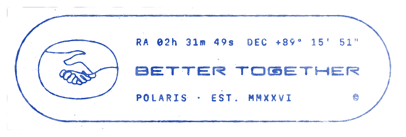
01 · Polaris
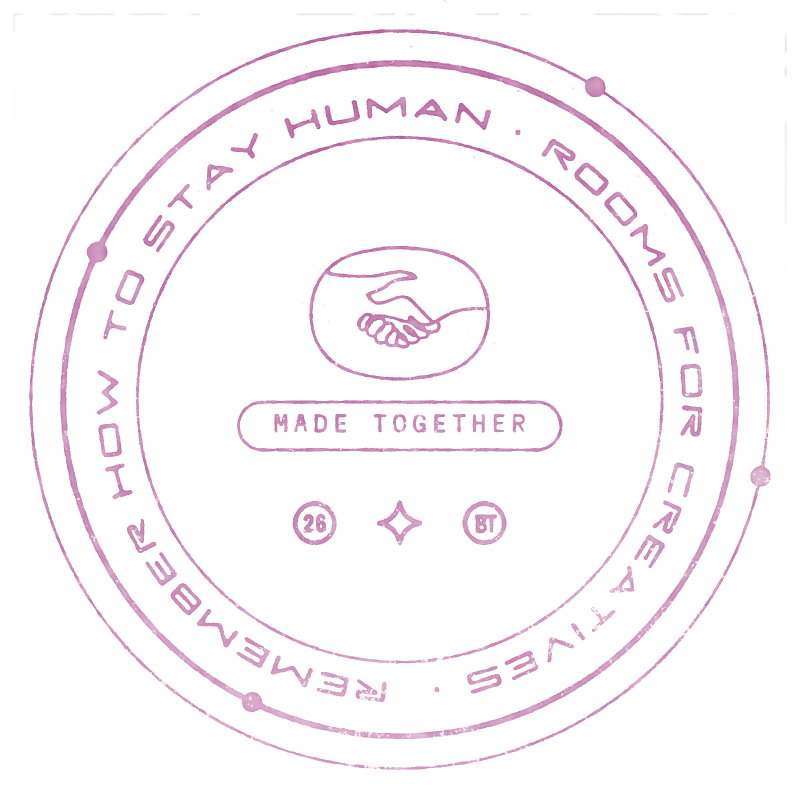
02 · Orbit
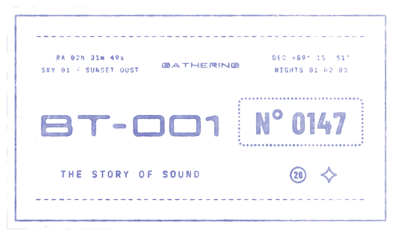
03 · Ticket
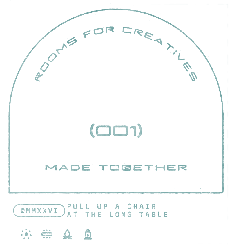
04 · Arch
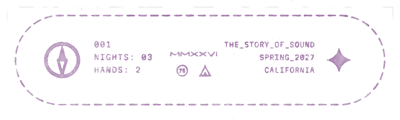
05 · Dashed
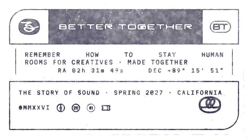
06 · Label
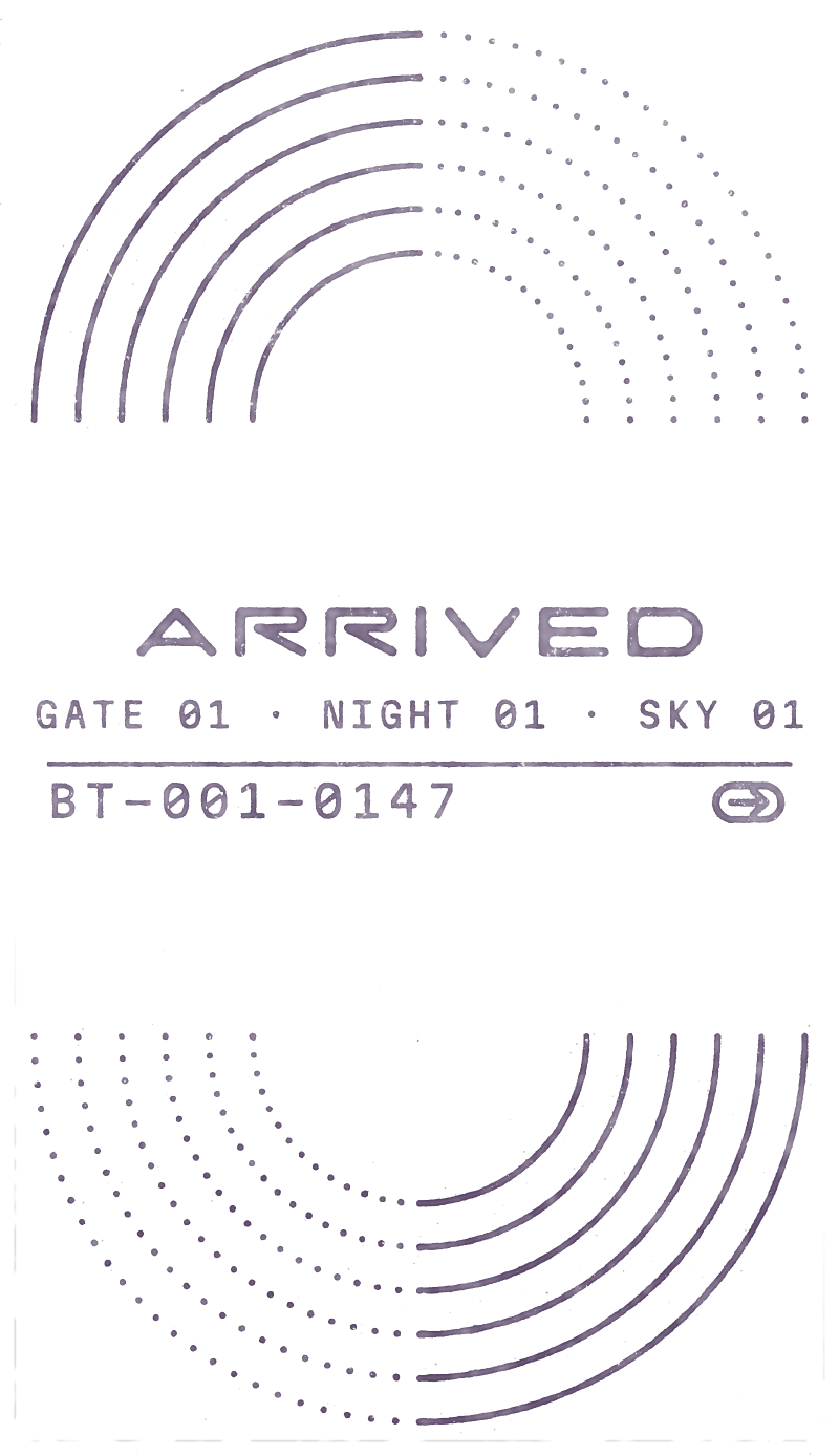
07 · Postmark
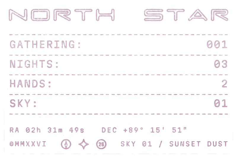
08 · Spec
Better Together · Brand Guidelines
05 · Micrographics
Vol. 01 · October 2026
036
05.7
In use
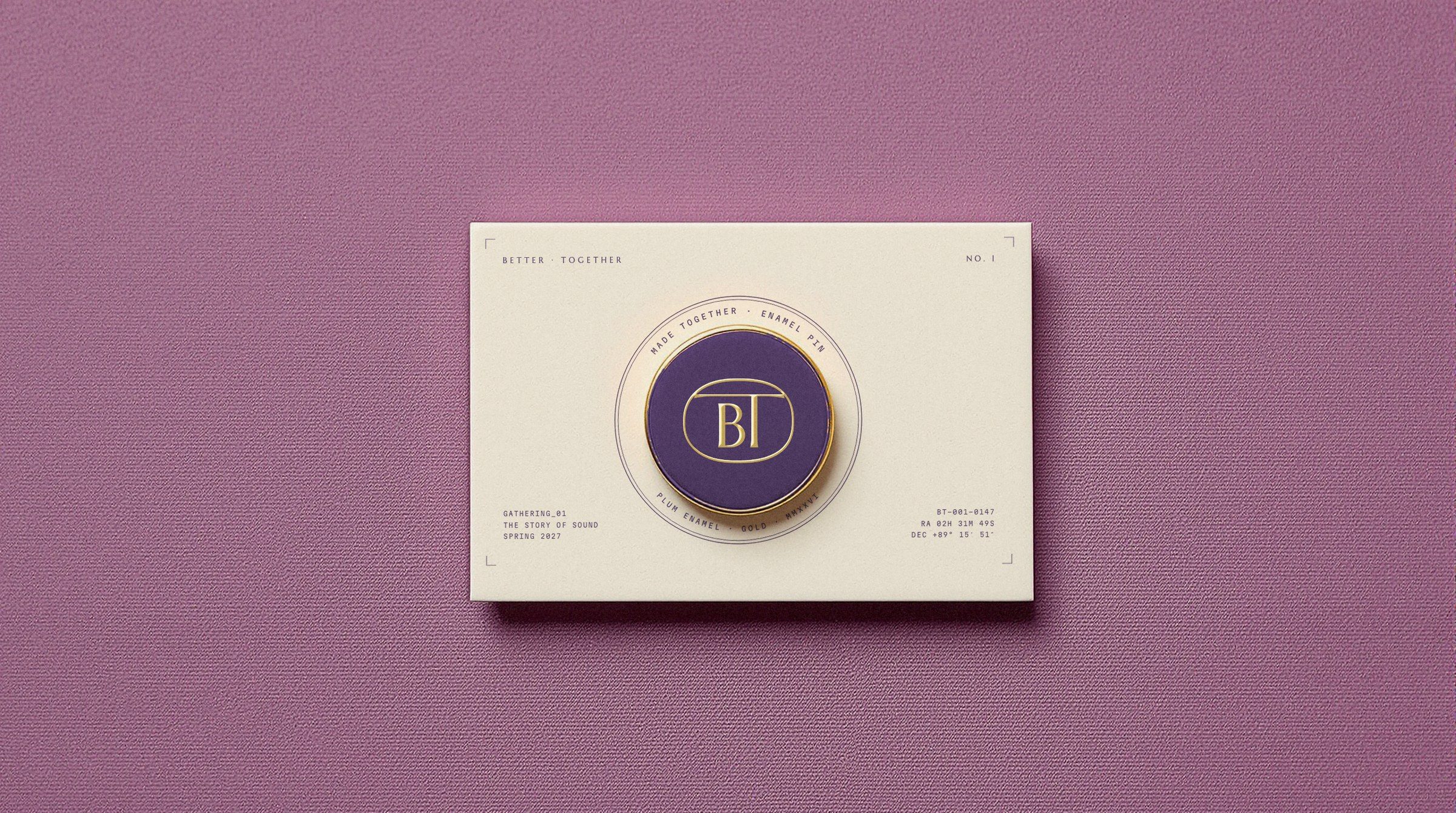
Up close: the back of the invitation, the woven label in the neck, the nameplate under the barn's neon, the pin on its backing card.
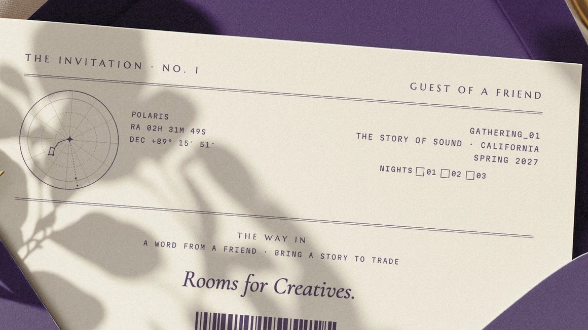
01 · The invitation's back
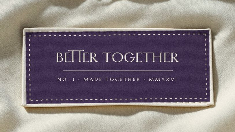
02 · The woven label
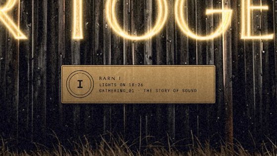
03 · The barn's nameplate
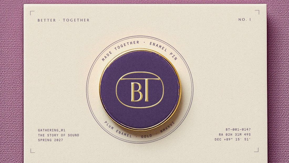
04 · The pin card
Better Together · Brand Guidelines
05 · Micrographics
Vol. 01 · October 2026
037
05.8
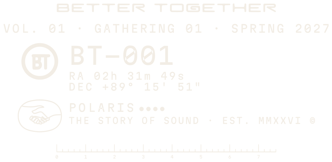
The BT spec plate
A label with real data only, set like the glass label on a car window: the handshake, a circled BT, BT-001, the North Star's coordinates, VOL. 01, Gathering 01, Spring 2027 and a ruler.
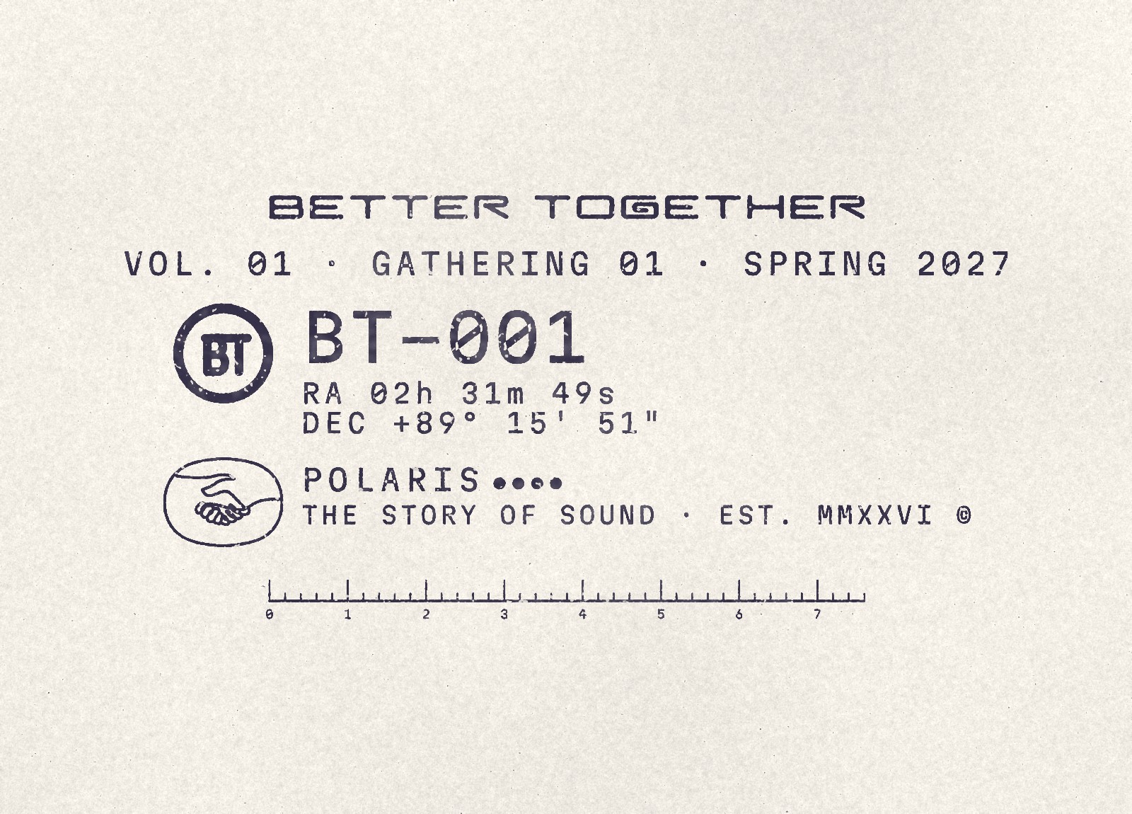
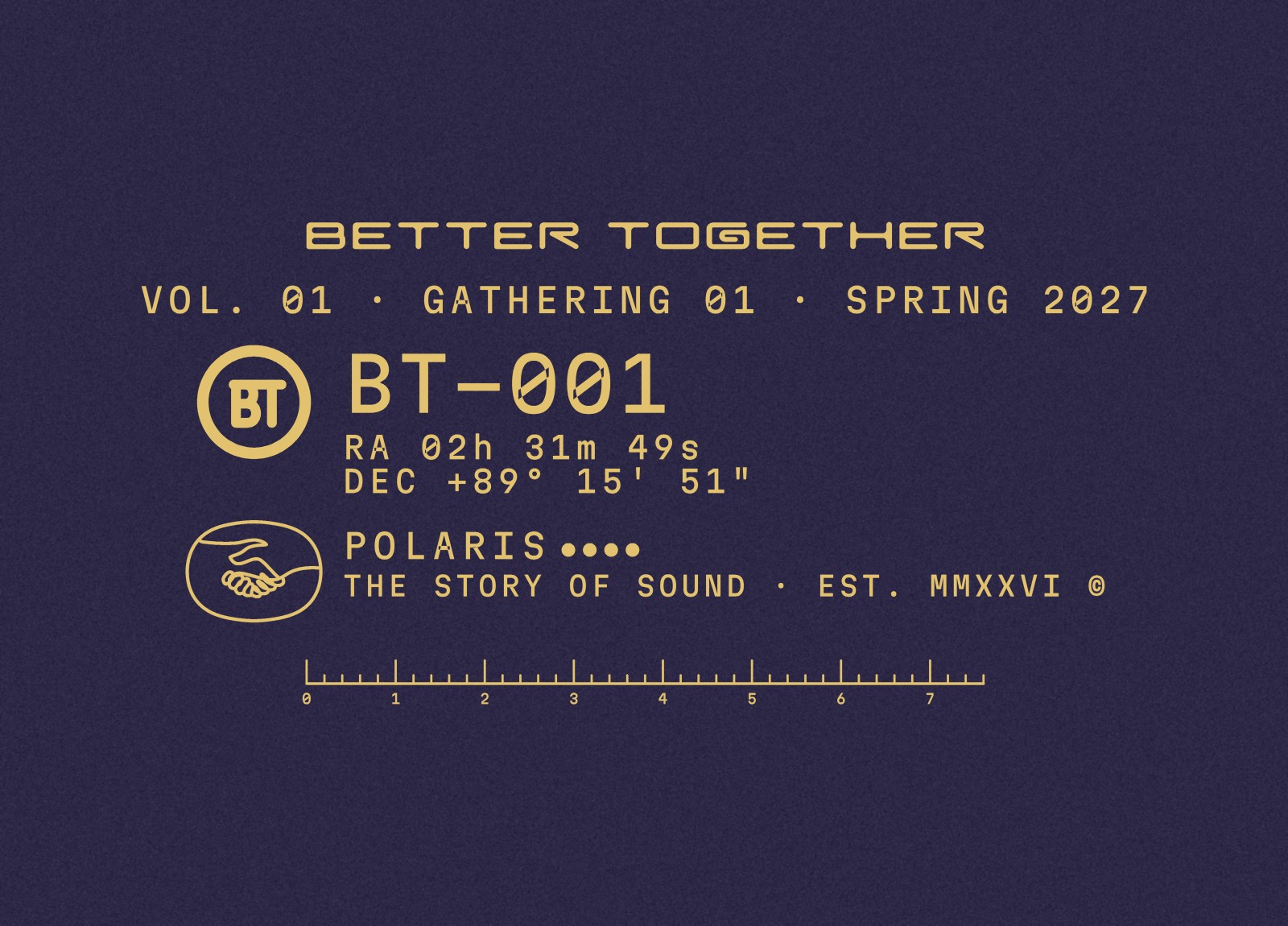
01 · By day · Night ink on paper
02 · At night · Gold on Night

Better Together · Brand Guidelines
05 · Micrographics
Vol. 01 · October 2026
038
05.9
The plate in use
The same plate everywhere, so it reads as a system: the back of the ticket, a hang tag, a Gold strip along the foot of a sky poster, the website's footer.

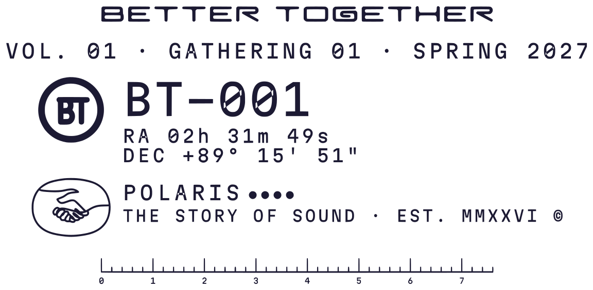
01 · Ticket back

02 · Hang tag

03 · Poster foot
Gather · Listen · Dance · Feast · Rest
Rooms for Creatives

04 · Website footer
Better Together · Brand Guidelines
05 · Micrographics
Vol. 01 · October 2026
039
05.10
Programme lockups
One grammar for everything a gathering runs: the handshake, a pictogram and a word in one frame, each programme in its own accent.








Better Together · Brand Guidelines
05 · Micrographics
Vol. 01 · October 2026
040
05.11
The call-sign ticket
After the radio cards: a huge code in the Index capitals, a row of boxes to tick for the gathering, a stamp area and the fine print.
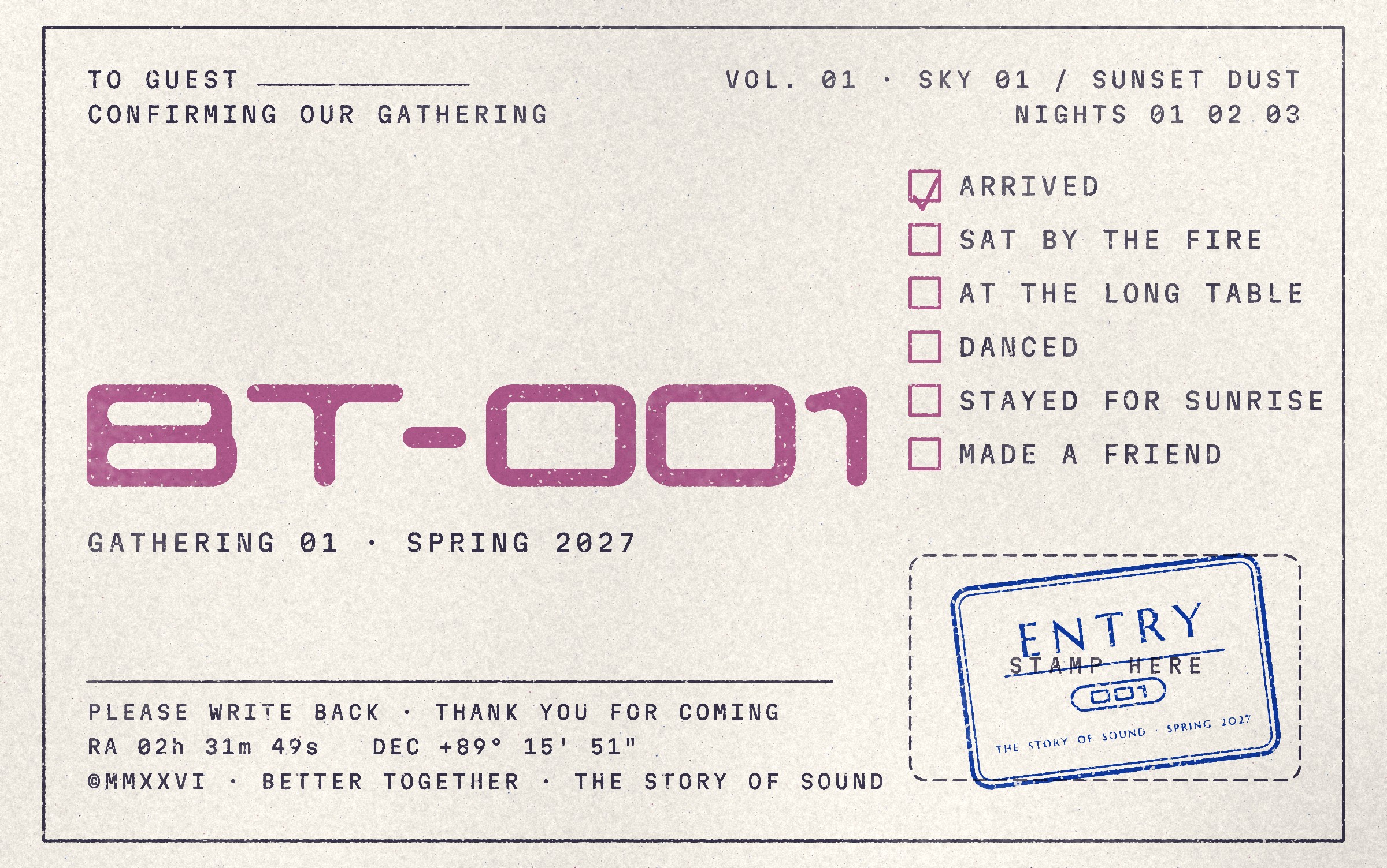
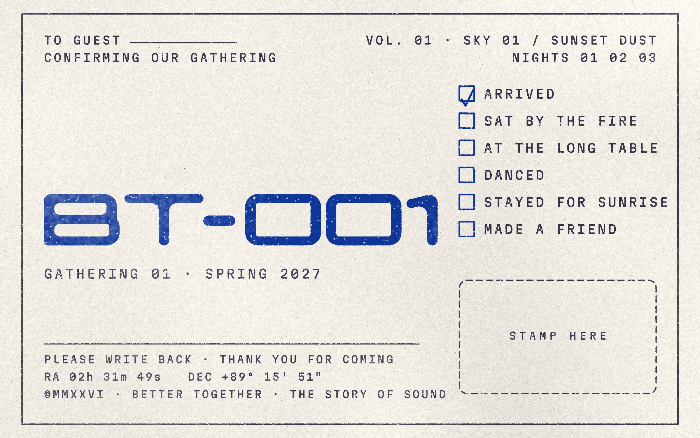
01 · Orchid and Night on uncoated stock
02 · Klein and Night
Better Together · Brand Guidelines
05 · Micrographics
Vol. 01 · October 2026
041

The room
Rooms for Creatives.
043 The room
044 The room system
045 The Gathering lid
046 Corner lettering
047 The ROOM lid
048 Provisions sack
049 Station posters
050 The sticker sheet
051 The table
052 Together to gathering
053 The toppings
Better Together · Brand Guidelines
042
06.1
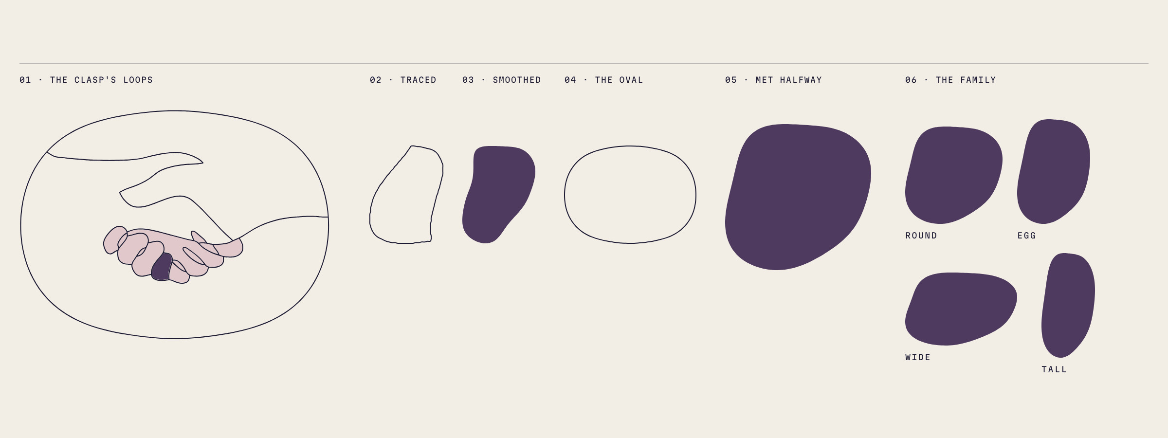
The room
One soft shape, traced from the handshake: where the two hands close, the line makes a small loop. Smoothed and met halfway by the handshake's own oval, it becomes the room, a room for creatives.
Better Together · Brand Guidelines
06 · The room
Vol. 01 · October 2026
043
06.2
The room system
One ink flood, one soft canvas left bare, 66 to 76 percent of every surface. By day the room is the paper; at night it holds a sky and the small type turns Gold.
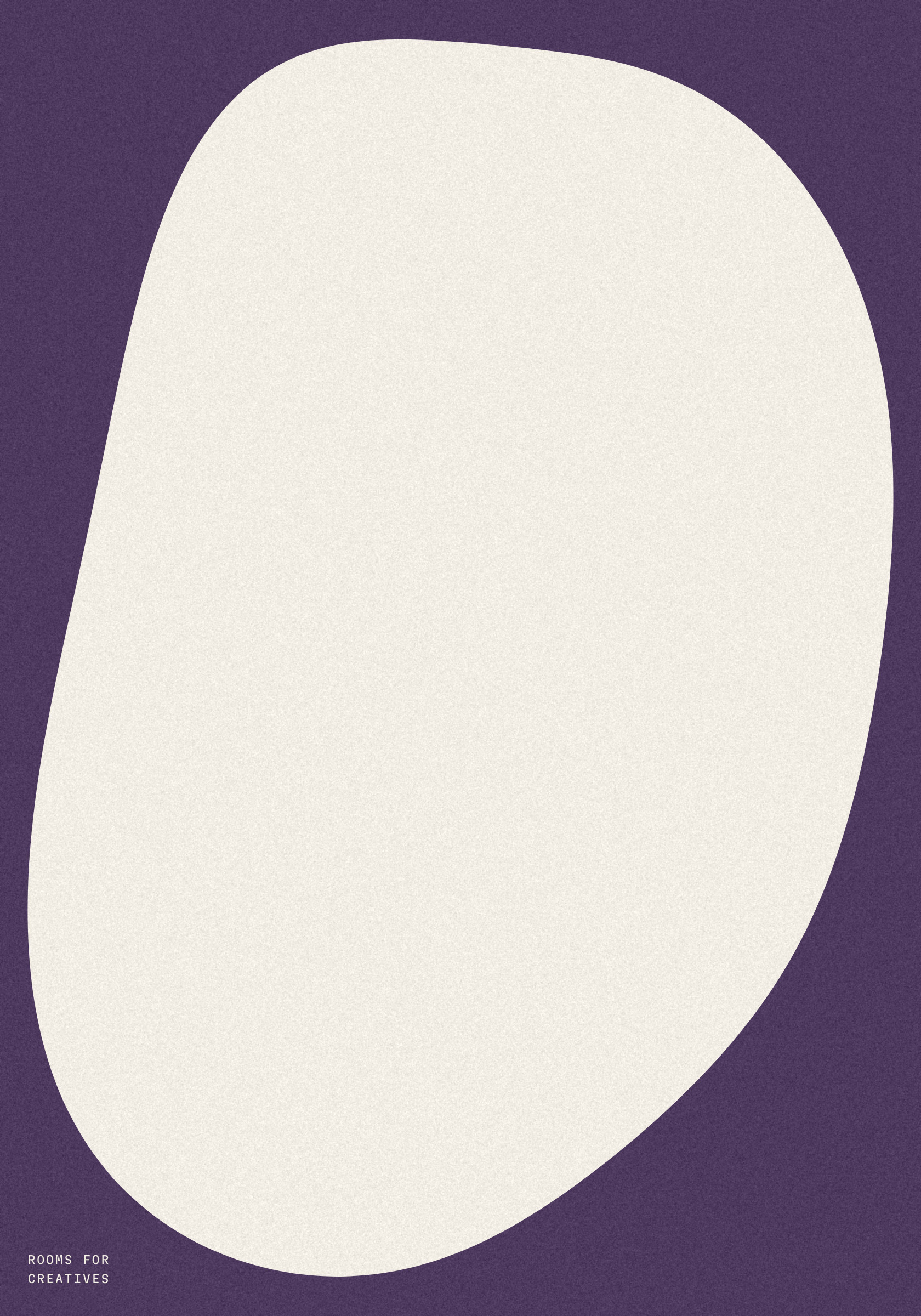
Poster · Plum
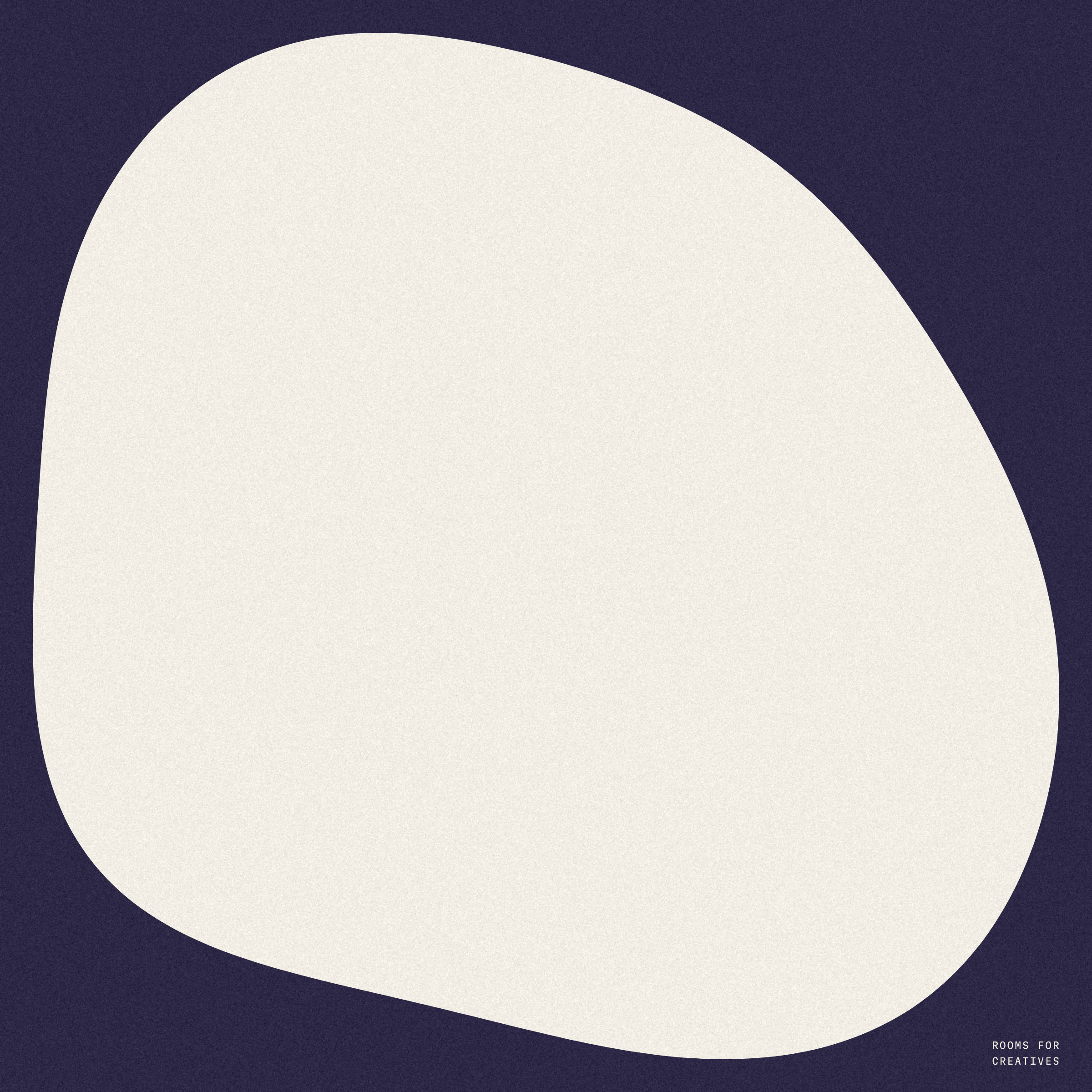
Box lid · Night
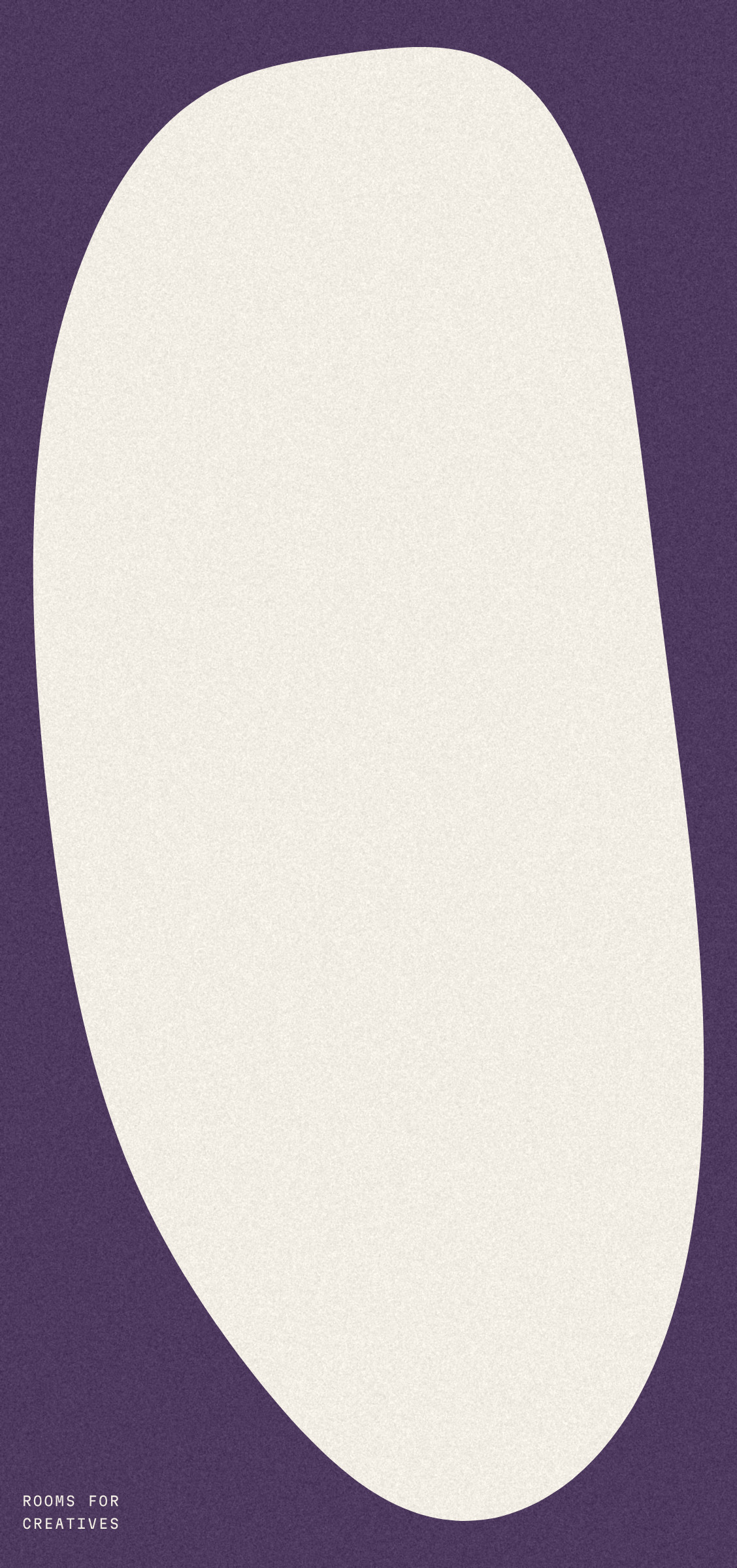
Sack · Plum
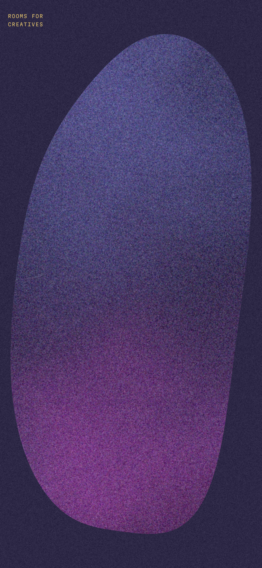
Phone · after dark
Better Together · Brand Guidelines
06 · The room
Vol. 01 · October 2026
044
06.3
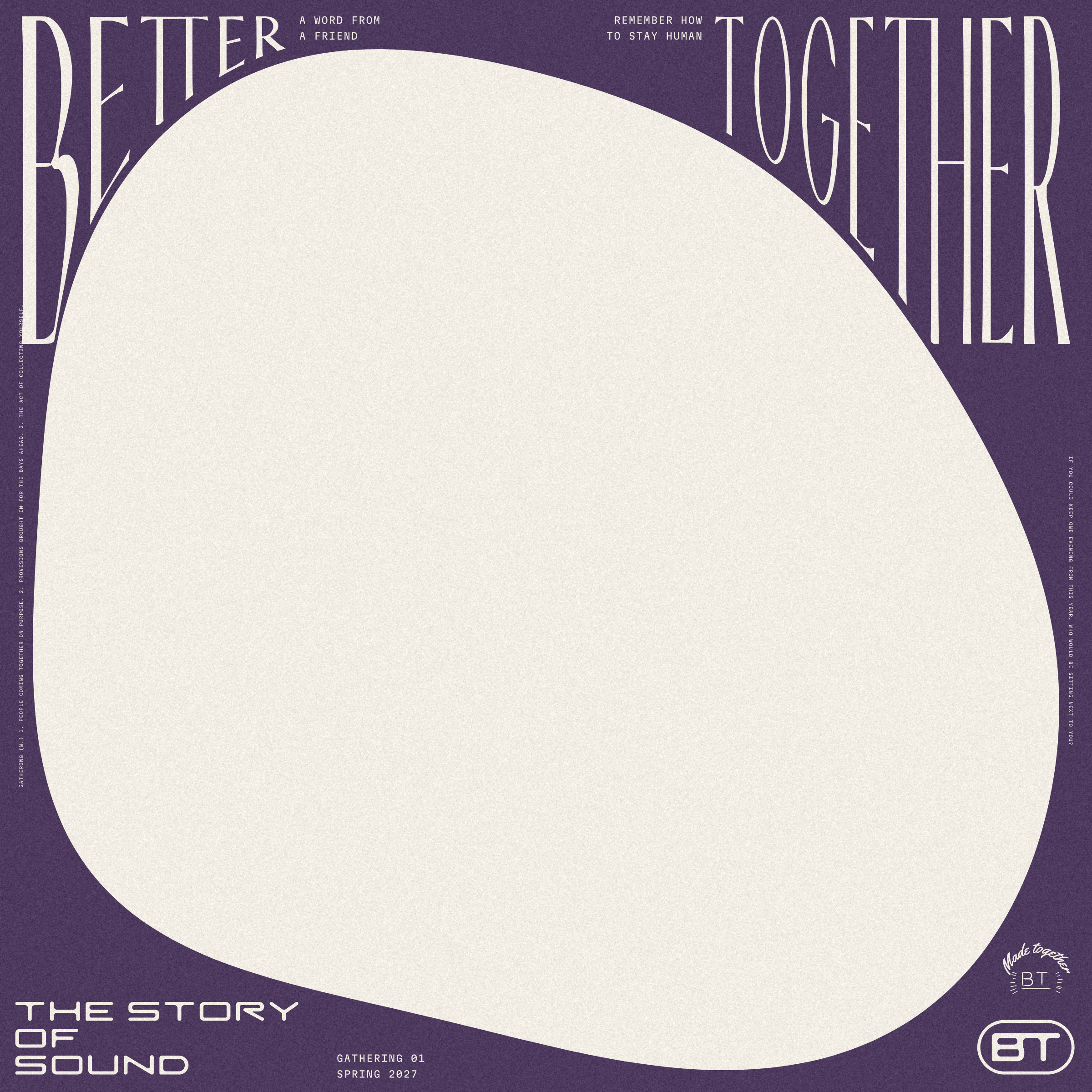
The Gathering lid
Plum floods the board, the room is left bare, and the name hangs from one top line into the corners until the curve stops it.
The rails carry a dictionary entry and an absurd question; the bottom pocket says THE STORY / OF / SOUND.
Better Together · Brand Guidelines
06 · The room
Vol. 01 · October 2026
045
06.4
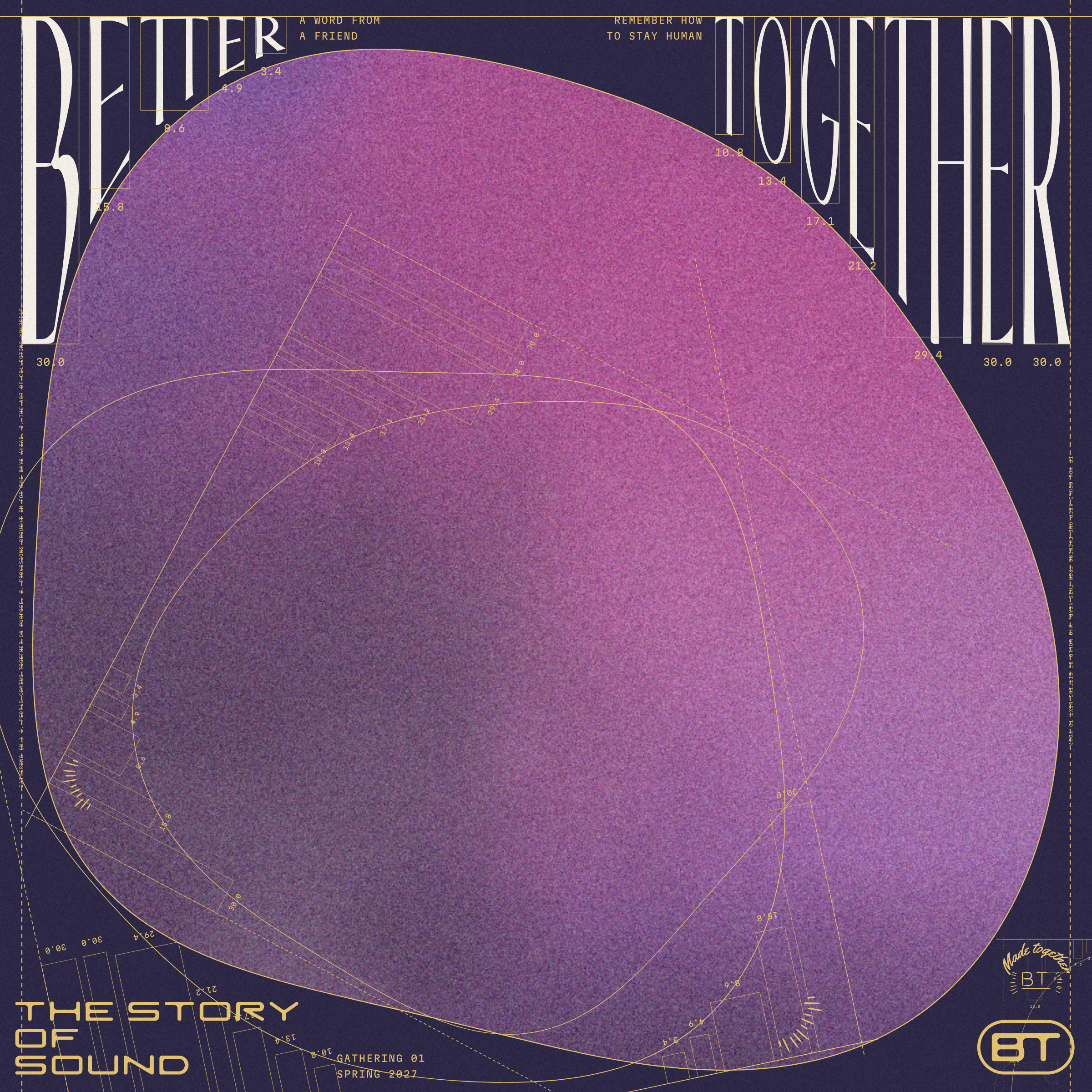
Corner lettering
The curve is the baseline. Each letter steps down to between 0.53 and 0.68 of the one before, and the tallest is capped at 30 percent of the lid.
Shown at night with its construction in Gold hairline: the top line, the edge lines, each letter's box and height.
Better Together · Brand Guidelines
06 · The room
Vol. 01 · October 2026
046
06.5
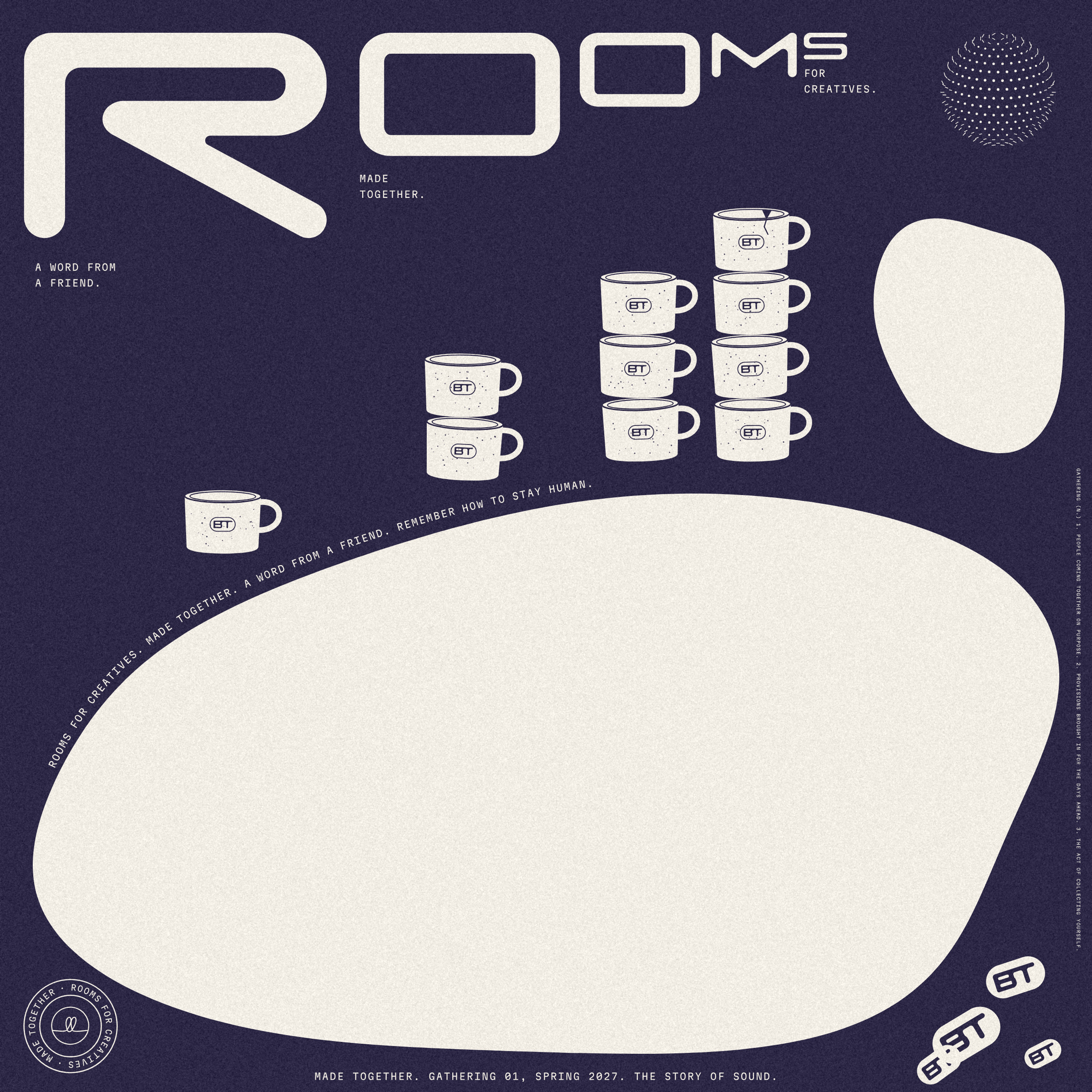
The ROOM lid
ROOM in the Index capitals shrinks by six tenths a letter while the camp mugs rise: one, two, three, four, the top one chipped.
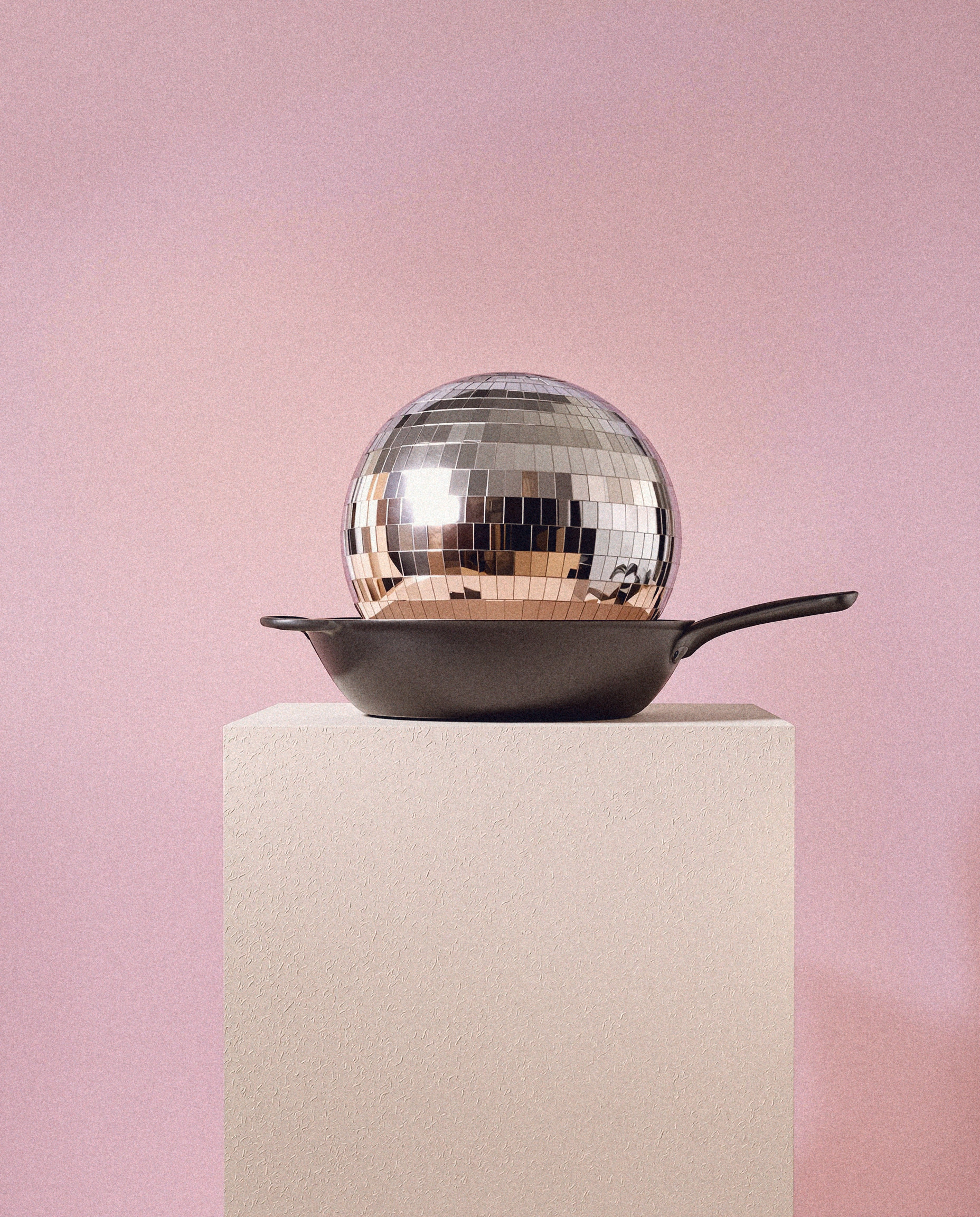
One topping per surface: here the disco sphere, our dance floor.
Better Together · Brand Guidelines
06 · The room
Vol. 01 · October 2026
047
06.6
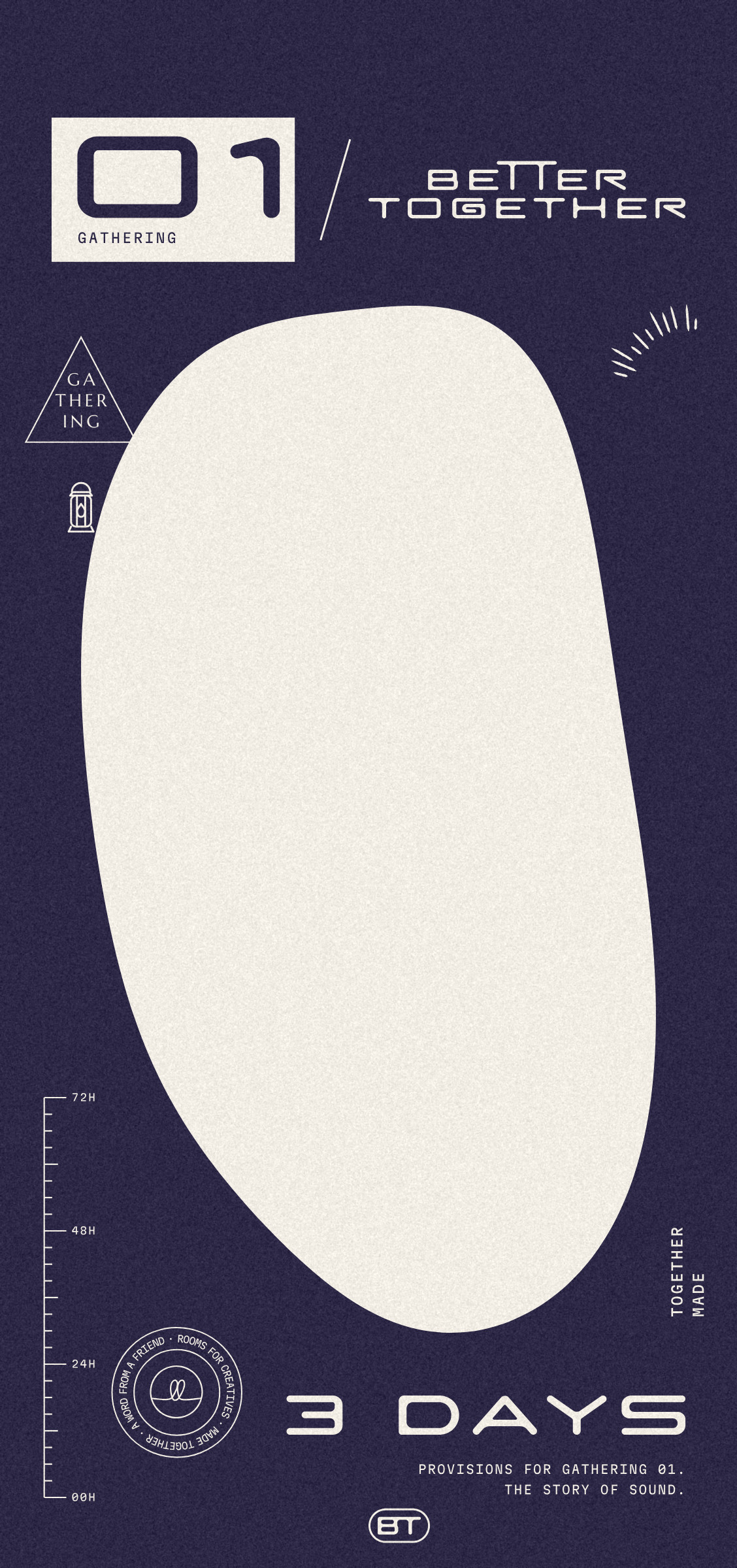
Provisions sack
01 boxed over GATHERING, a ruler counting three days in hours, a seal reading Rooms for Creatives, and 3 DAYS where the weight would be.

Better Together · Brand Guidelines
06 · The room
Vol. 01 · October 2026
048
06.7
Station posters
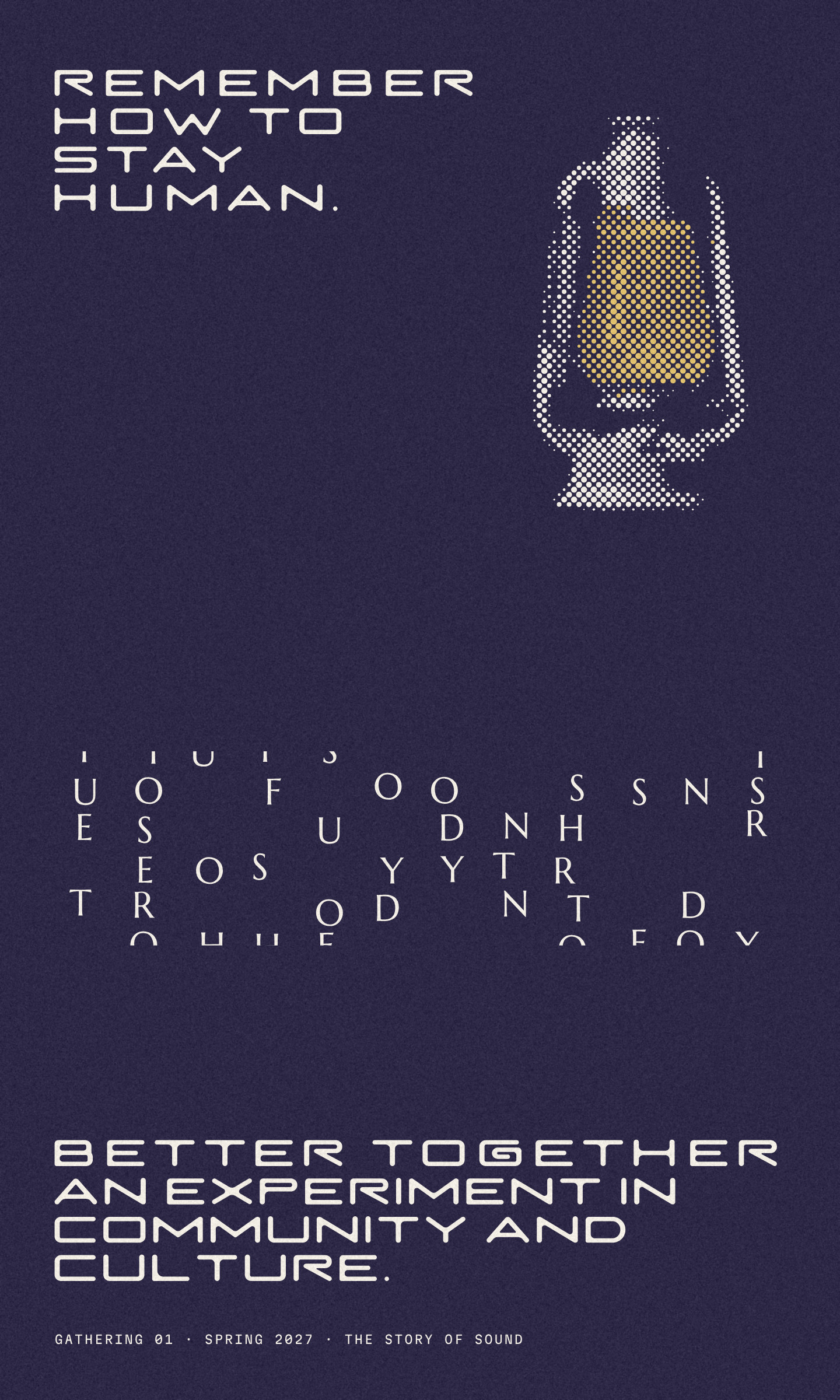
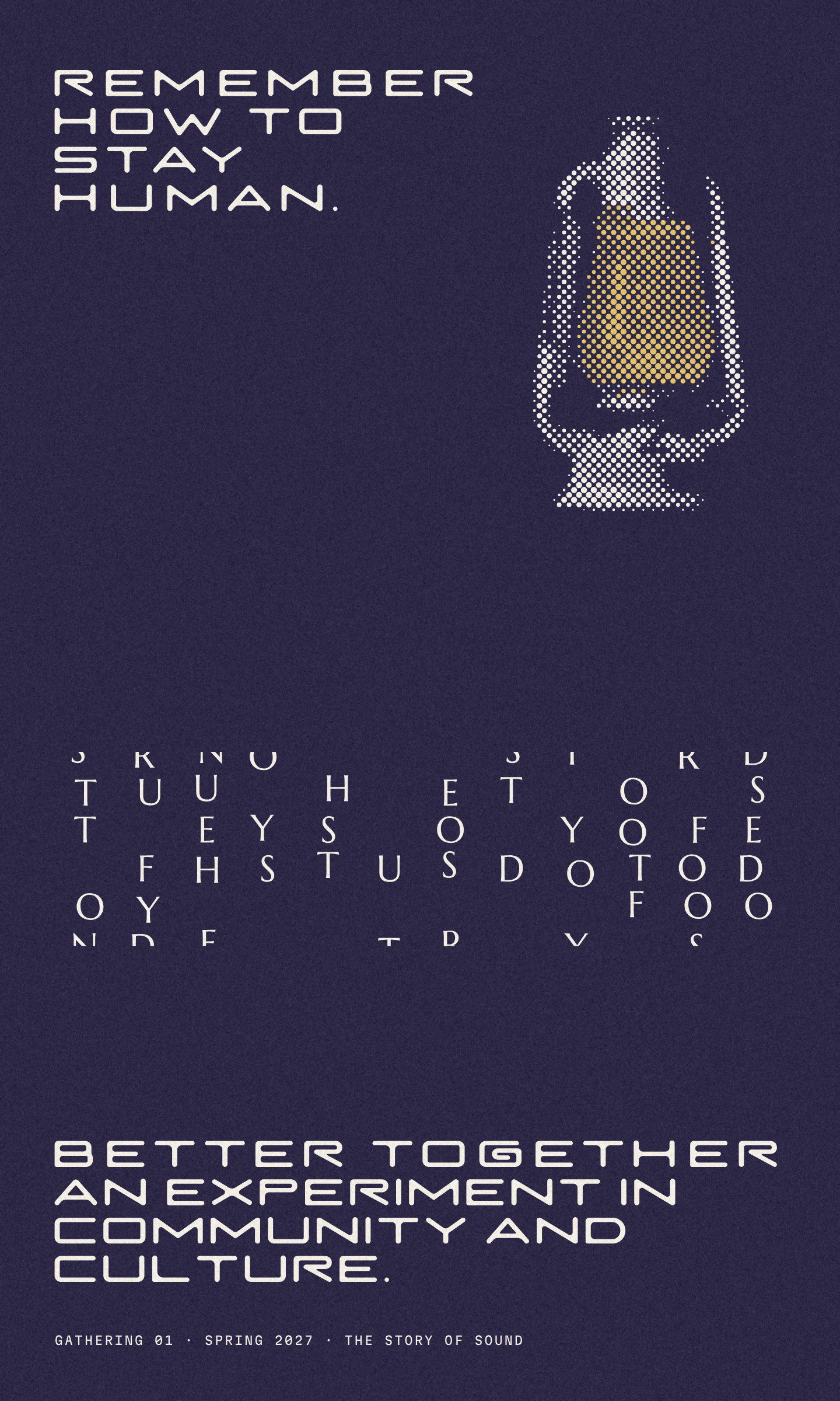
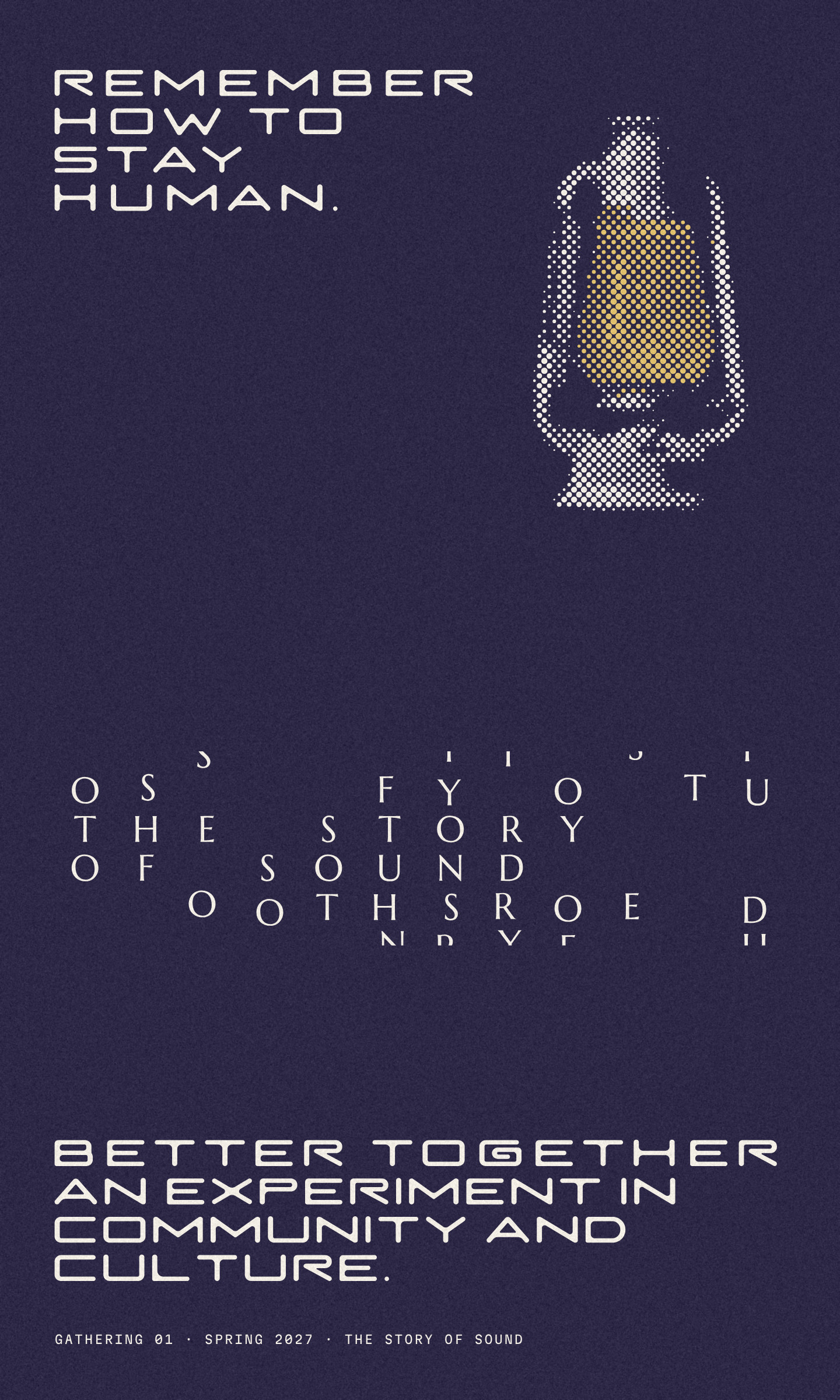
A headline built like a tower, a printed lantern, and a field of scattered capitals that settles, poster by poster, into THE STORY / OF SOUND. Each one carries the line we remember, Remember how to stay human, and what we are: an experiment in community and culture.
Better Together · Brand Guidelines
06 · The room
Vol. 01 · October 2026
049
06.8
The sticker sheet
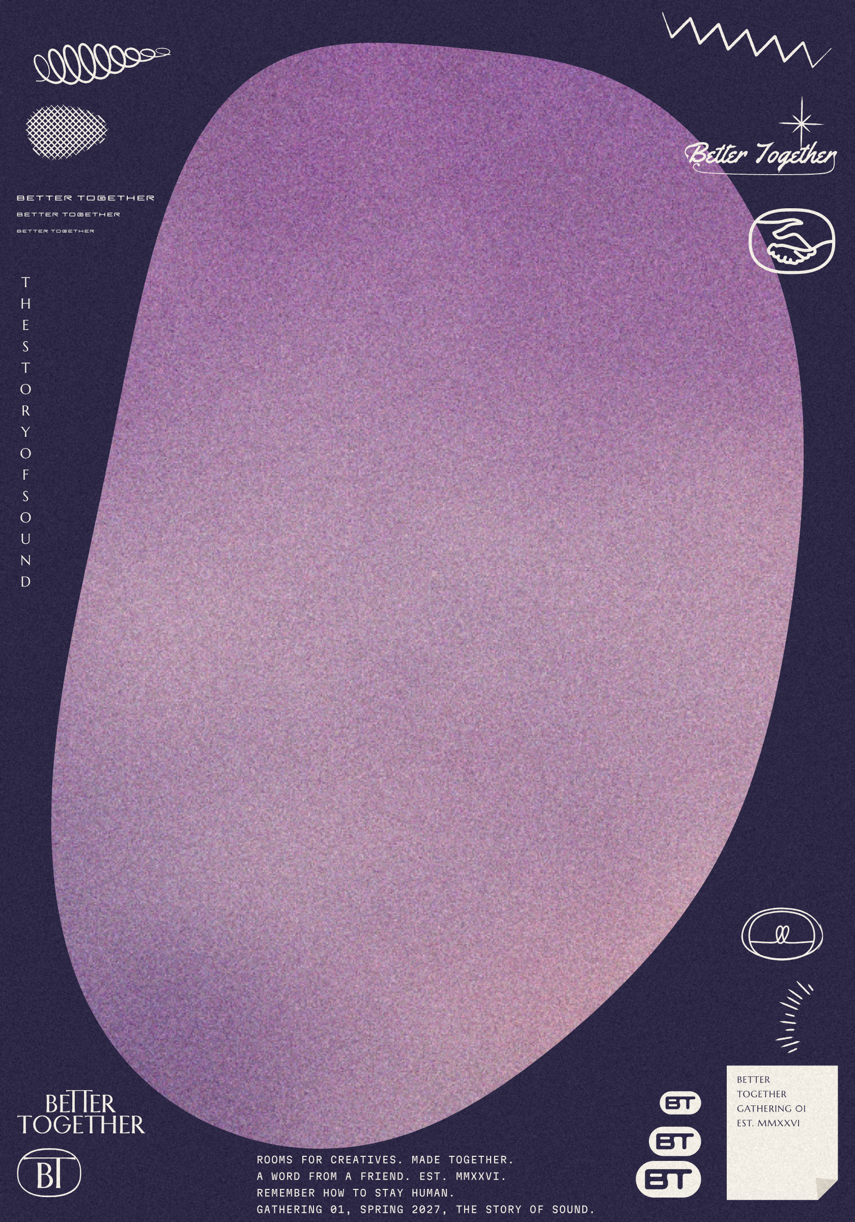
A huge empty room holding Sunset Dust, and a thin margin crammed with every voice: the name, the BT, the handshake, the badge and the hand marks.
Better Together · Brand Guidelines
06 · The room
Vol. 01 · October 2026
050
06.9
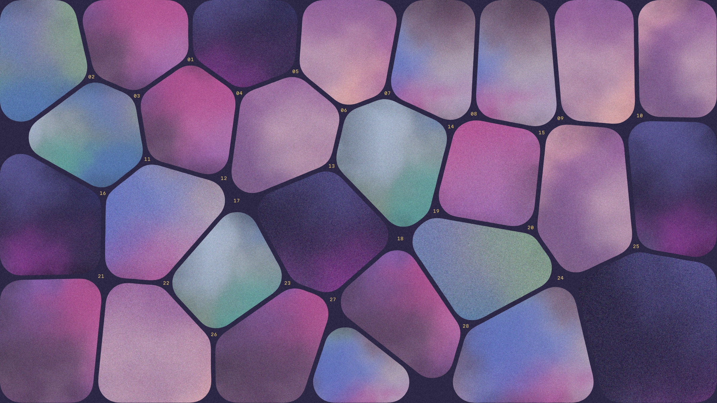
The table
Rooms packed edge to edge like a long table, each holding a crop of the five skies, with seat numbers in Gold where the gutters meet.
Better Together · Brand Guidelines
06 · The room
Vol. 01 · October 2026
051
06.10
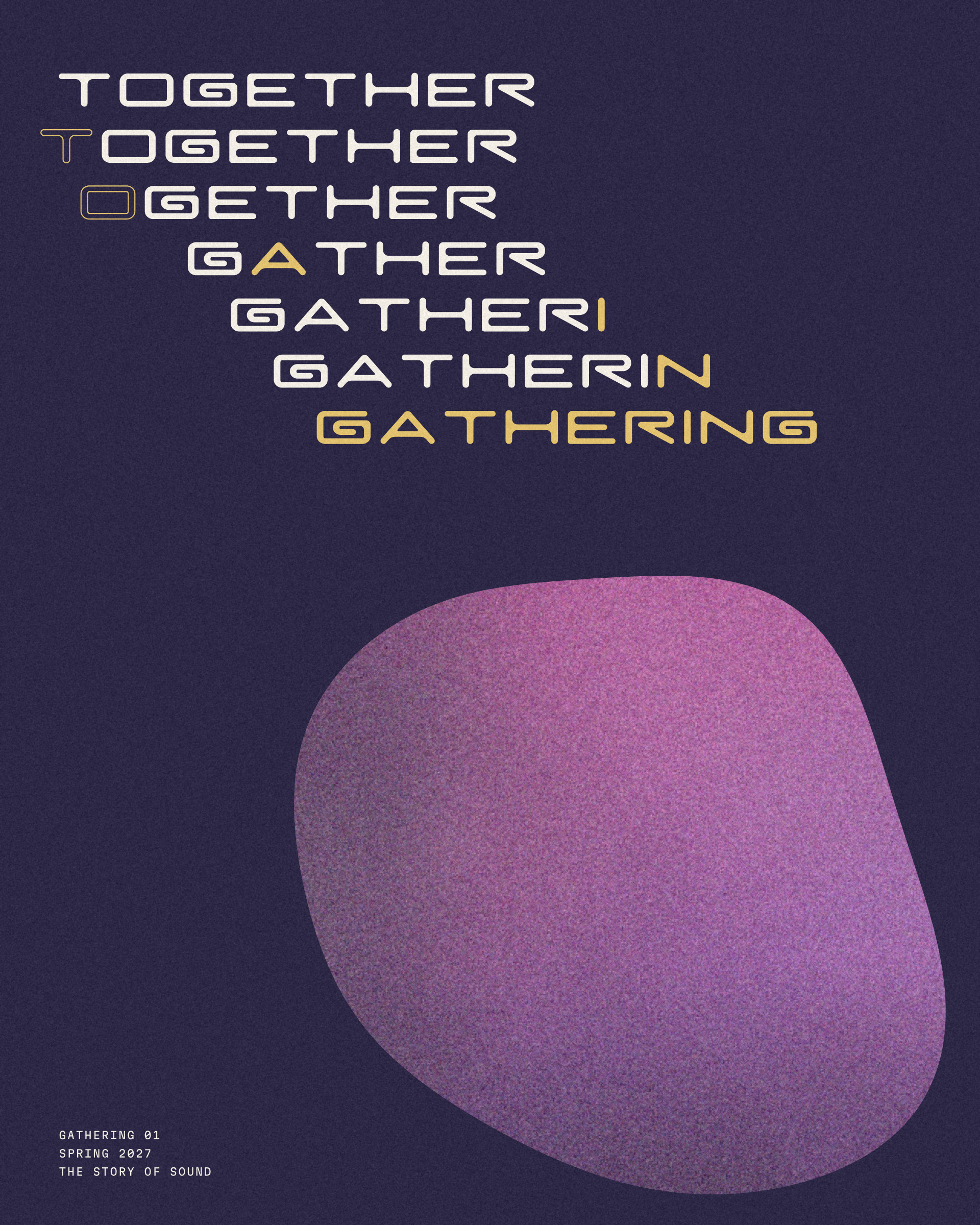
Together to gathering
TOGETHER already holds GATHER: drop the TO, change one letter, add ING. One line per step, for a programme cover, a social post or a ten-second transition.
Better Together · Brand Guidelines
06 · The room
Vol. 01 · October 2026
052
06.11
The toppings
Hairline drawings for a ranch gathering, one per surface: never two on the same piece.

01 · Stepped mountains

02 · Desert lightning

03 · Heat shimmer

04 · Disco sphere

05 · Sunrise rays

06 · Star chart
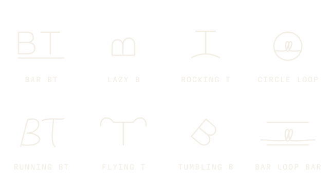
07 · Cattle brands

08 · Rope coil

09 · Topography

10 · Tally marks
Better Together · Brand Guidelines
06 · The room
Vol. 01 · October 2026
053

Photography
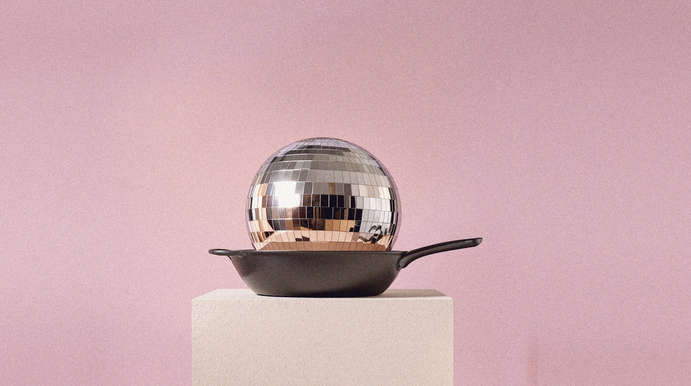
One object, one plinth, one line, one light.
055 Still life
056 Still-life posters
057 Together
058 People
059 Places, outdoors
060 Places, indoors
061 Treatments
Better Together · Brand Guidelines
054
07.1
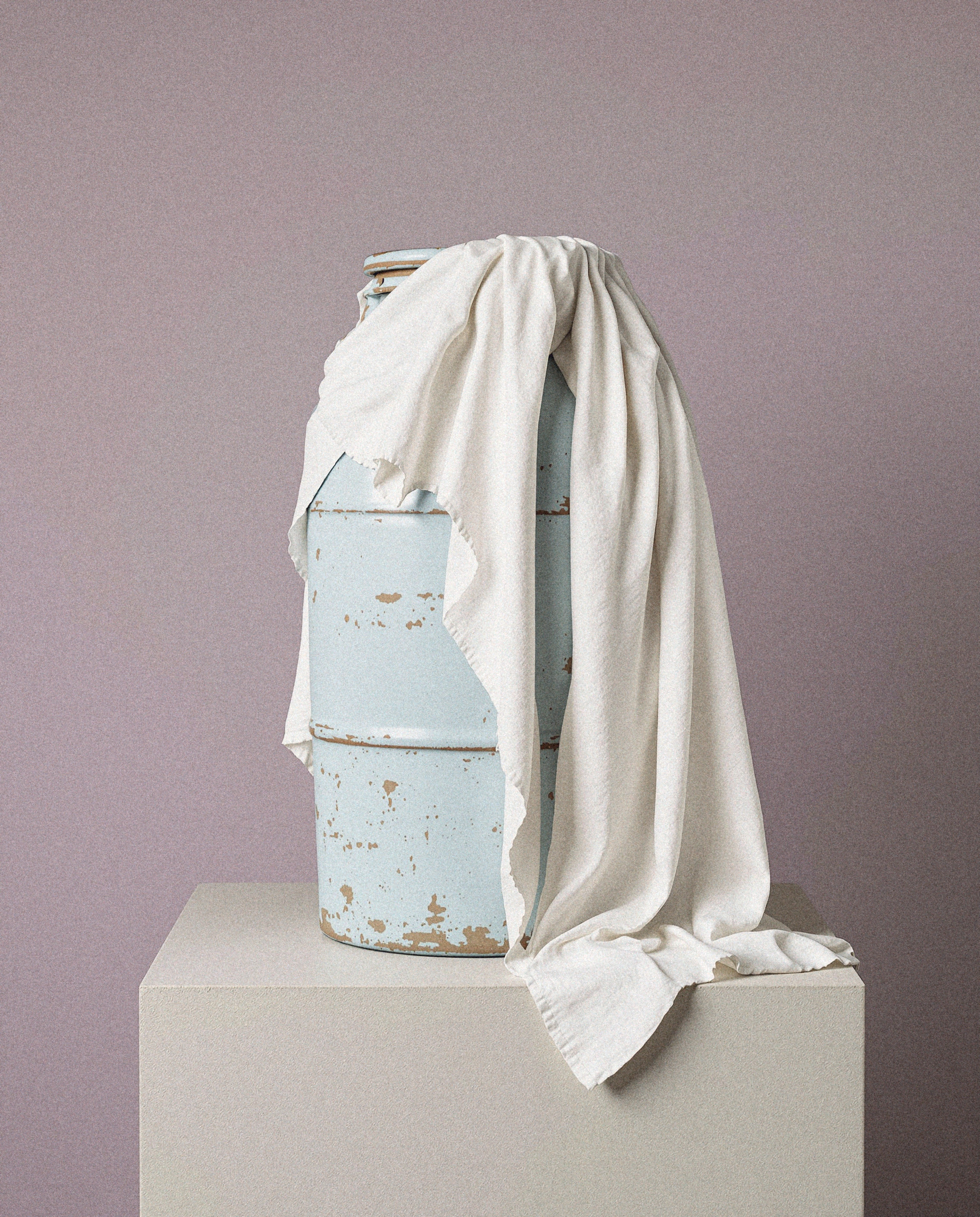
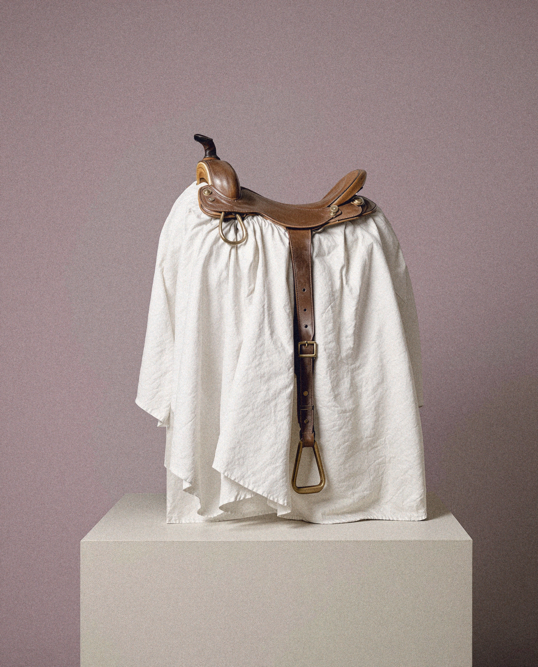
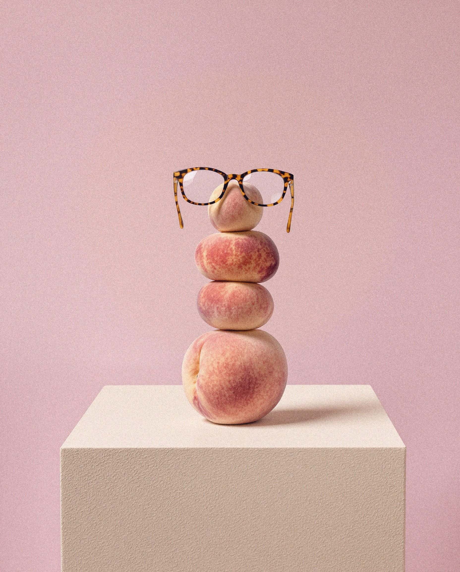
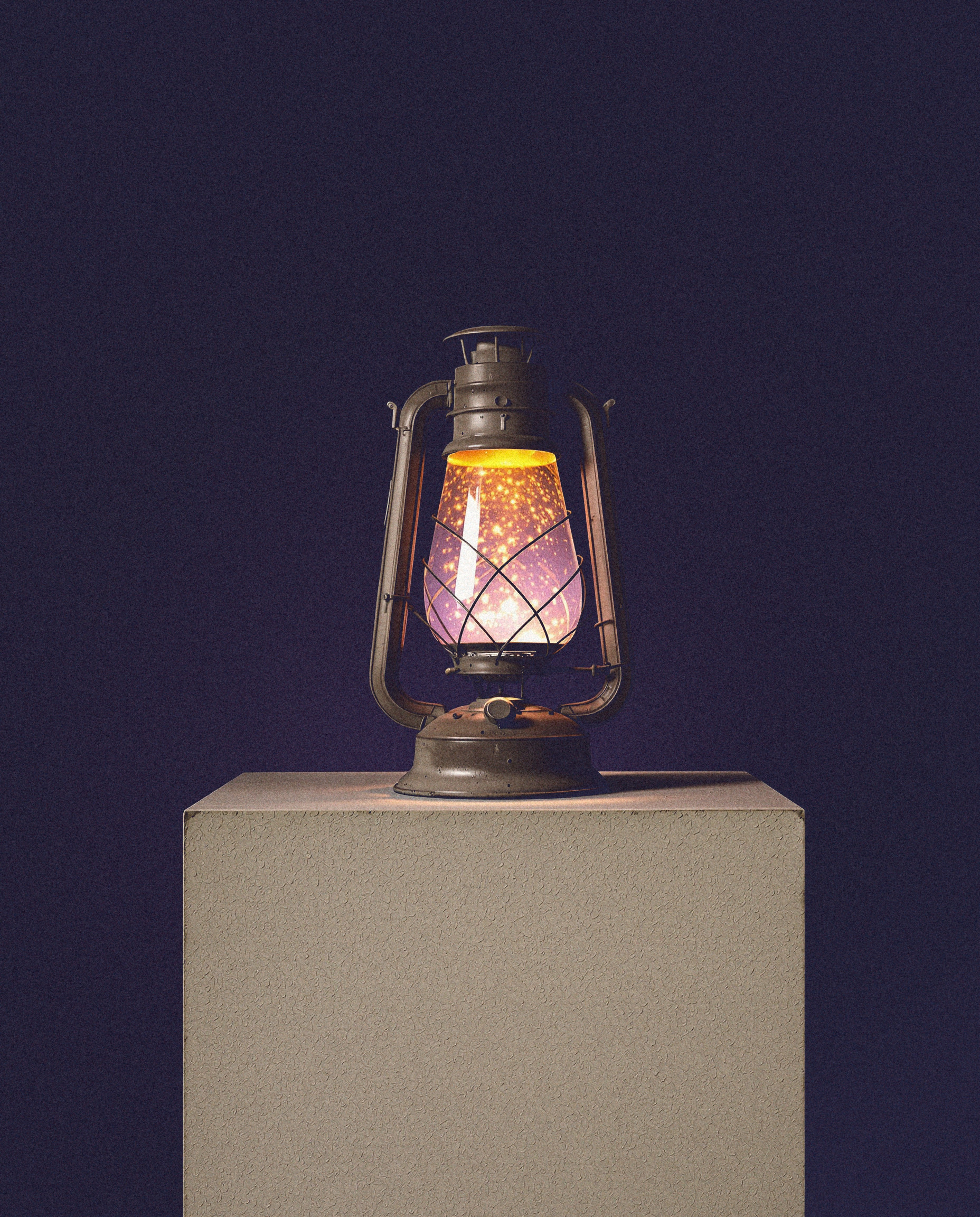
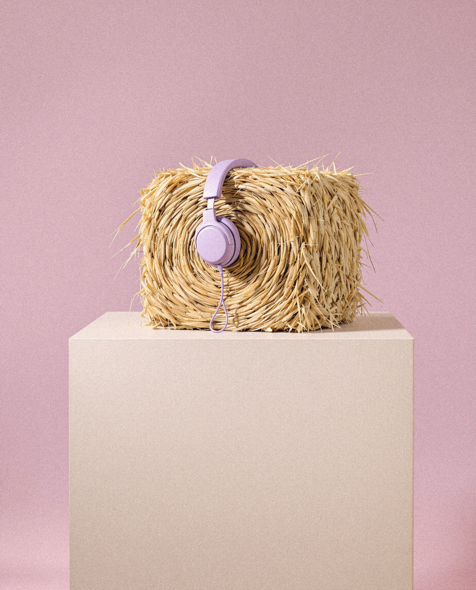
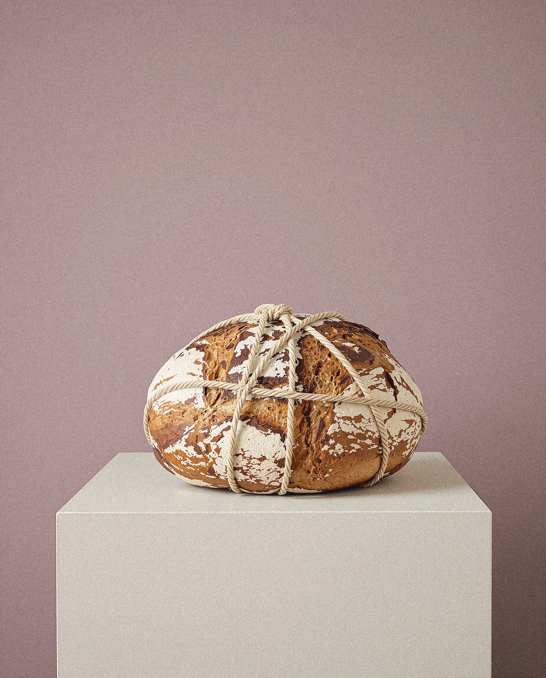
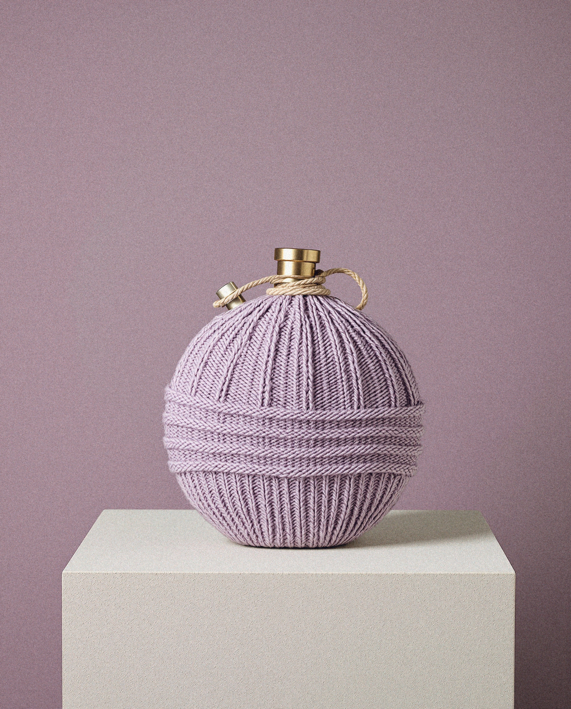
Still life
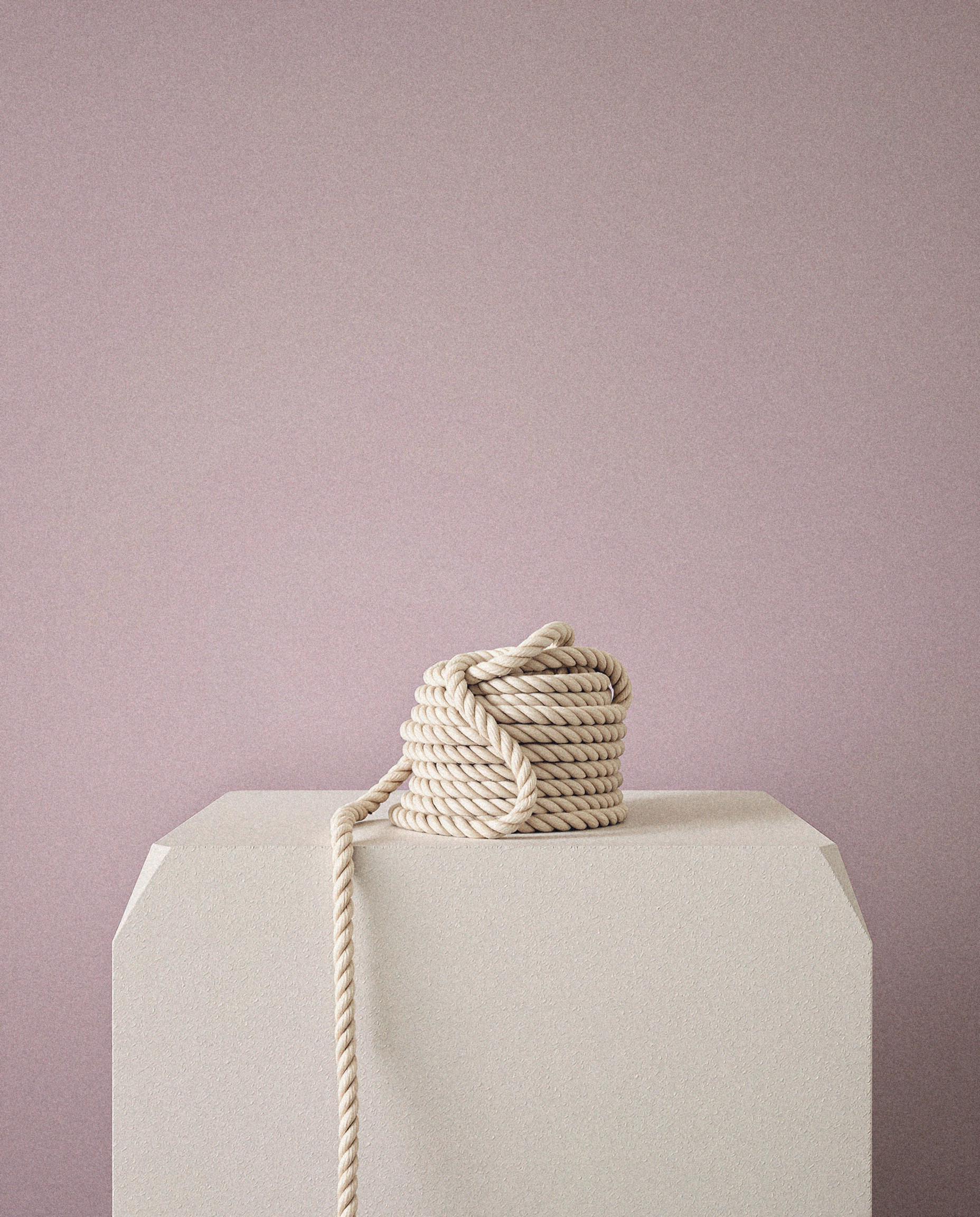
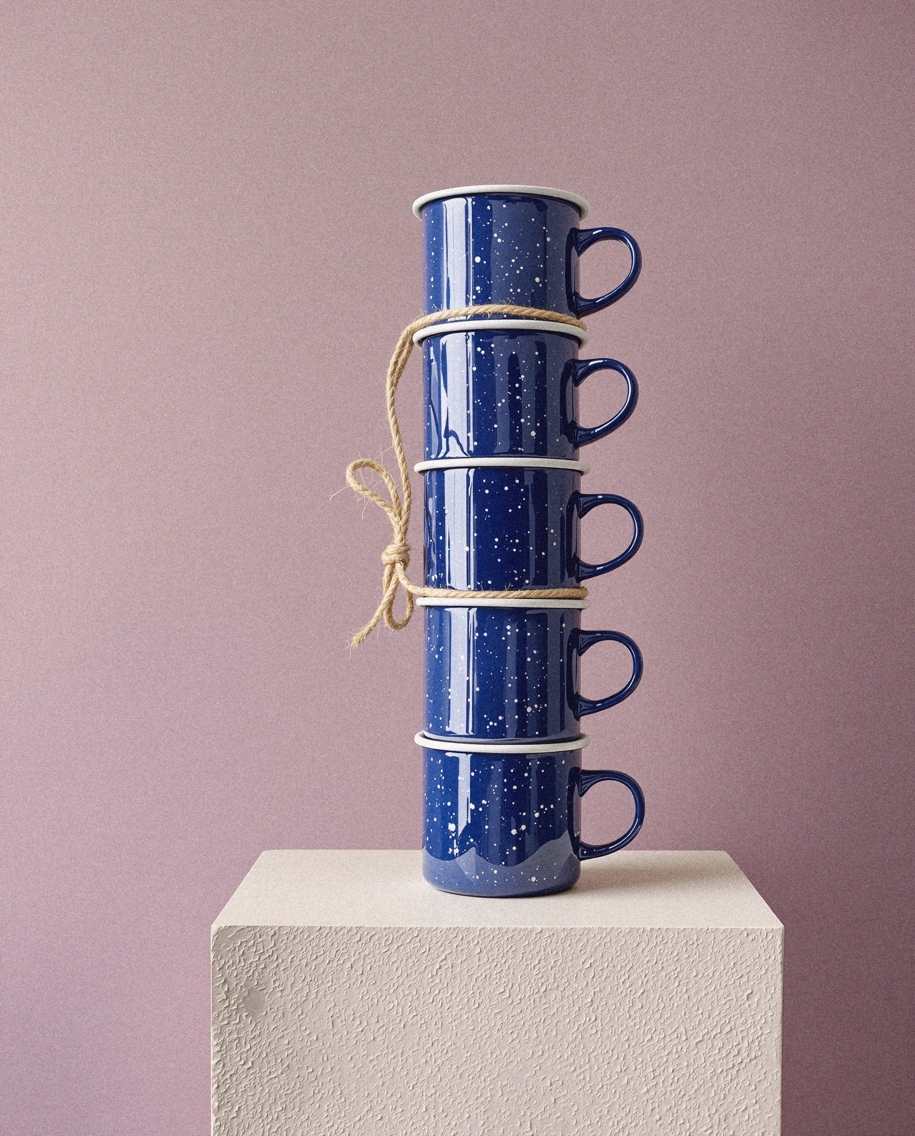
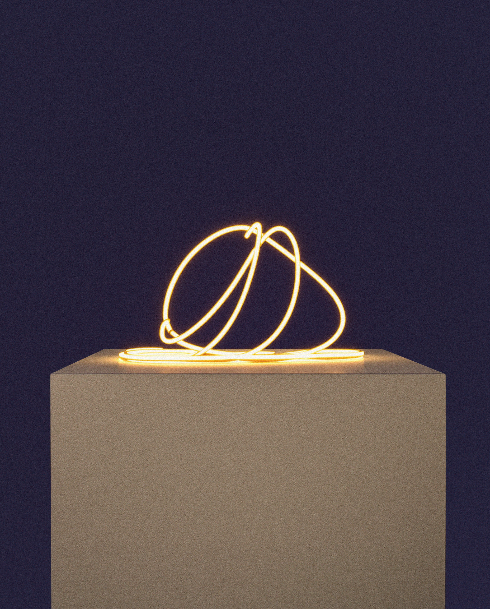
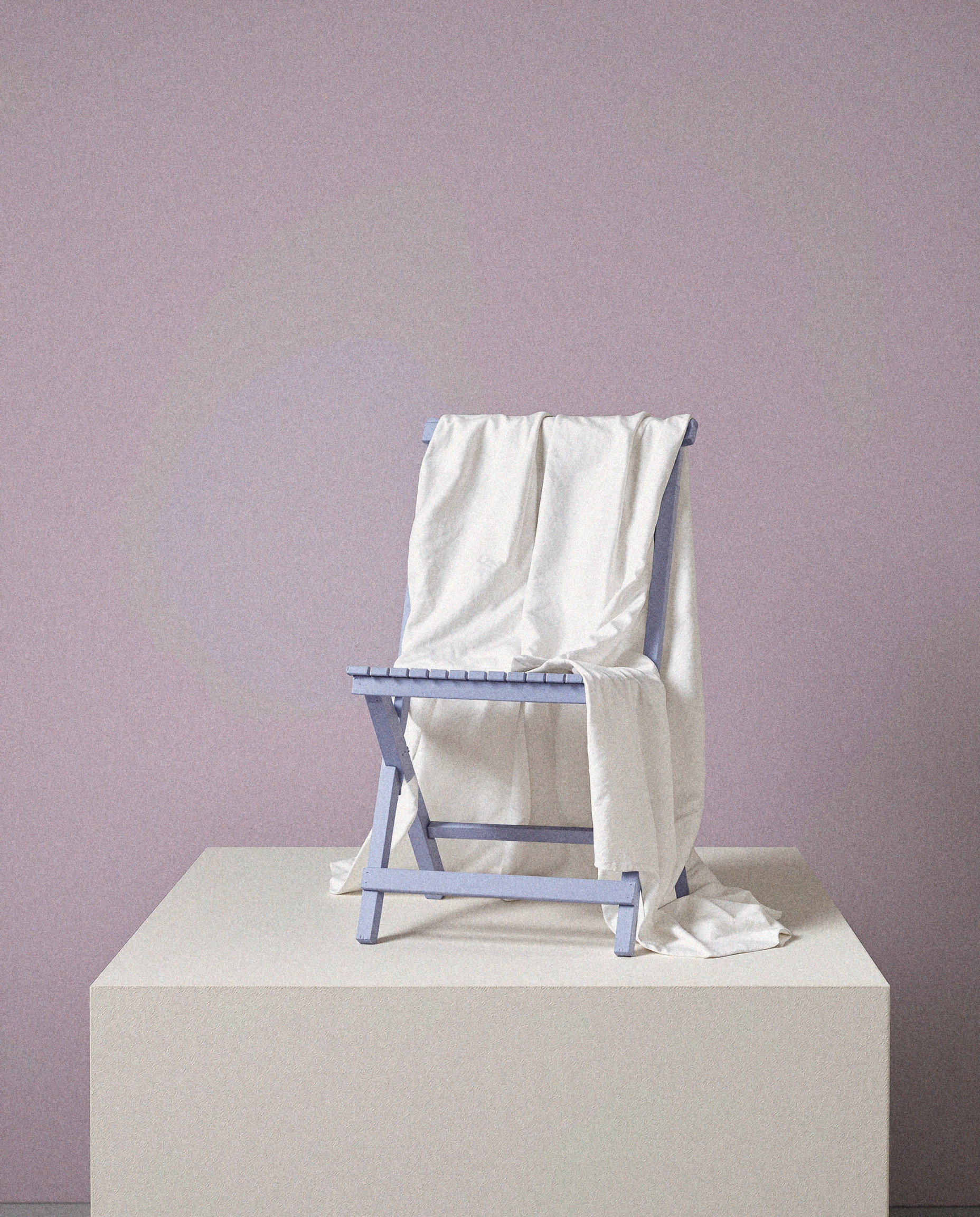
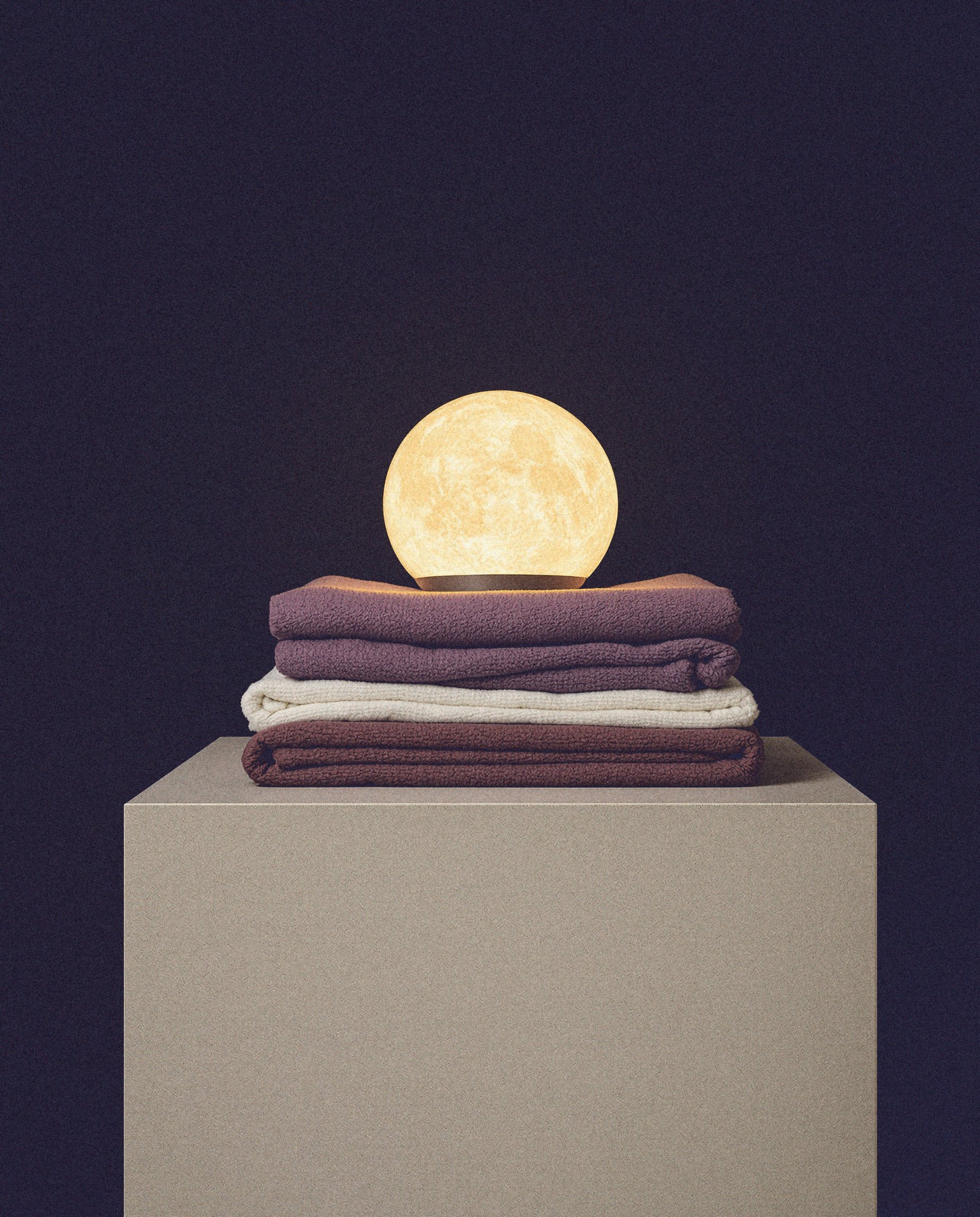
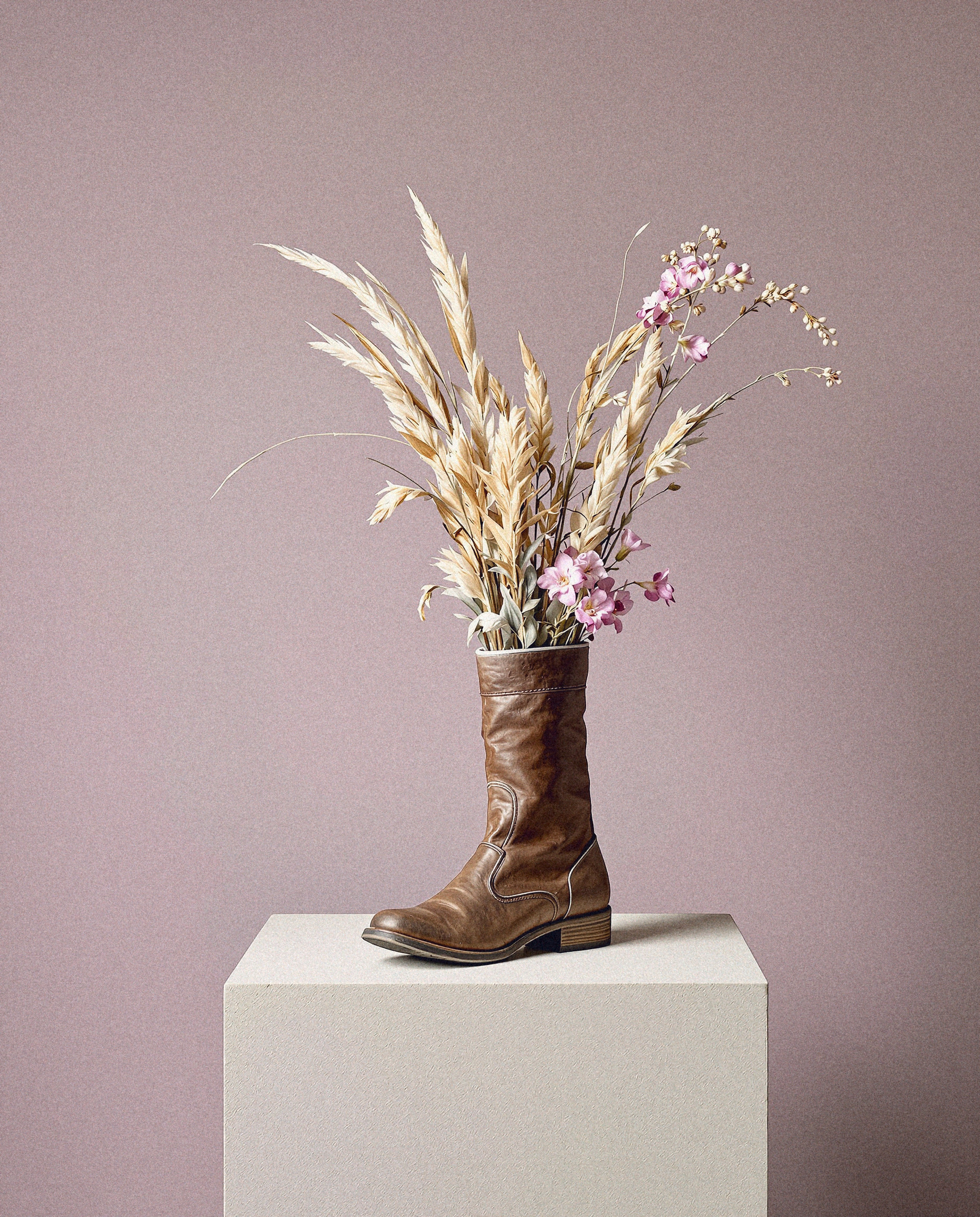
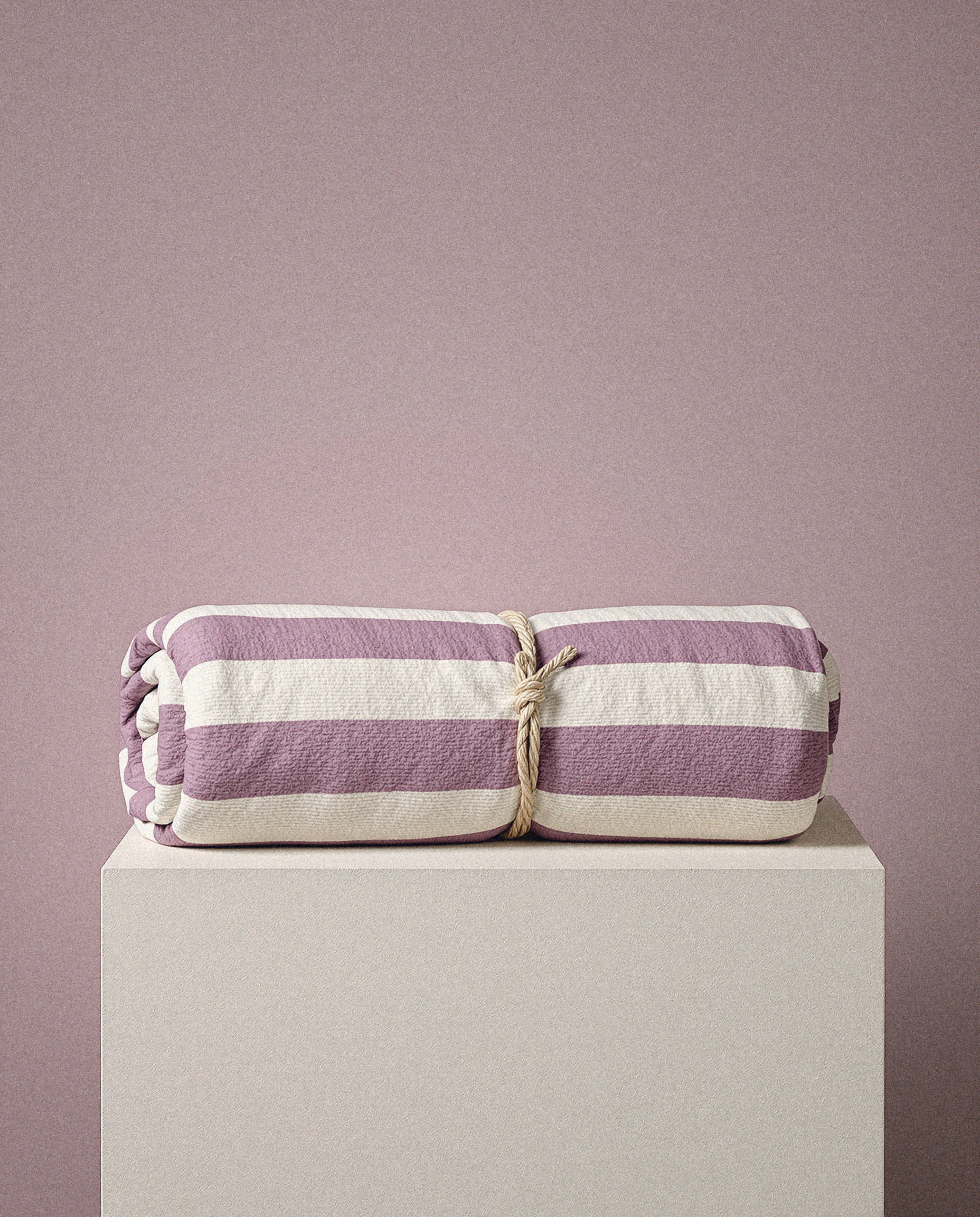
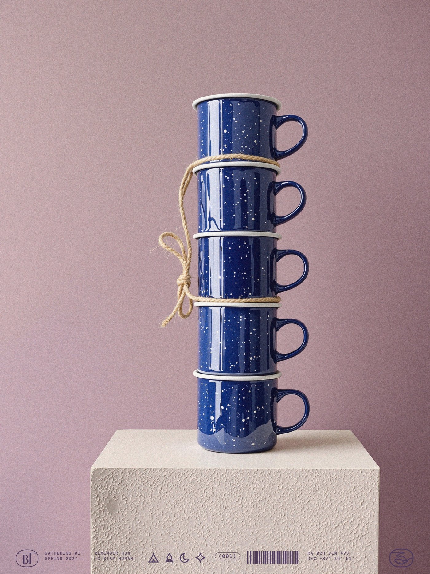
One object, one plinth, one line, one light, on the gathering's sky. Twelve frames by day and three after dark.
Direction frames, generated for this round; a real shoot rebuilds them with the same rules.
Better Together · Brand Guidelines
07 · Photography
Vol. 01 · October 2026
055
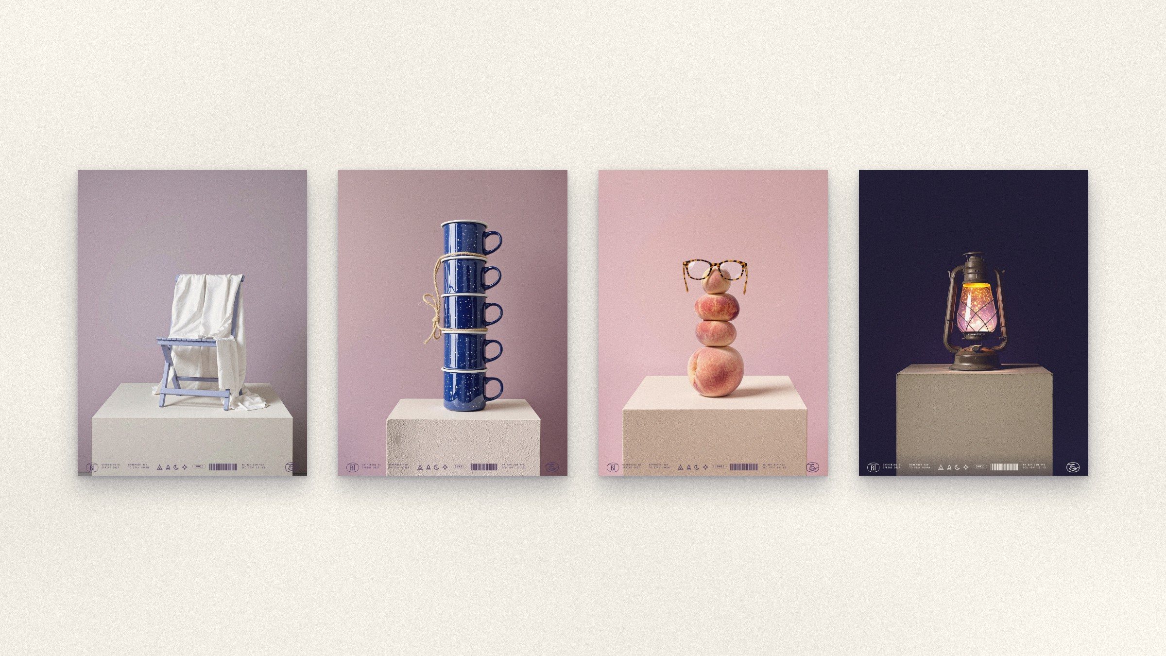
07.2 · Still lifes as posters, a band of micrographics along the foot
056
07.3
Together
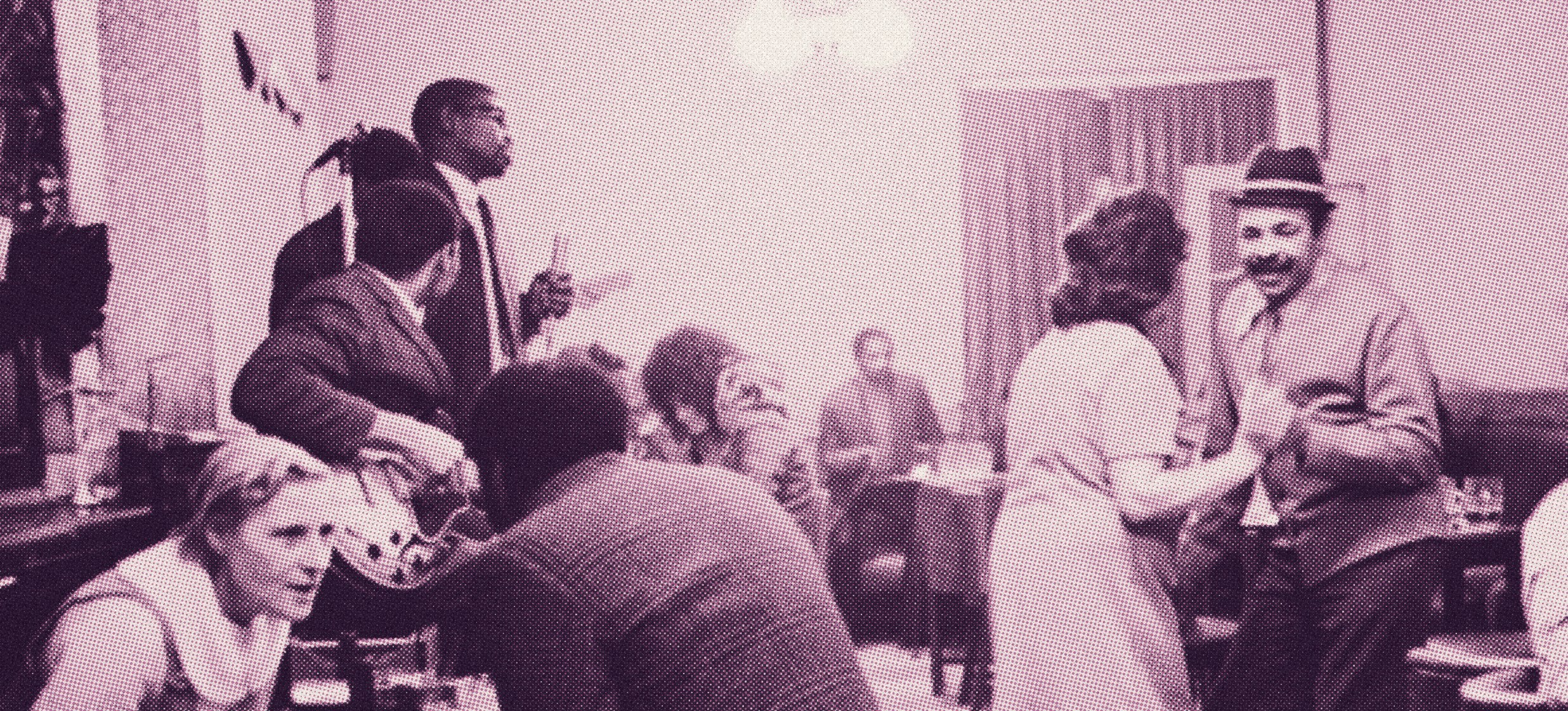

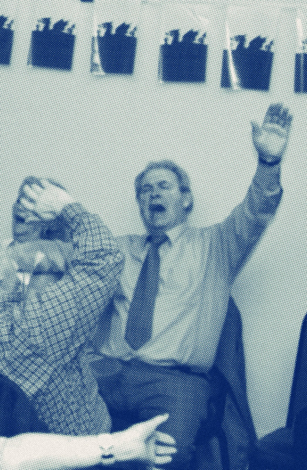
Riso · Night and Orchid · Plum and Rose Dust · Klein and Lagoon
Photographs: Martin Parr · direction, not licensed · treatments ours
Better Together · Brand Guidelines
07 · Photography
Vol. 01 · October 2026
057
07.4
People
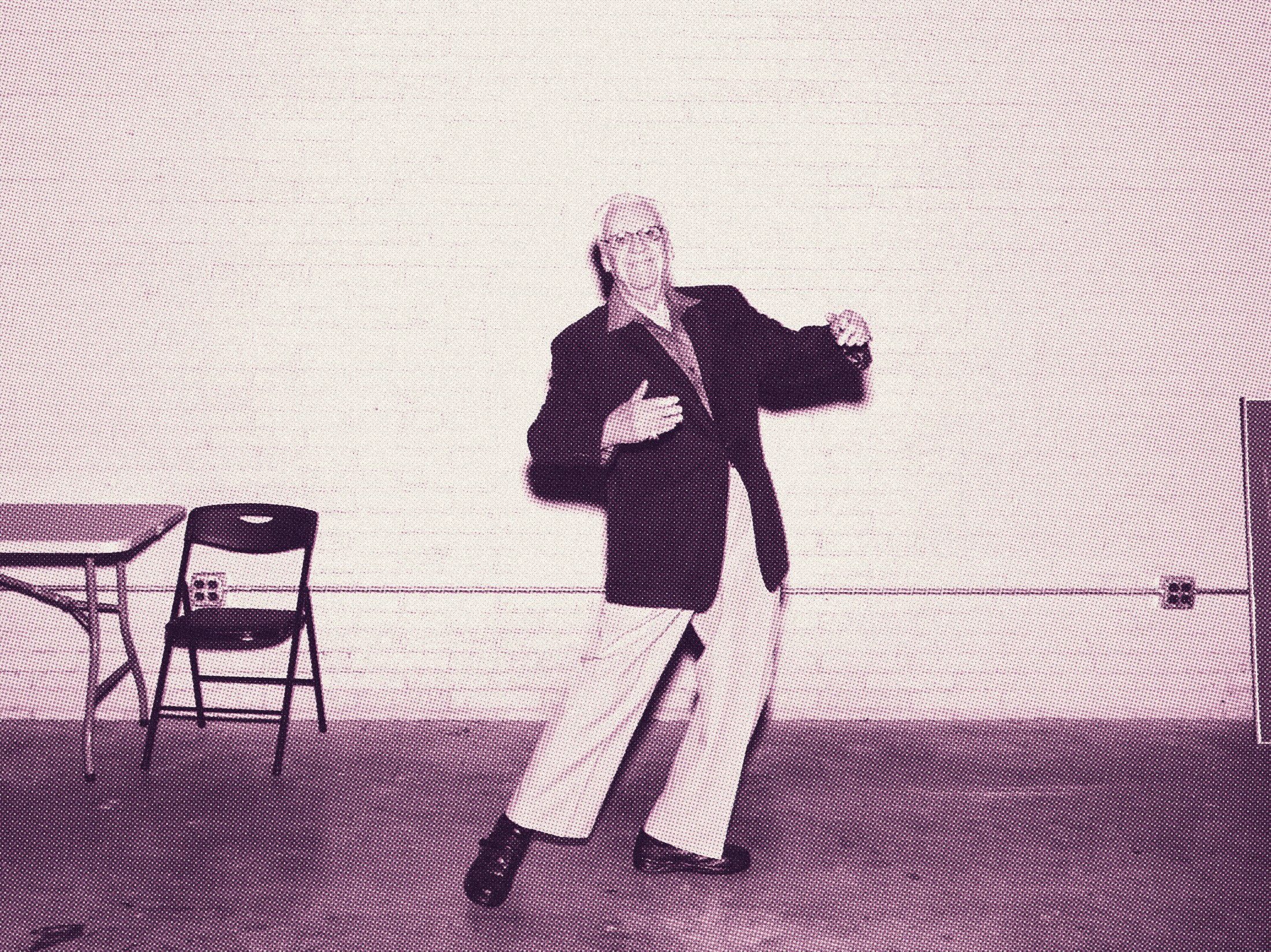
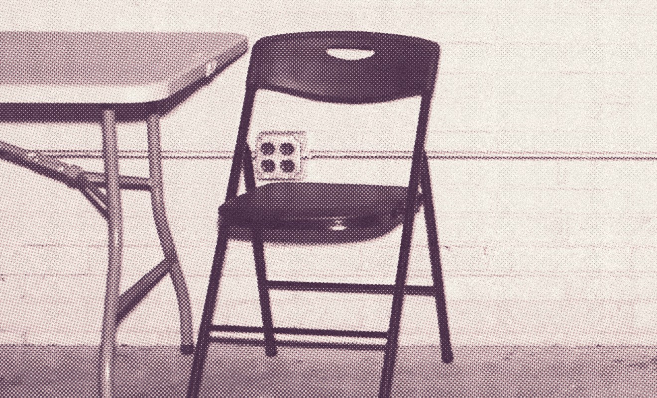
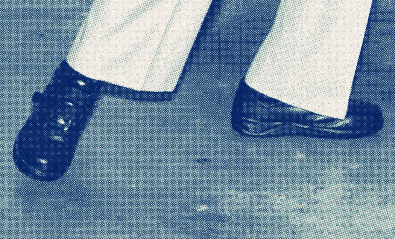
Editorial and unposed · one frame, three crops · Rooms for Creatives
Photograph: Alec Soth · direction, not licensed · treatments ours
Better Together · Brand Guidelines
07 · Photography
Vol. 01 · October 2026
058
07.5
Places, outdoors
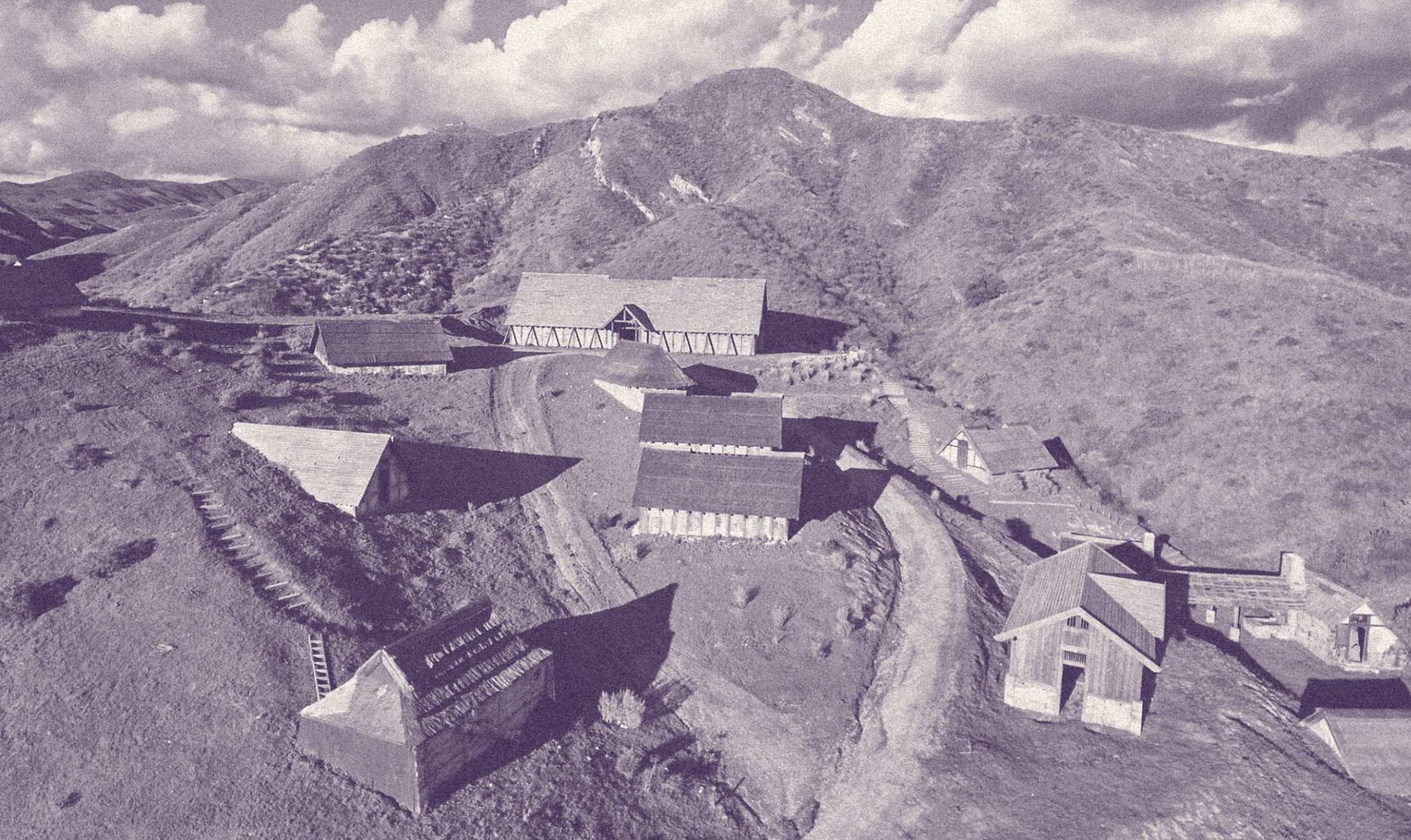
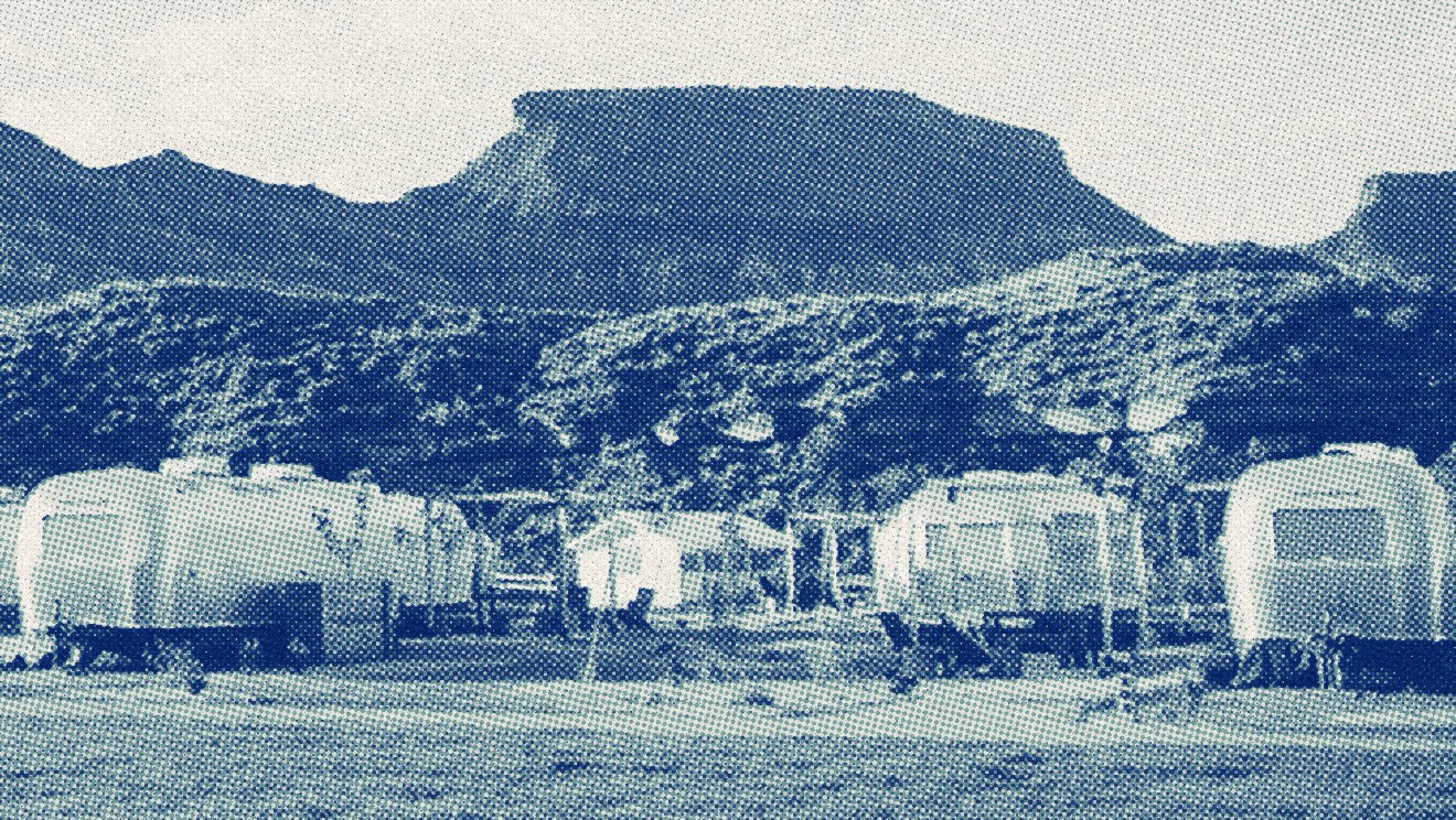
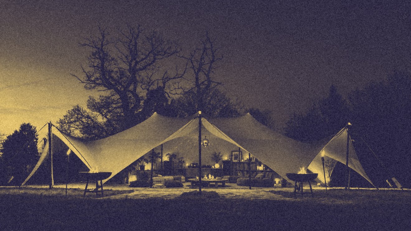
Duotone Plum to Milk · riso Klein and Lagoon · duotone Night to Gold
Steve's references · makers to confirm · direction only
Better Together · Brand Guidelines
07 · Photography
Vol. 01 · October 2026
059
07.6
Places, indoors
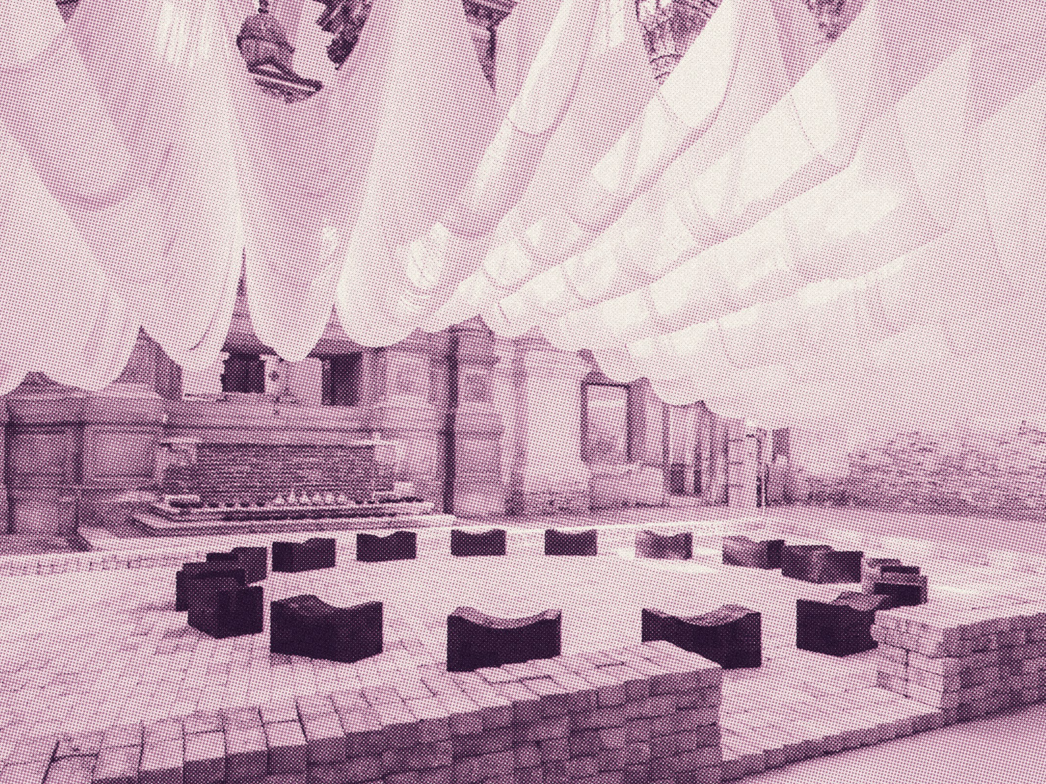
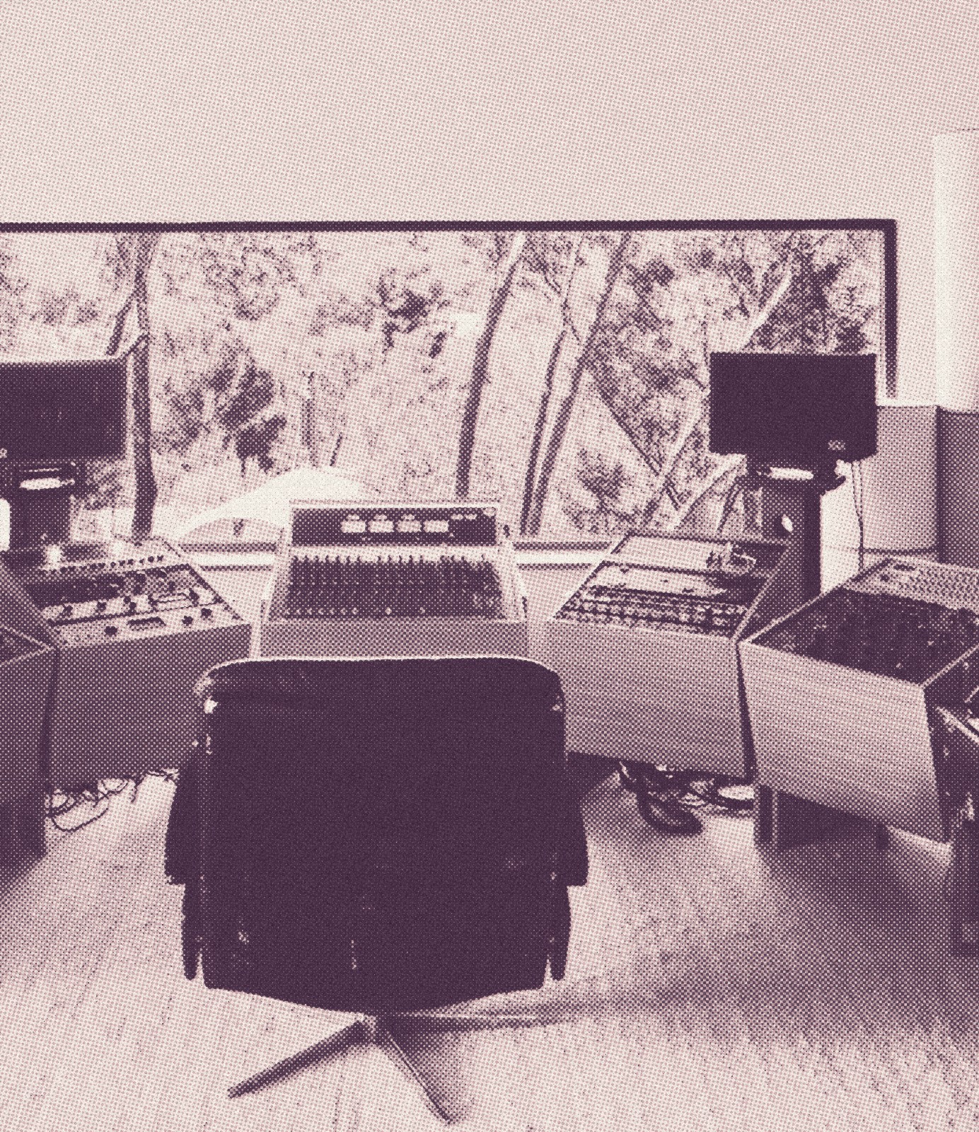
A circle of seats under the cloth · the chair facing the window
Steve's references · makers to confirm · direction only
Better Together · Brand Guidelines
07 · Photography
Vol. 01 · October 2026
060
07.7
Treatments
People and places never run in full colour. One treatment per spread, grain on everything, matched to the skies; the still lifes carry the colour.
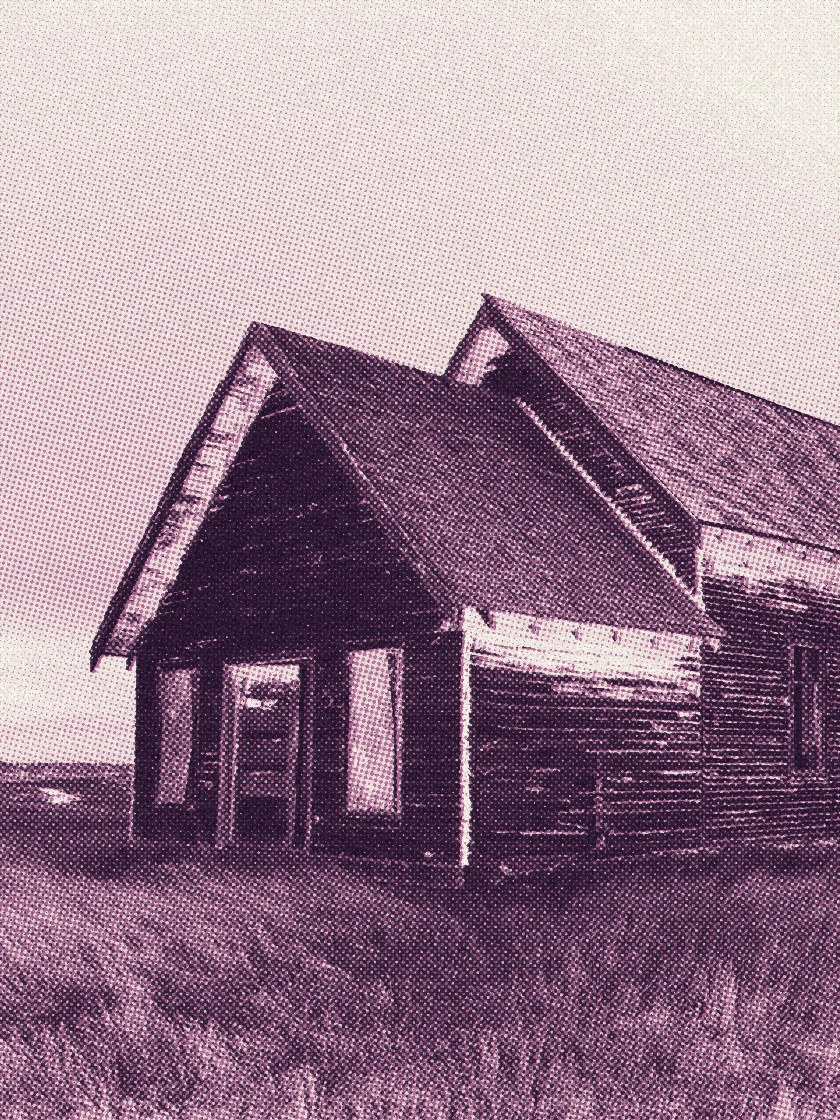
Riso · Night and Orchid
Two inks in halftone: the dark ink holds the shadows, the colour ink the midtones.
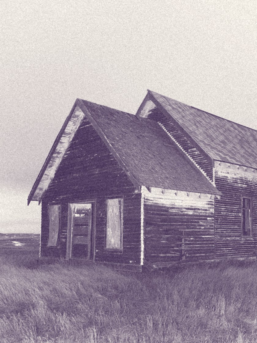
Duotone · Plum to Milk
For land, daylight and the long table.
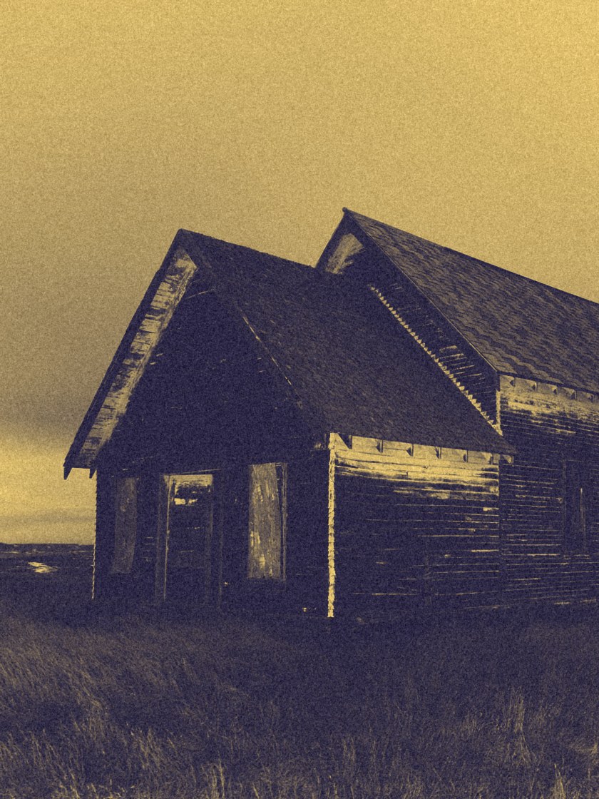
Duotone · Night to Gold
Night everywhere, Gold only where there is light.
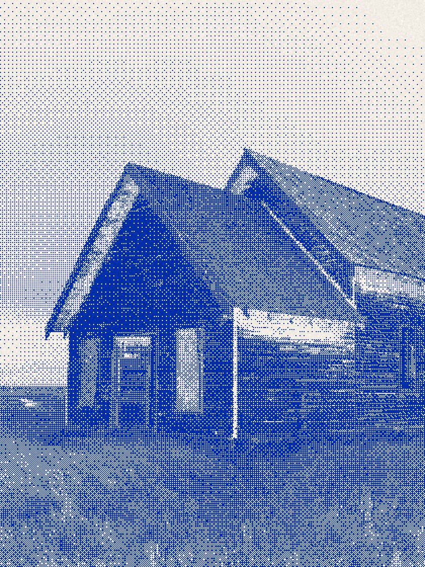
Dither · Klein on Milk
One ink, for screens, stickers and the smallest print.
Better Together · Brand Guidelines
07 · Photography
Vol. 01 · October 2026
061

In the world
Where the name goes to work.
063 Neon
064 Deboss
065 The room at night
066 Posters on a wall
067 Website
068 Three homepages
069 The scroll
070 Mobile
071 The ticket
072 Lights on
073 The van
074 The motel
075 Billboard
076 Label and hang tag
077 The invitation
078 The passport
079 The lid
080 The stack
081 The provisions sack
082 The station
083 The tees
084 The prints
085 The supper room
086 At a glance
Better Together · Brand Guidelines
062
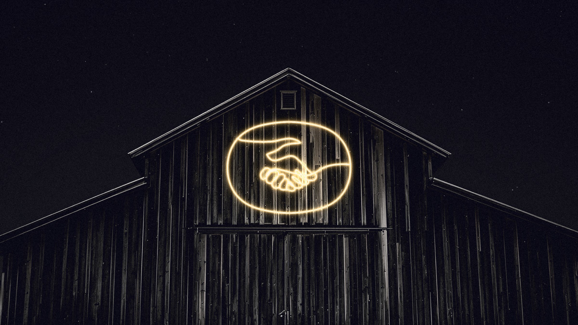
08.1 · The mark held still while the world changes: neon
063
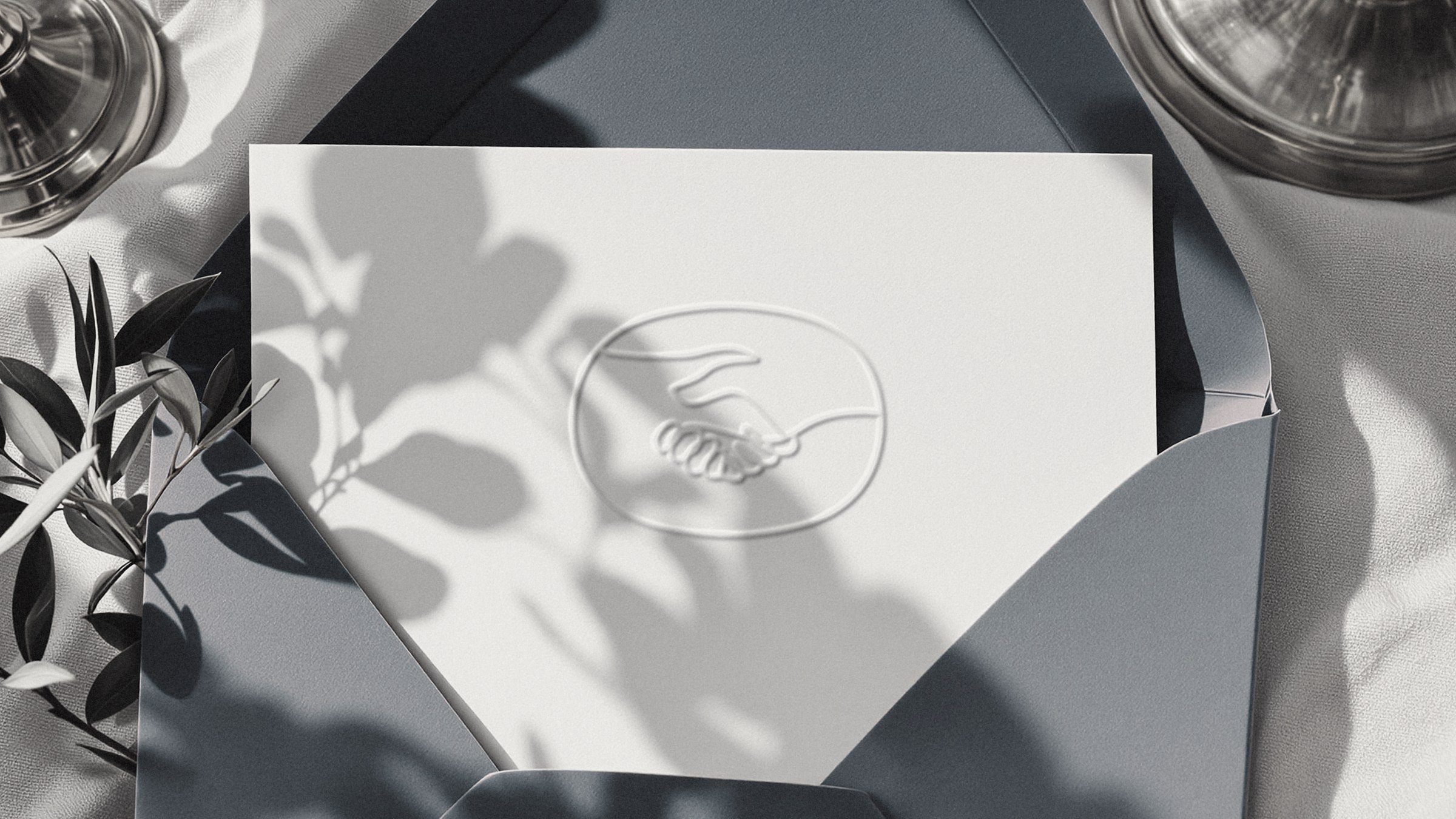
08.2 · Deboss
064
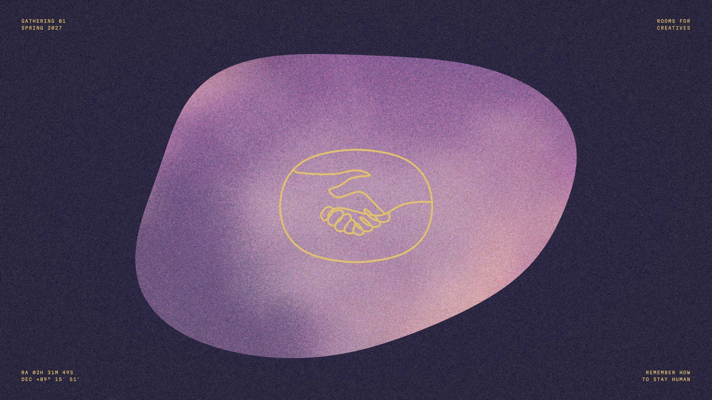
08.3 · The room at night
065
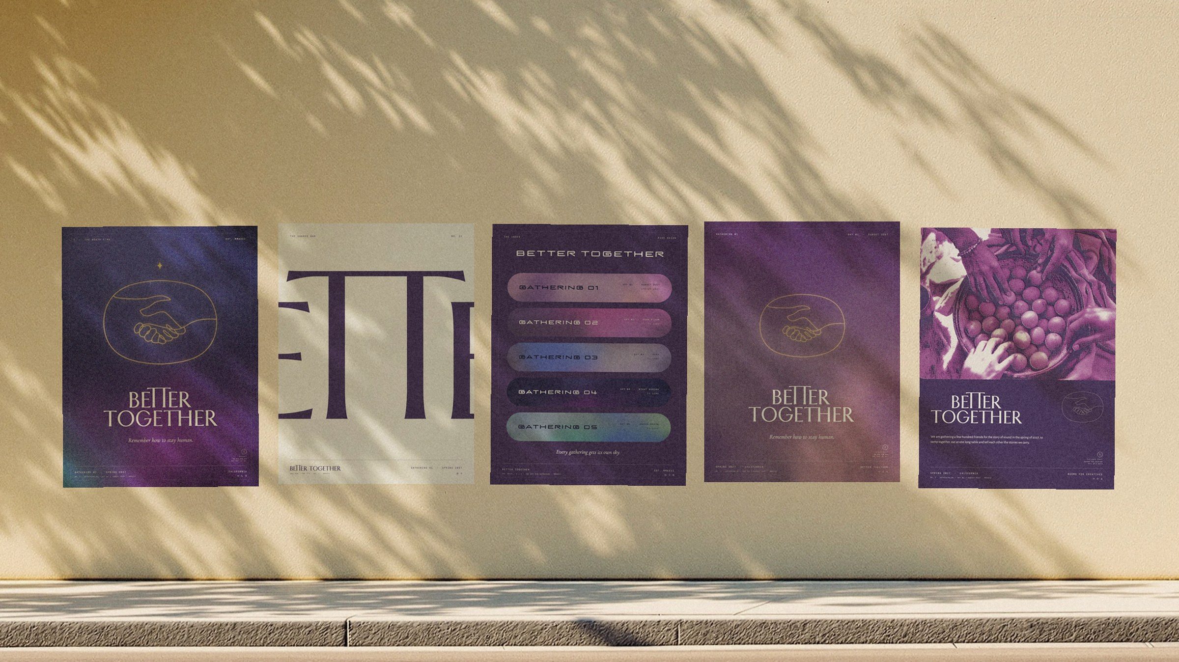
08.4 · Posters on a wall
066
bettertogether.xyz
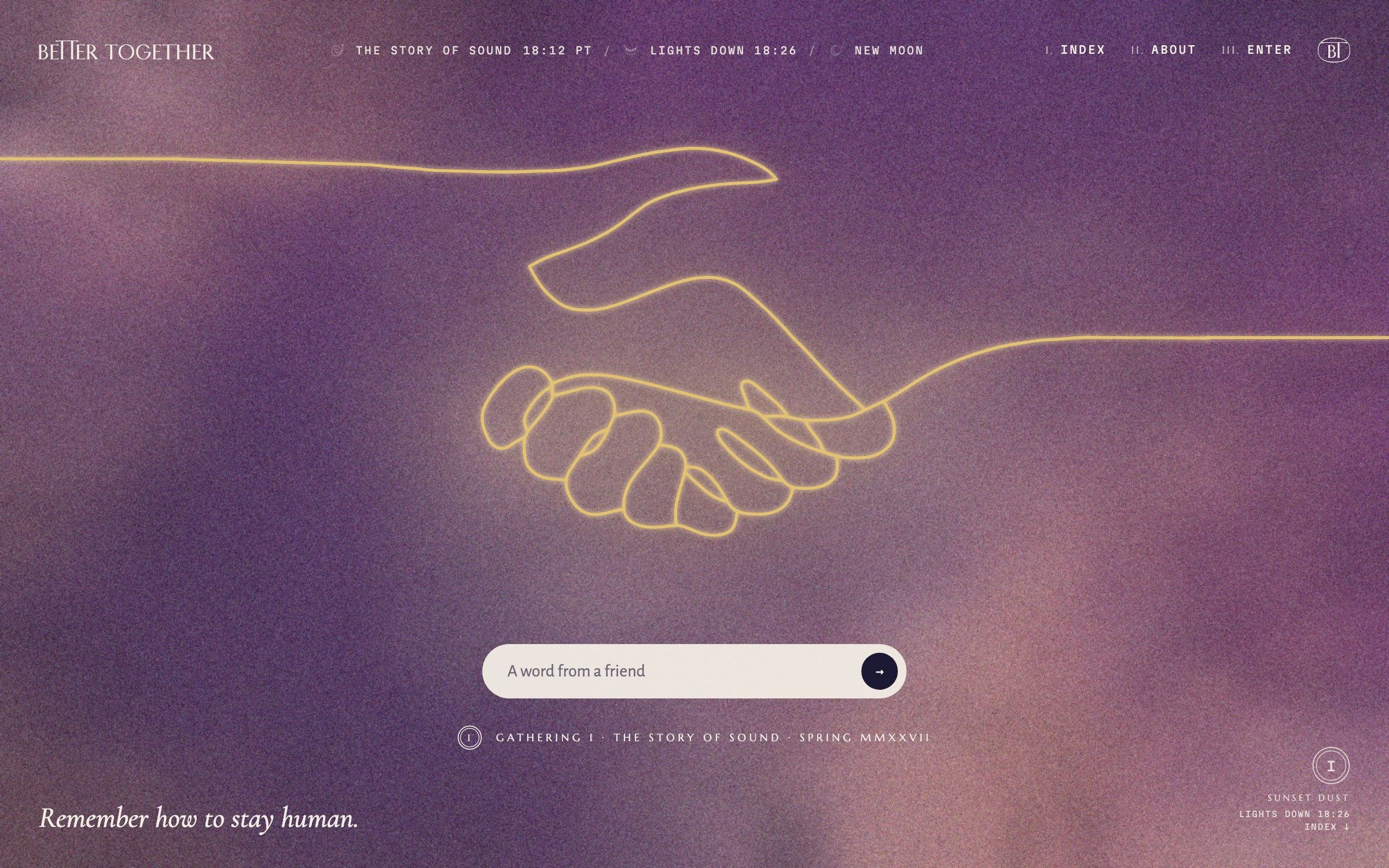
08.5 · The site after sunset
067
08.6
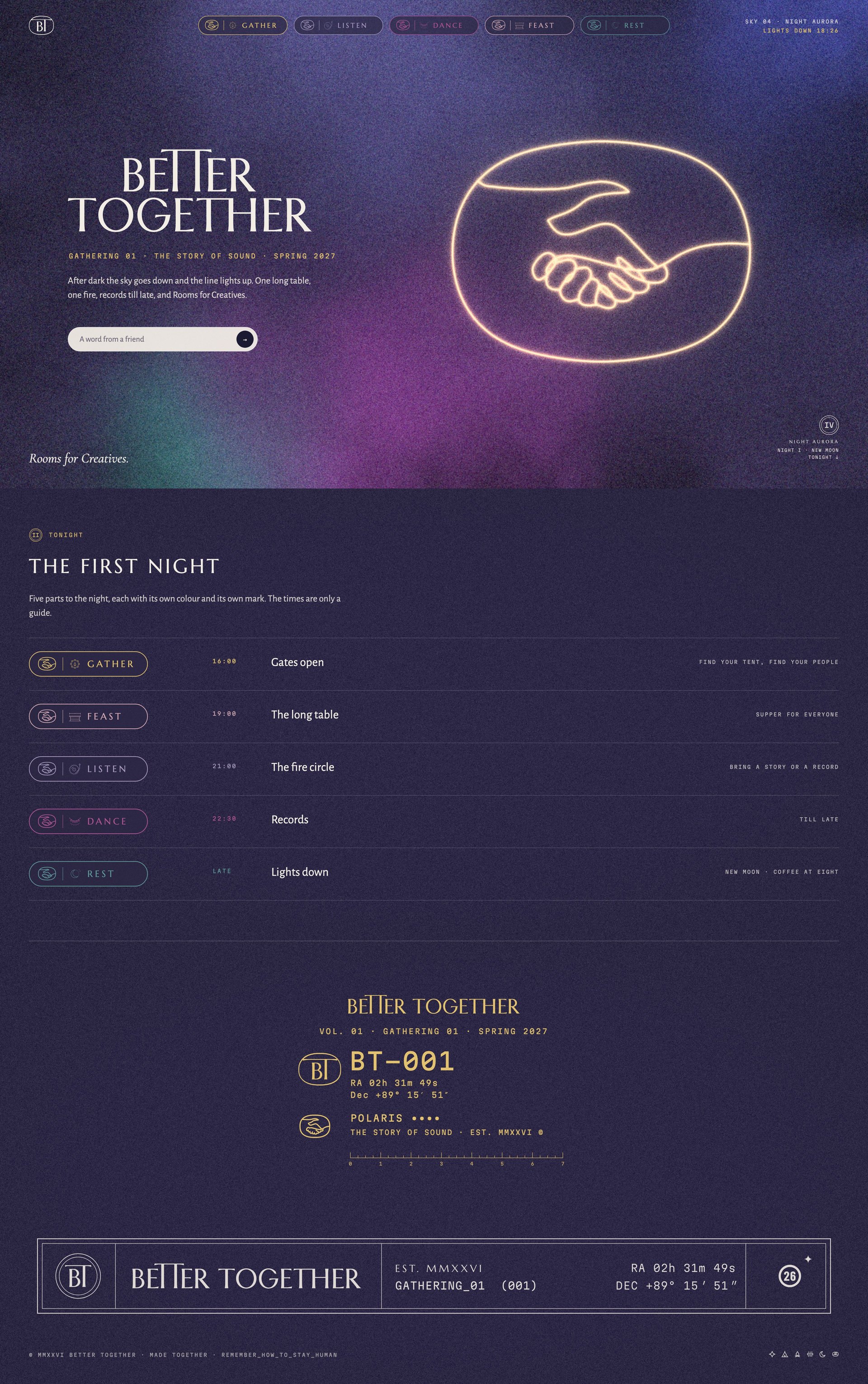
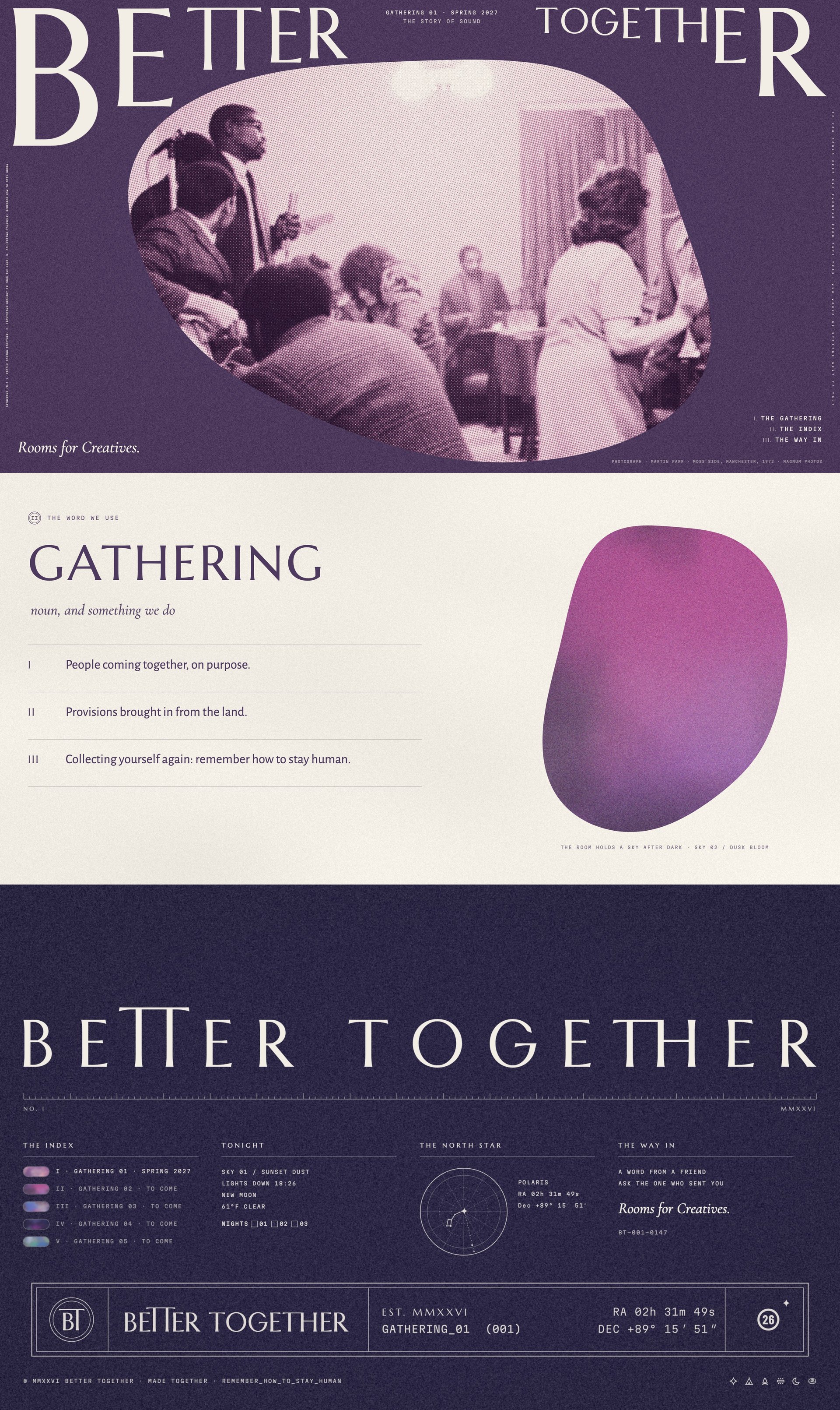
Three homepages
The same system three ways: by day on Sunset Dust, after dark on Night Aurora, and as the room on a Plum flood.
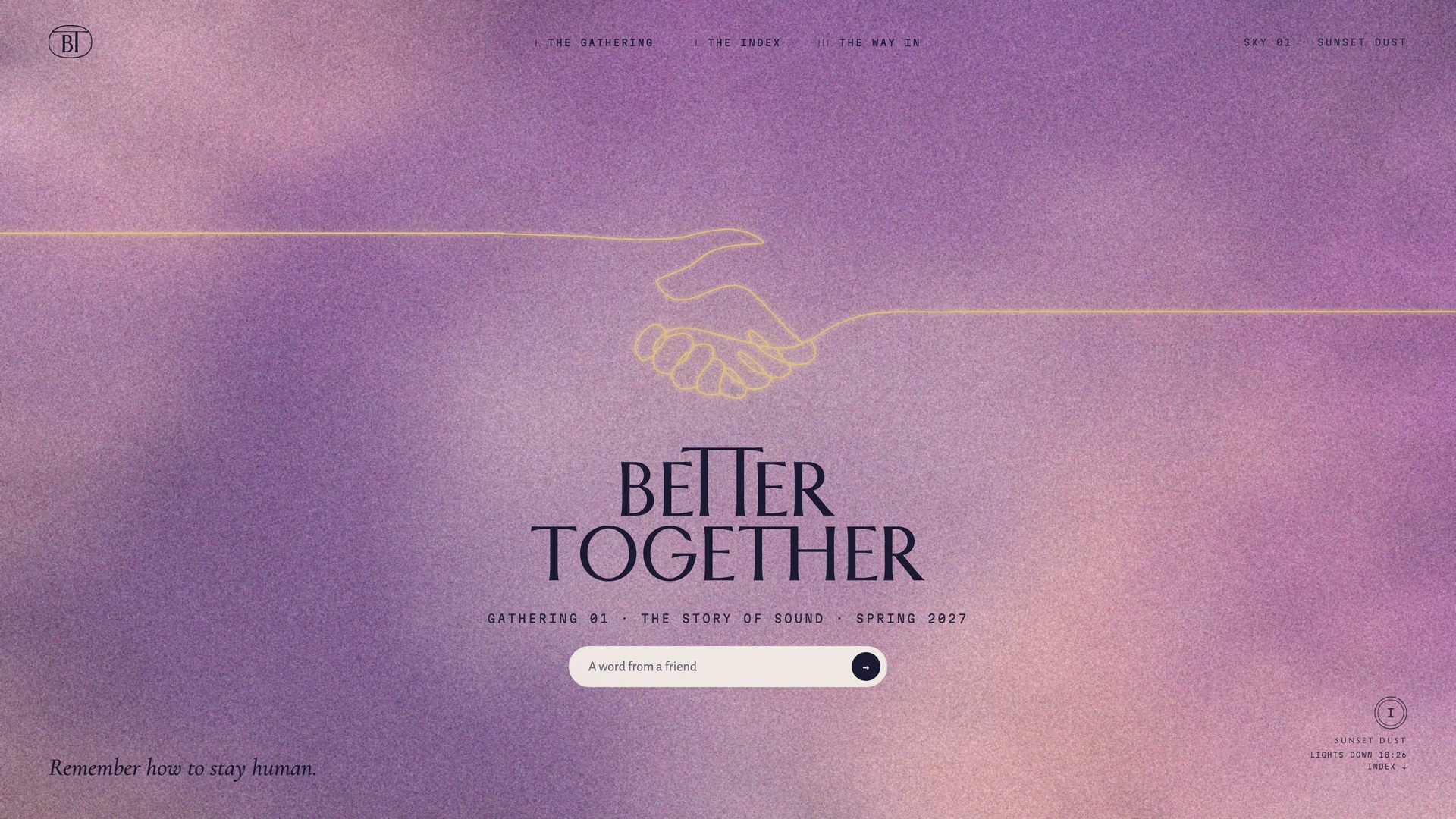
A · Day
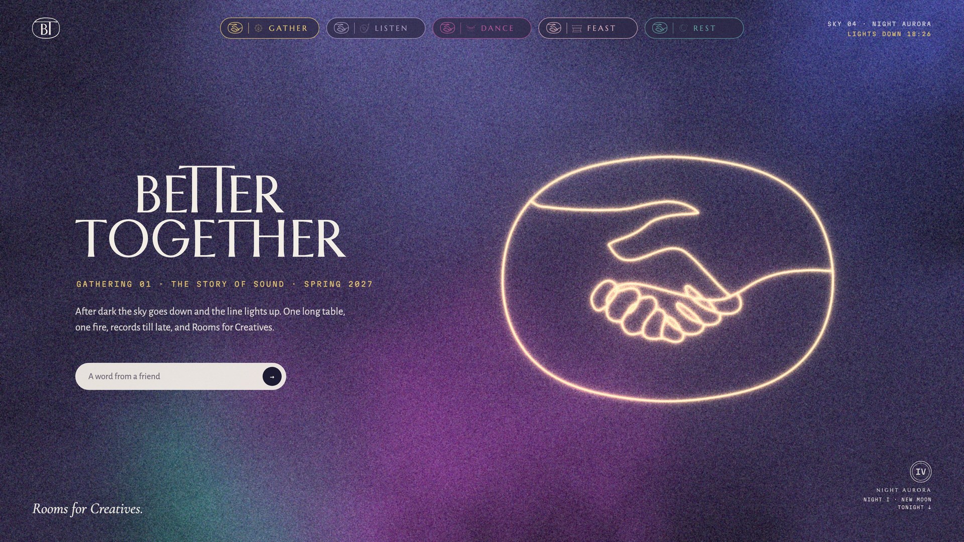
B · After dark
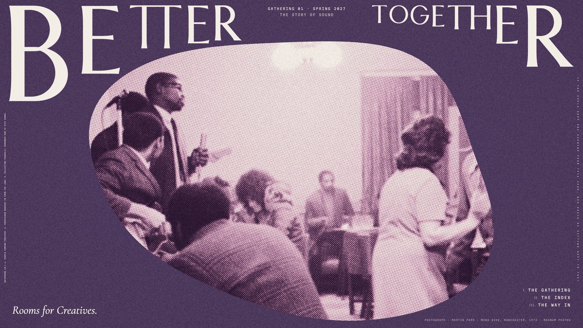
C · The room
Better Together · Brand Guidelines
08 · In the world
Vol. 01 · October 2026
068
08.7
The scroll
Below the fold, each home runs the same system: the index of skies, the first night hour by hour, the word we use, and a footer that carries the spec plate.
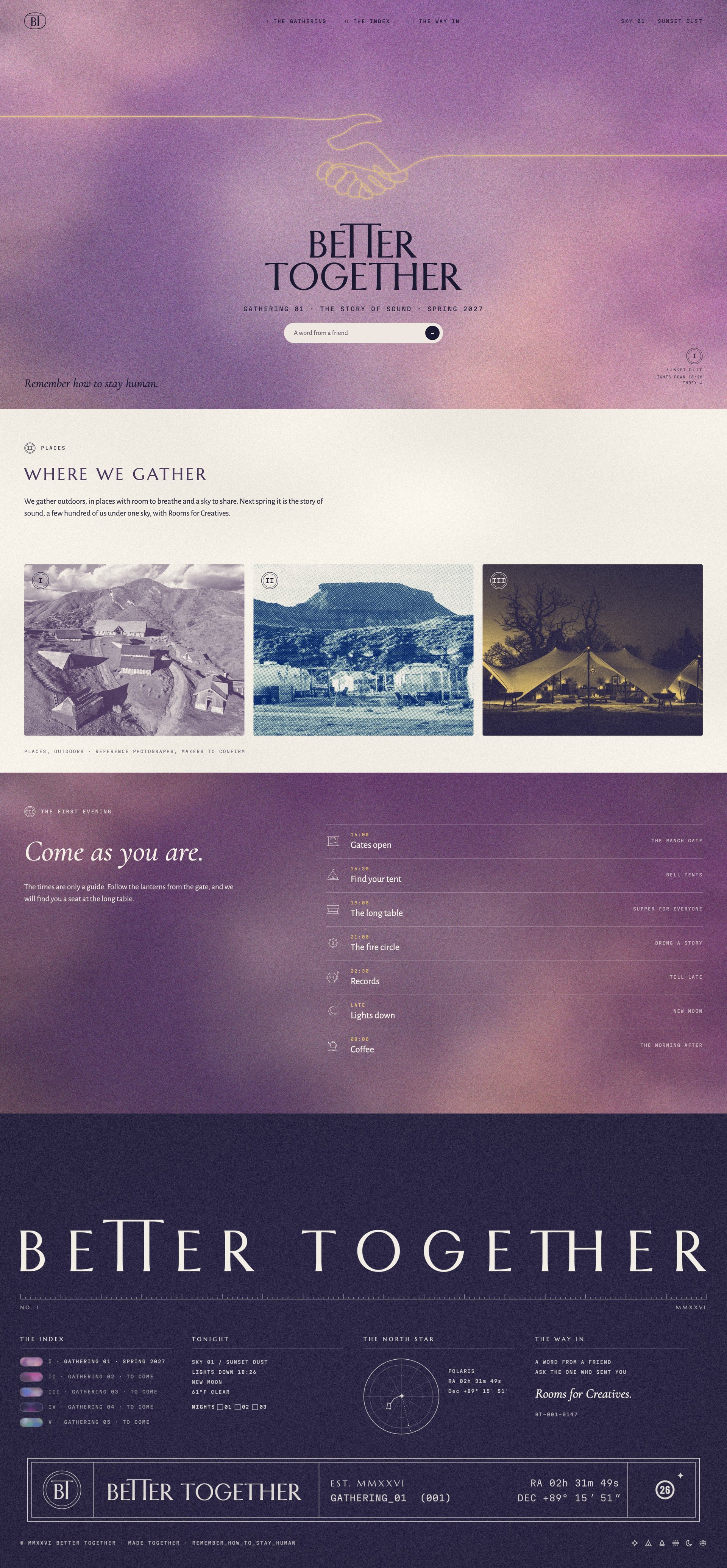
A · Day
B · After dark
C · The room
Better Together · Brand Guidelines
08 · In the world
Vol. 01 · October 2026
069
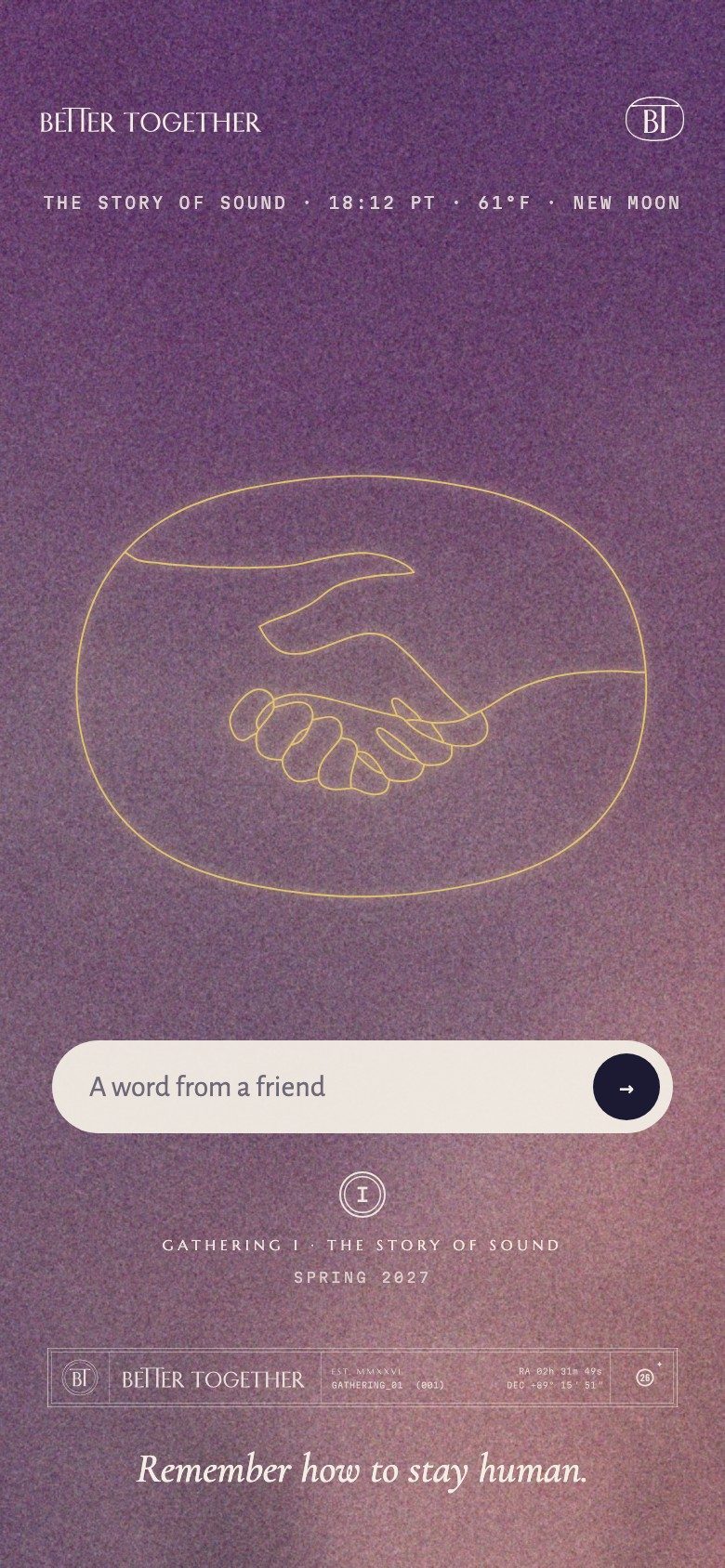
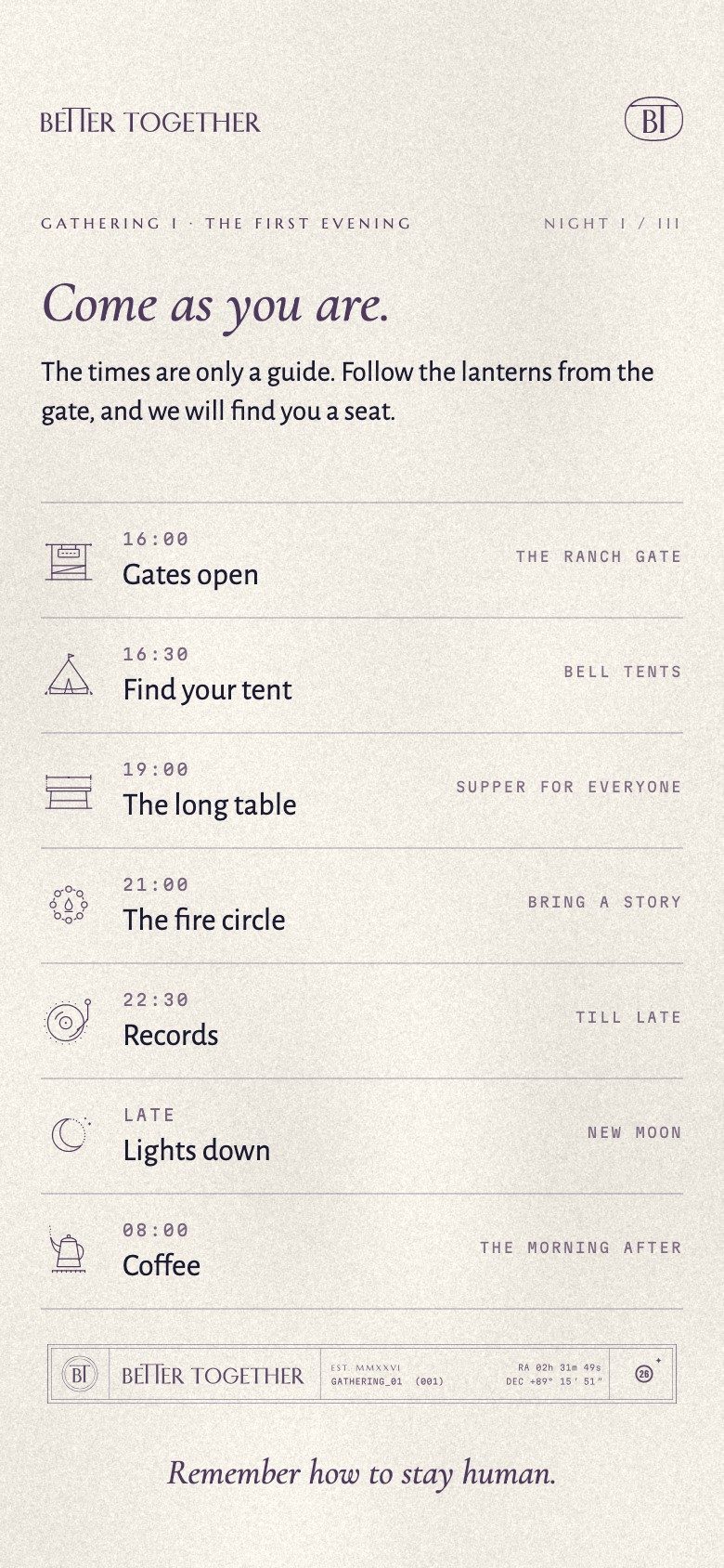
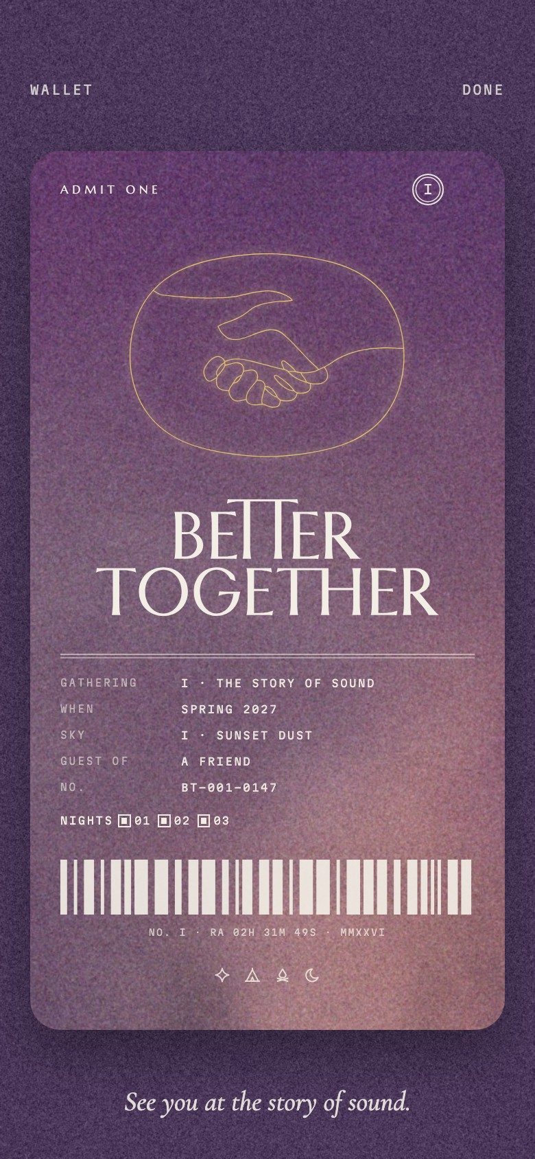
08.8 · Mobile: home, the evening hour by hour, the guest pass
070
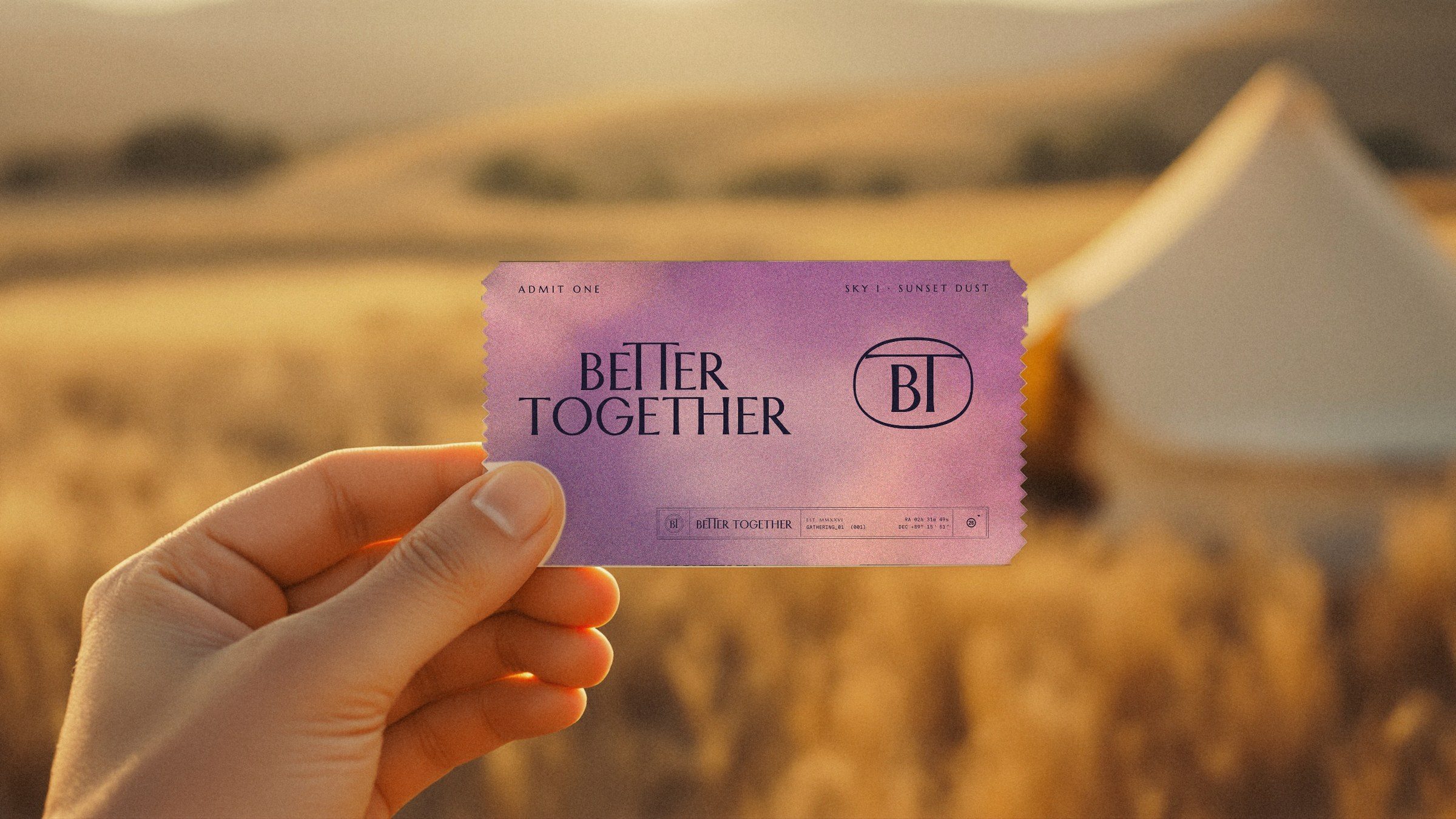
08.9 · The ticket at golden hour
071
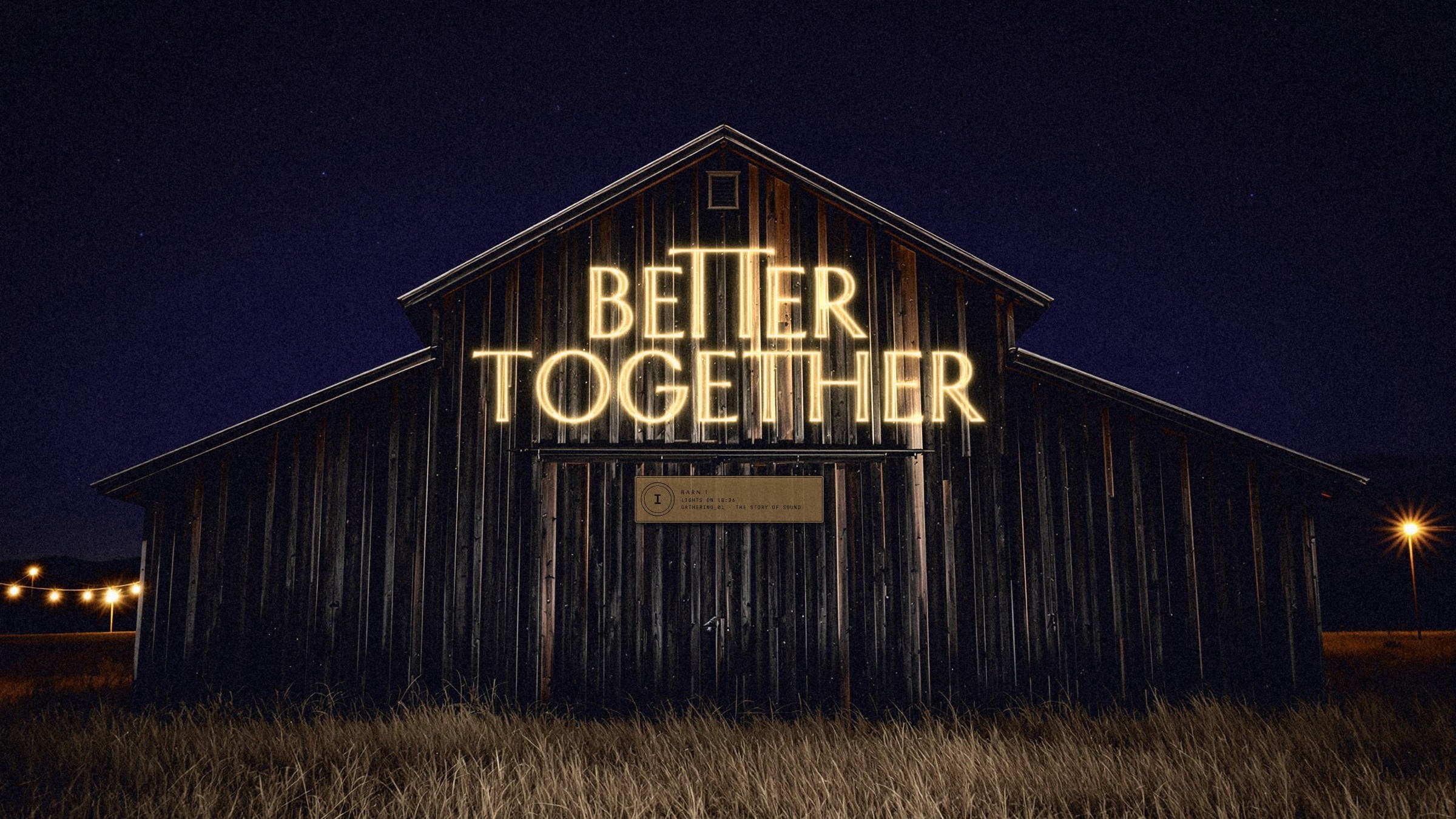
08.10 · Lights on: the stacked name in neon
072
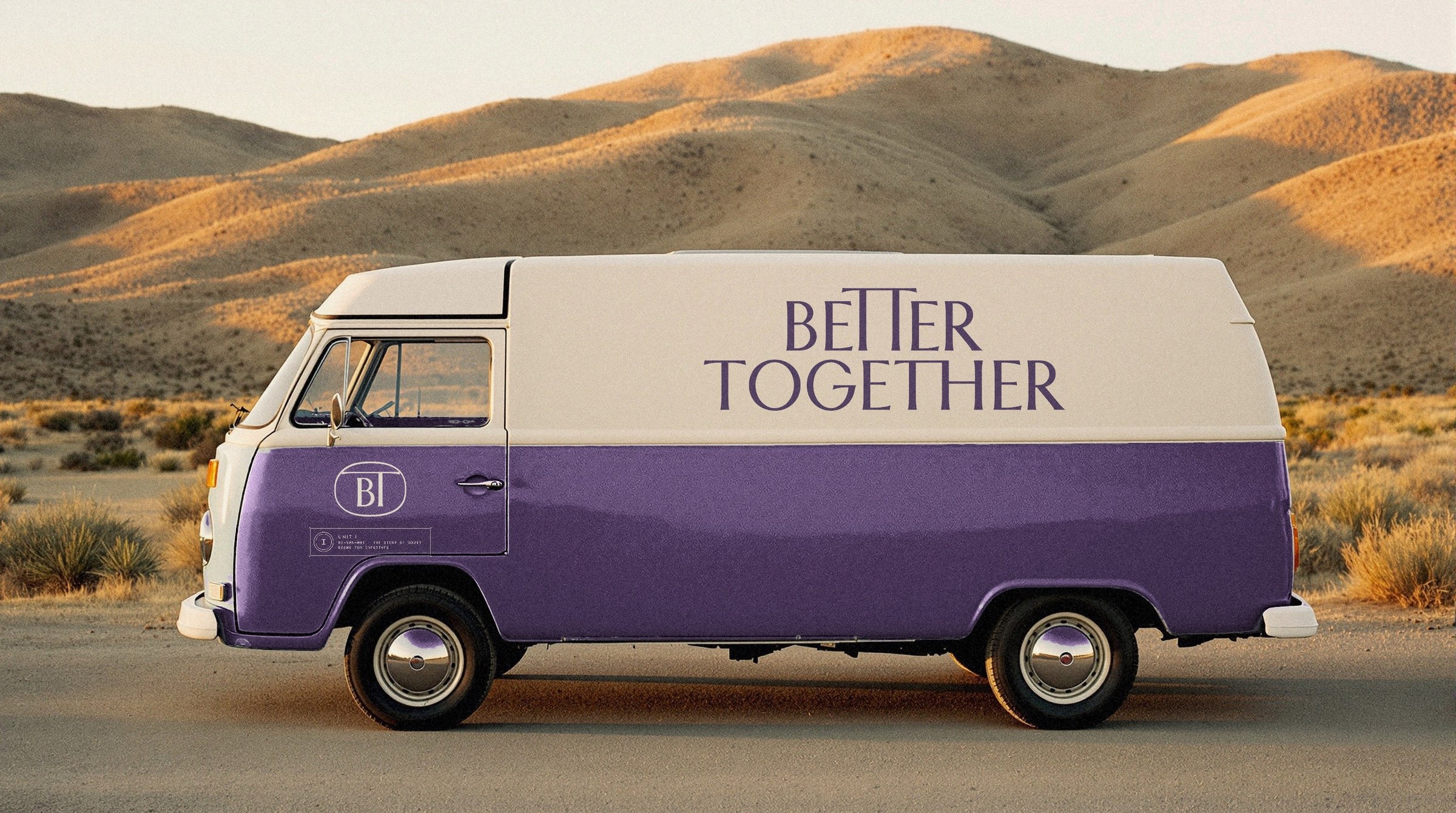
08.11 · The van
073
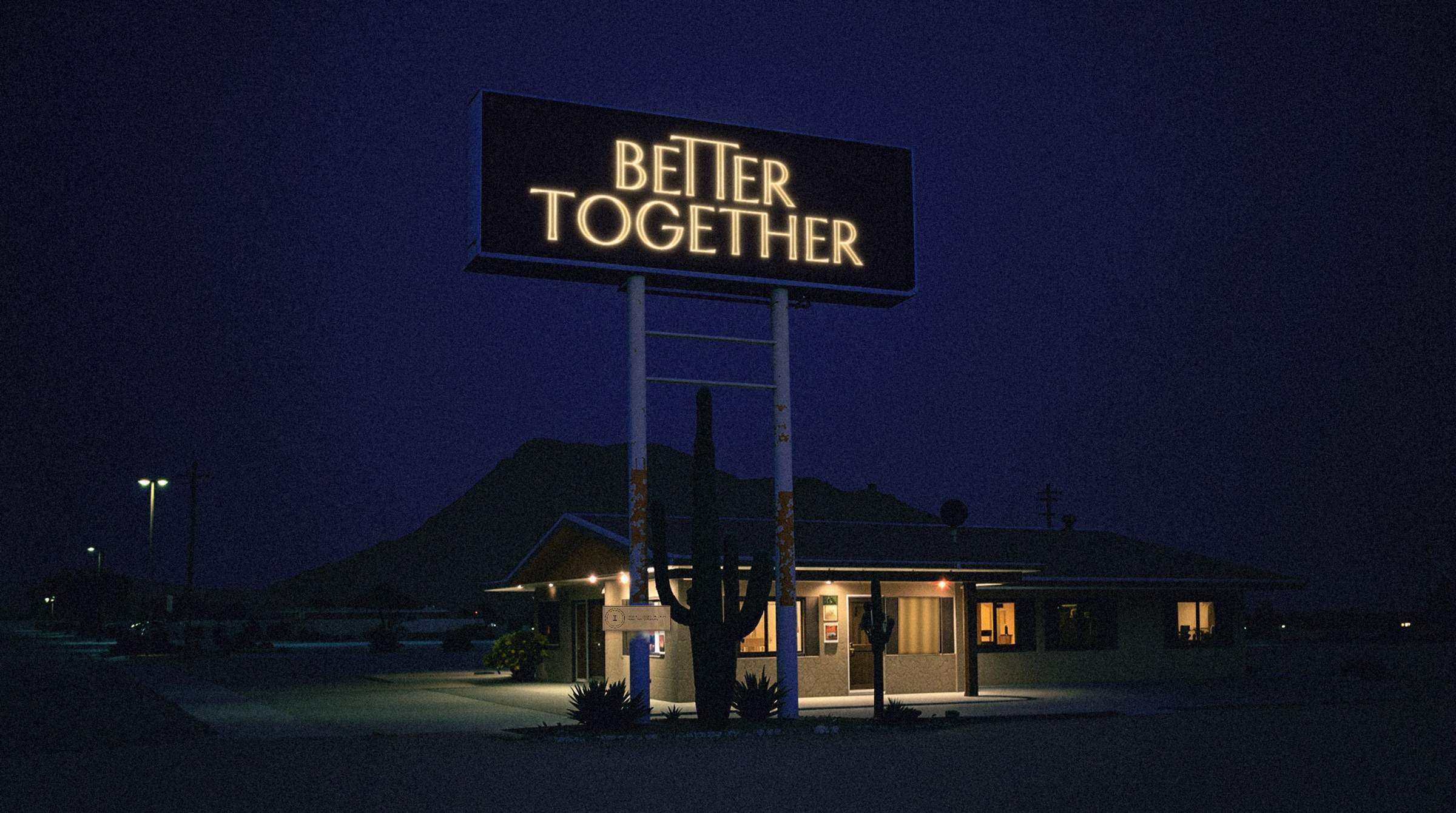
08.12 · The motel
074
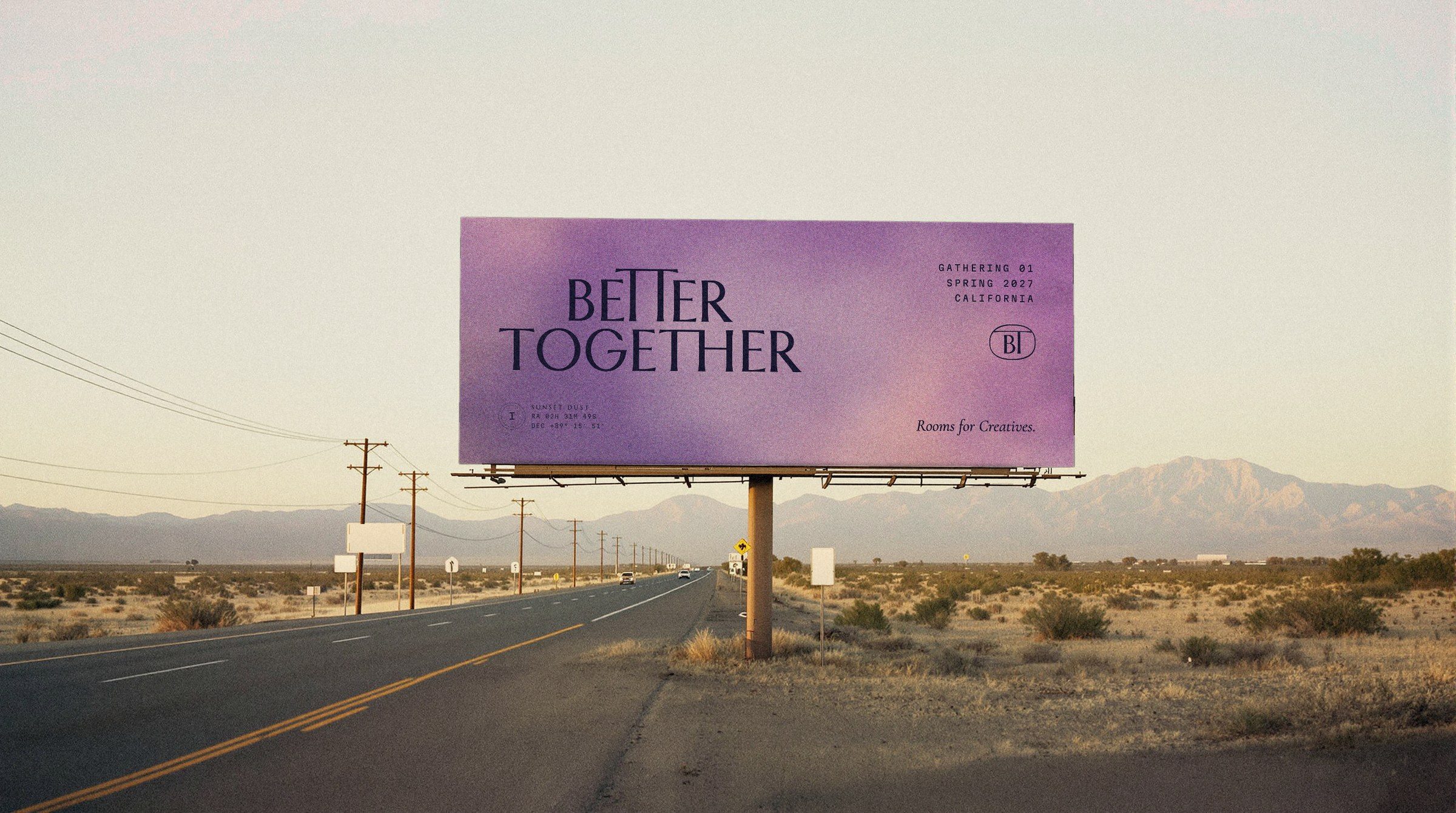
08.13 · One billboard on an empty road
075
08.14
Label and hang tag
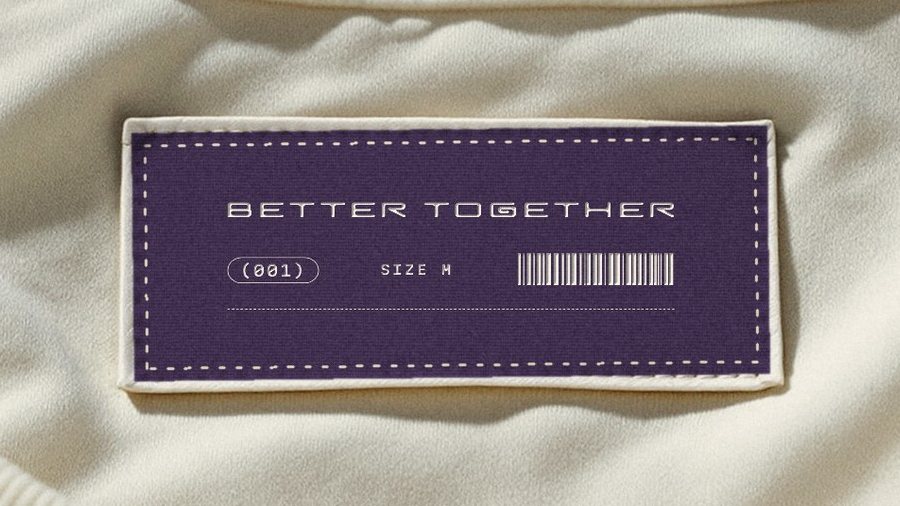
The woven label in the neck, Plum with Milk thread and a cream topstitch, above the hang tag on the tee.
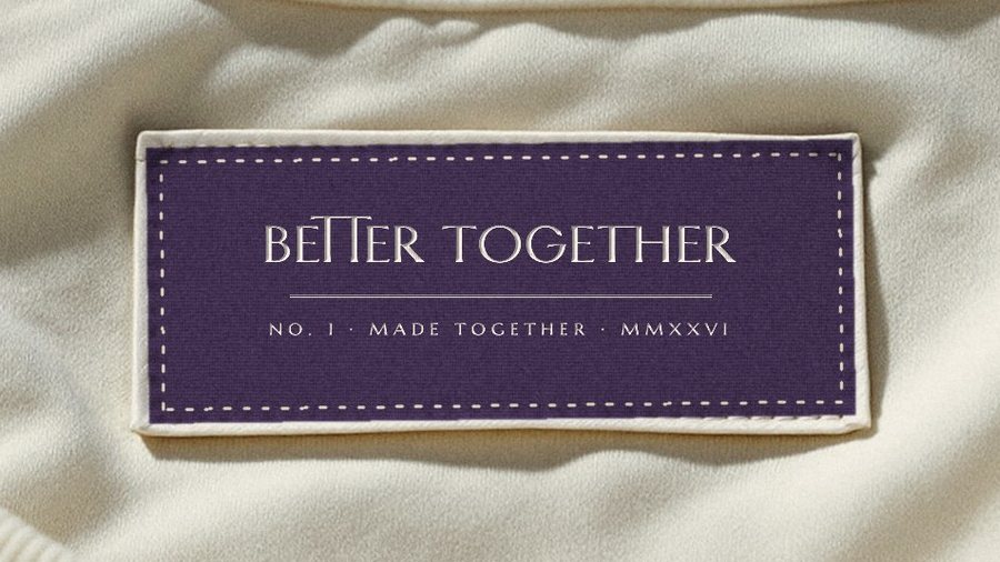
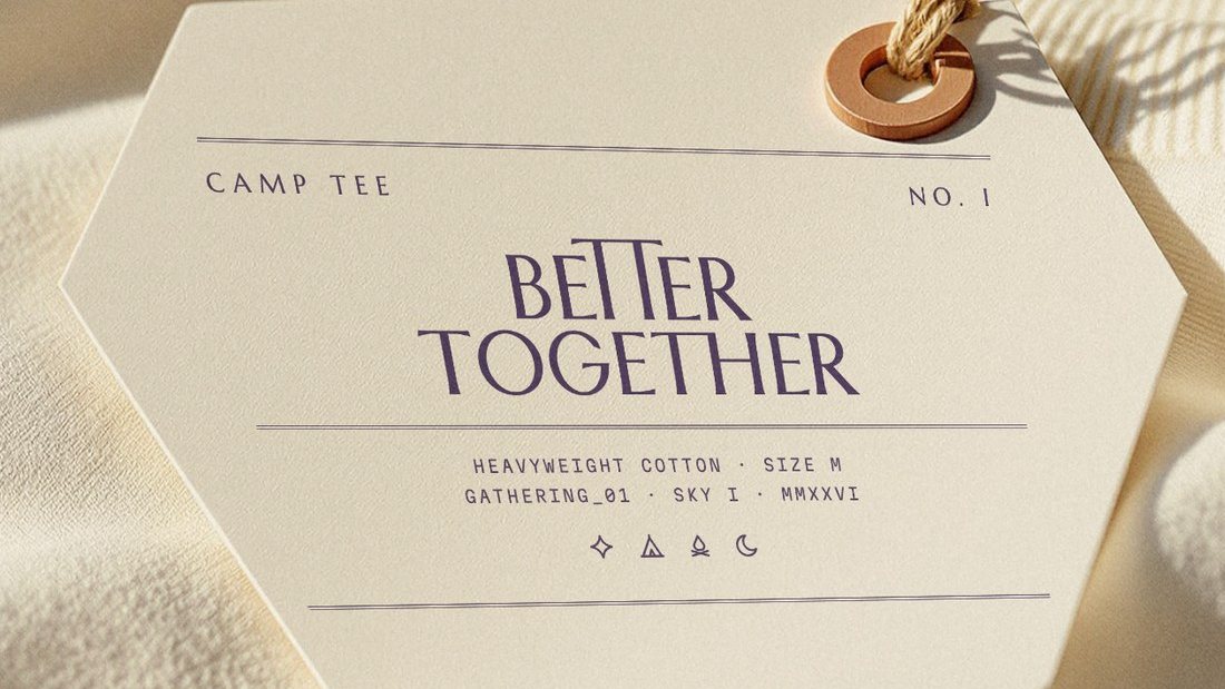
I · Inscription
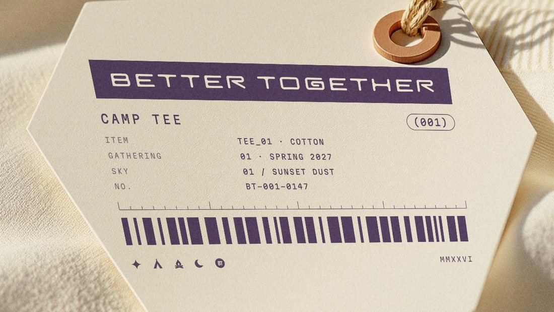
II · Index
Better Together · Brand Guidelines
08 · In the world
Vol. 01 · October 2026
076
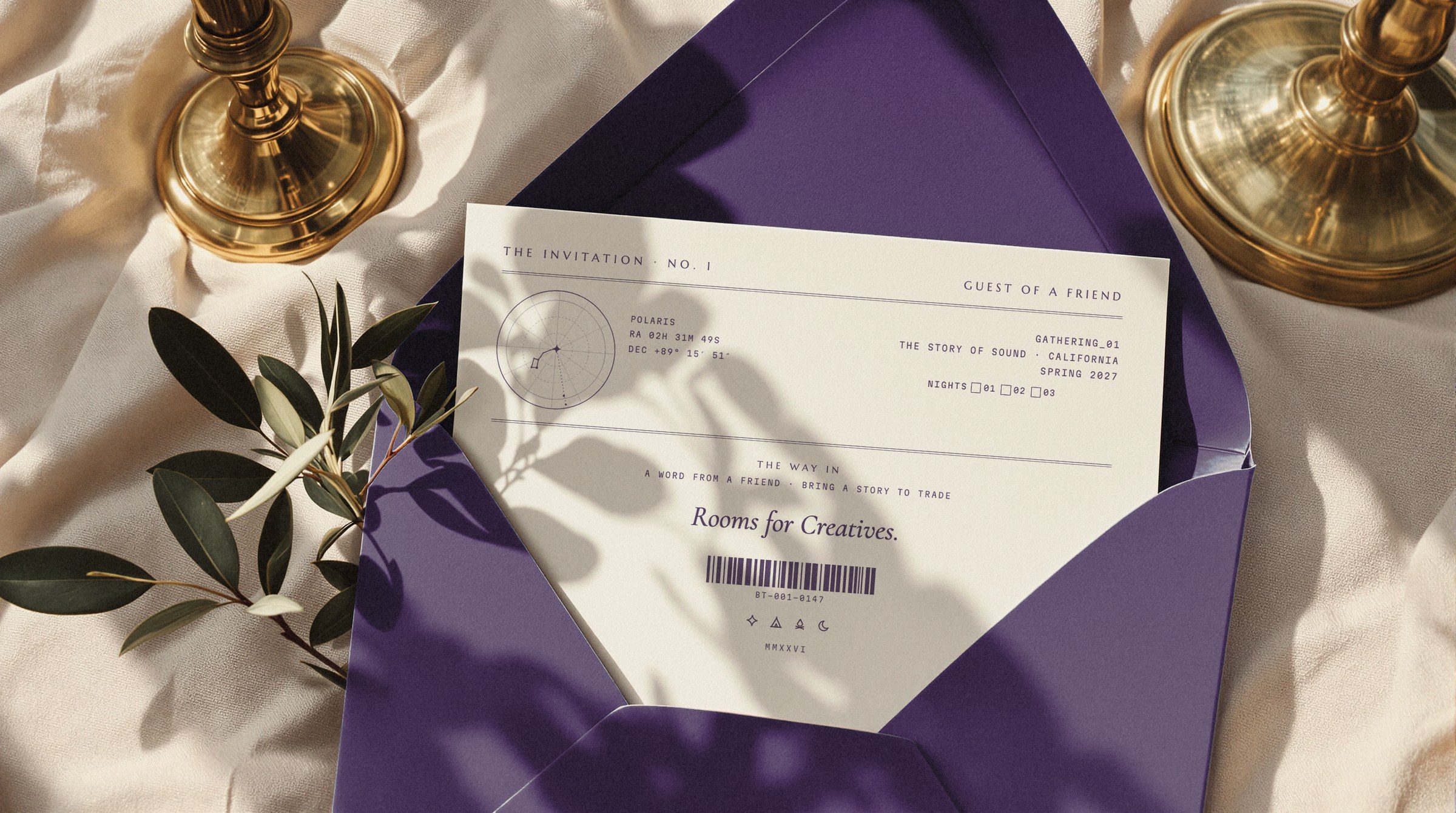
08.15 · The back of the invitation
077
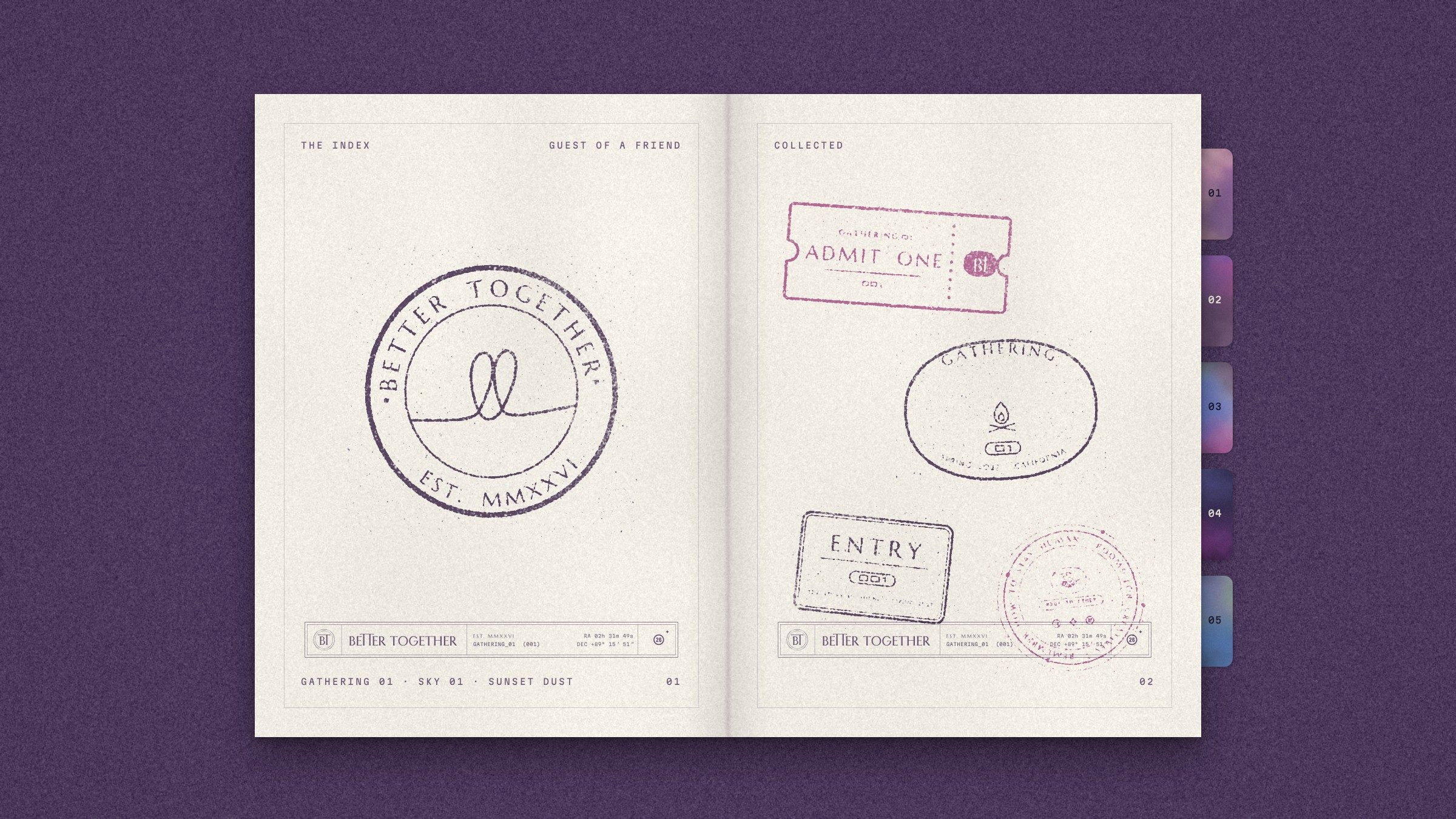
08.16 · The gathering passport
078
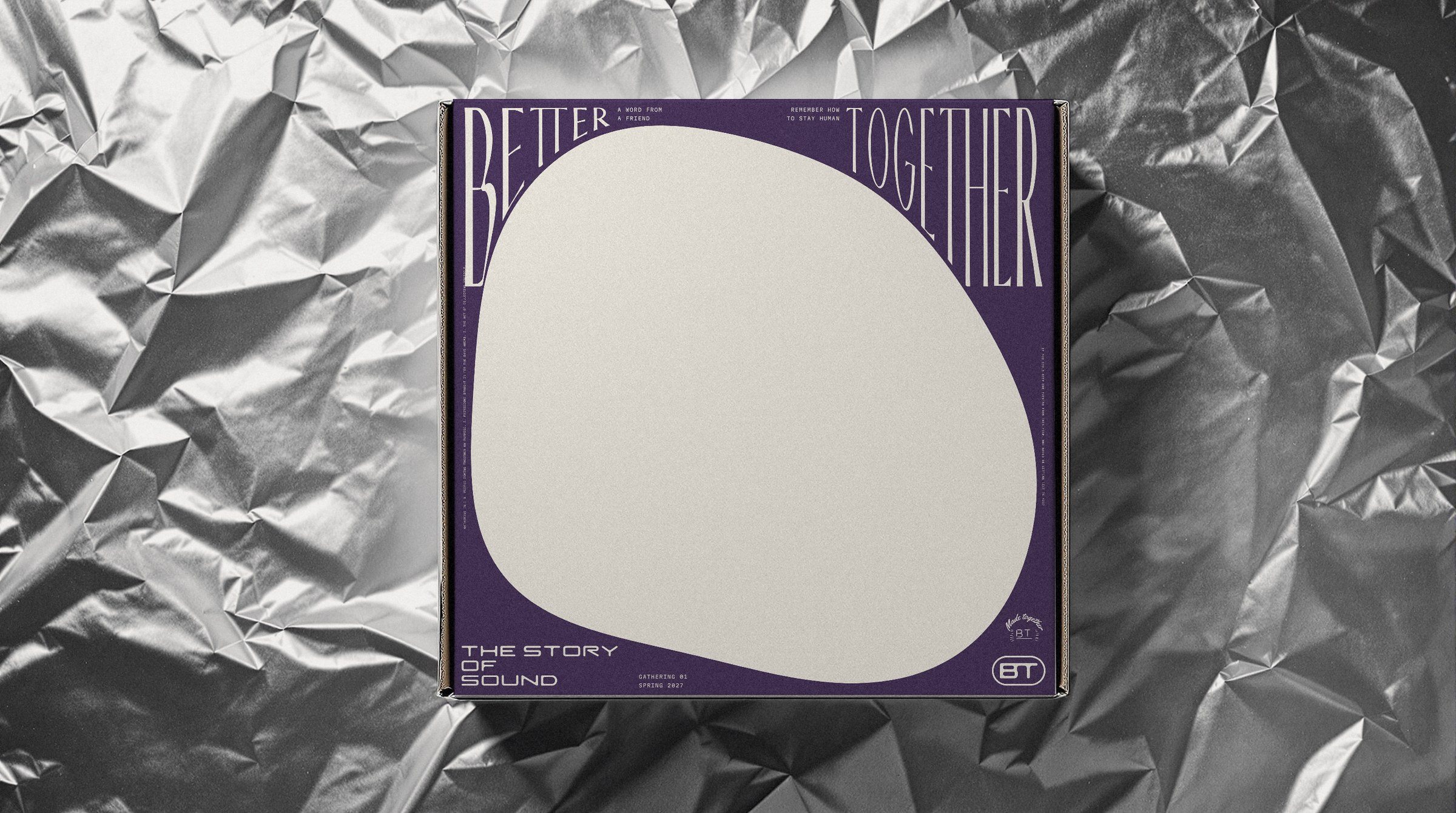
08.17 · The lid on foil
079
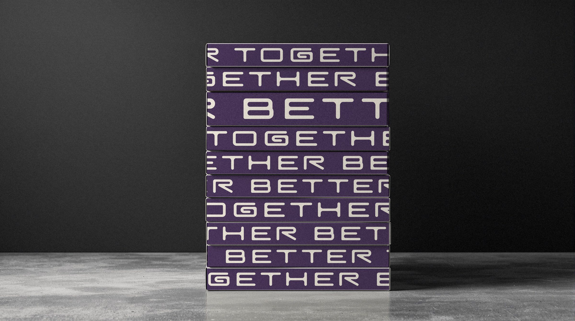
08.18 · The stack
080
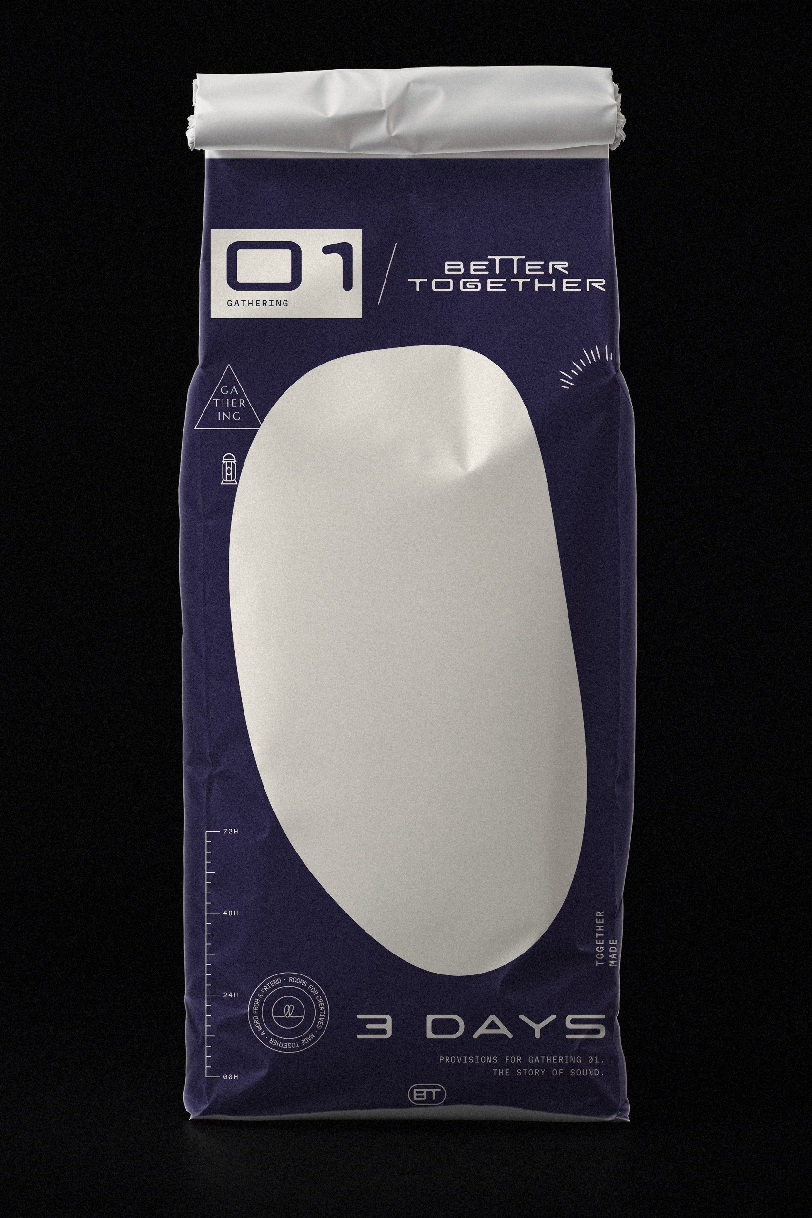
08.19 · The provisions sack
081
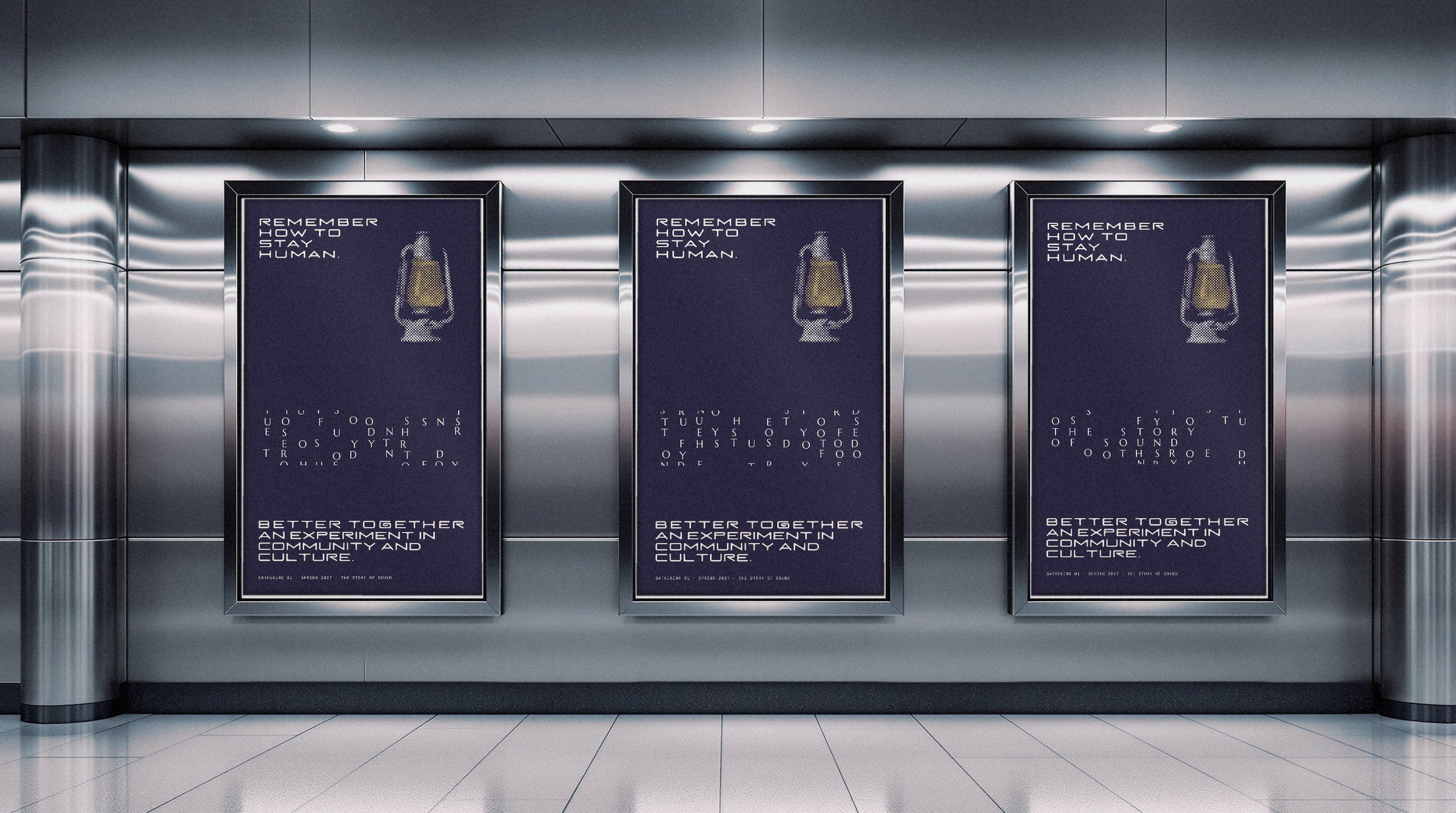
08.20 · Station posters
082
08.21
The tees
Three tees about sound, each in one ink and one shape from the room family: the BT small on the chest, the words big on the back.
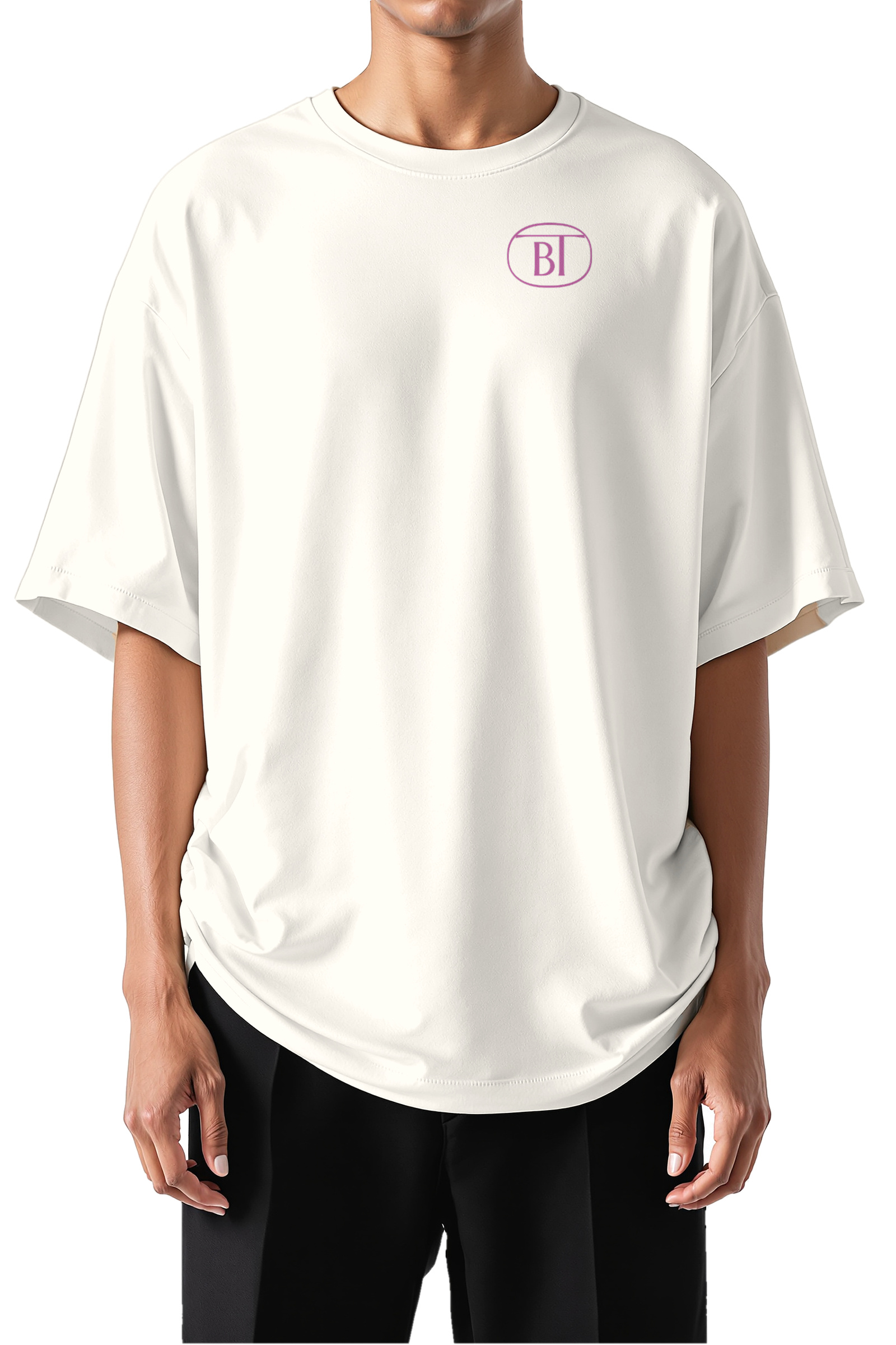
Front · the BT on the chest
In each tee’s ink
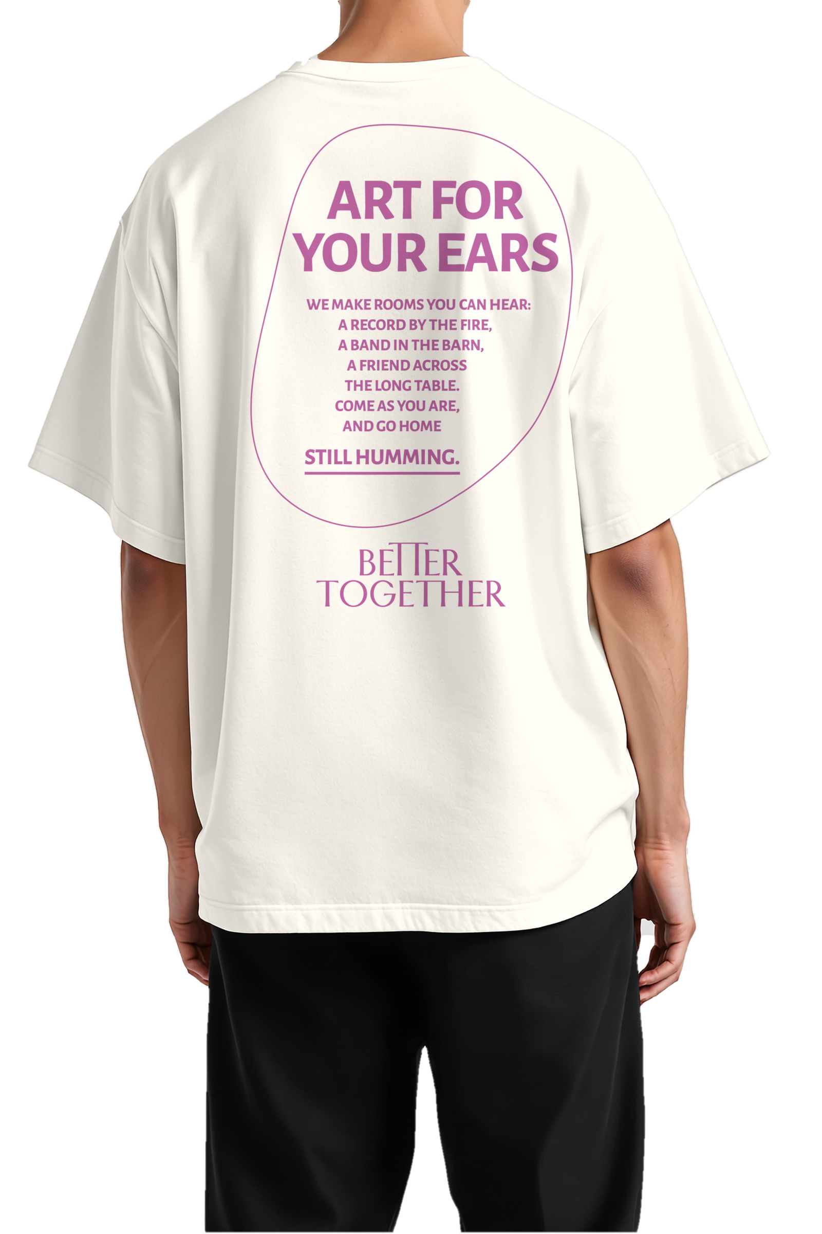
01 · Art for your ears
Orchid on natural · the egg
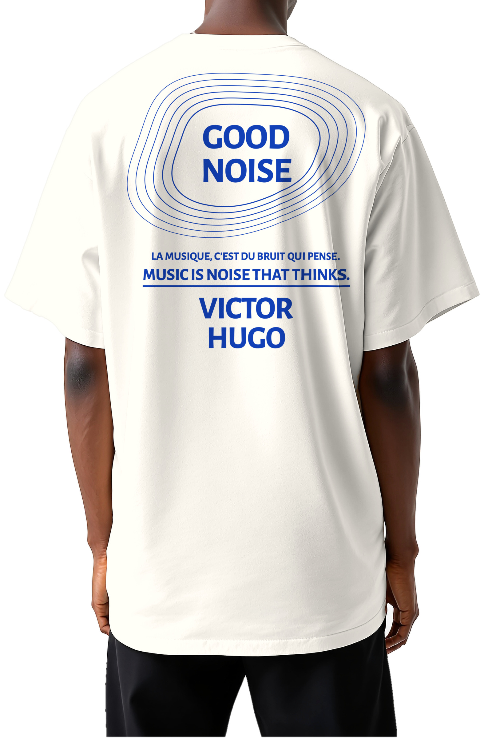
02 · Good noise
Klein on natural · the wide room
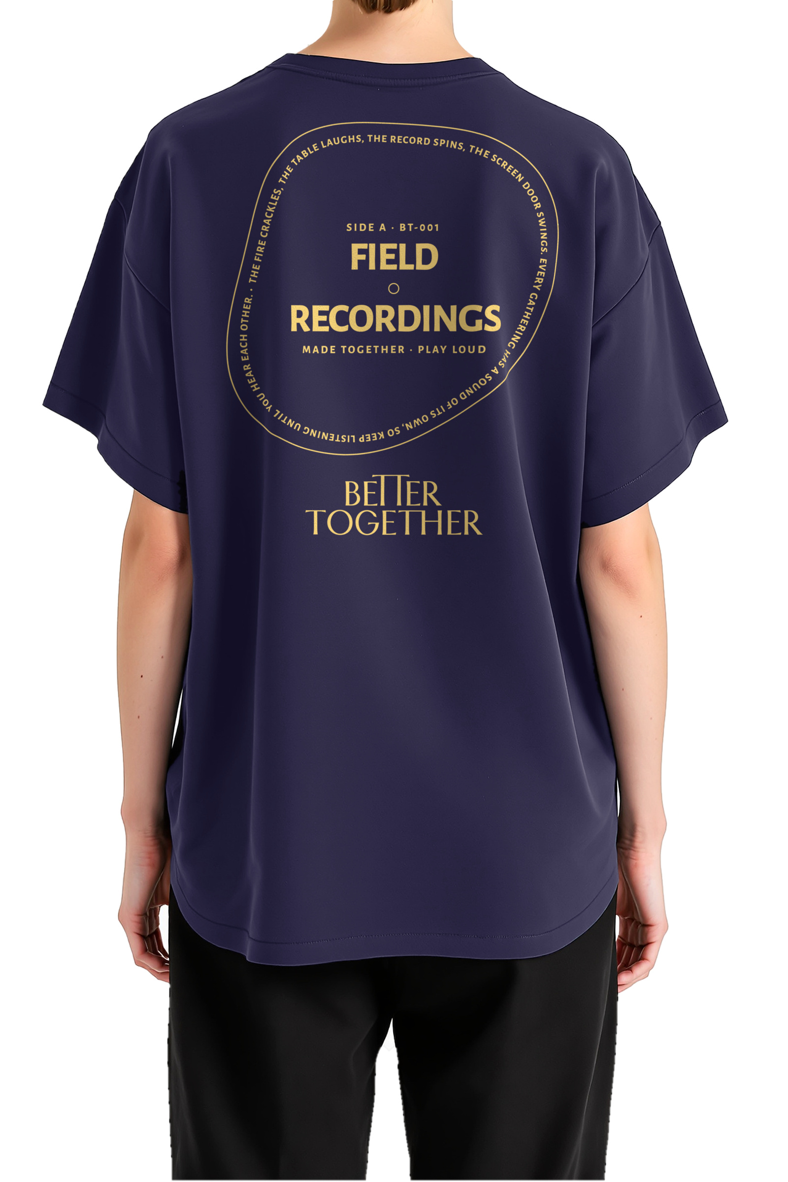
03 · Field recordings
Gold on night · the round room
Better Together · Brand Guidelines
08 · In the world
Vol. 01 · October 2026
083
08.22
The prints
Each back takes one shape from the room family, drawn as a line in the tee’s one ink, and makes it part of the idea.
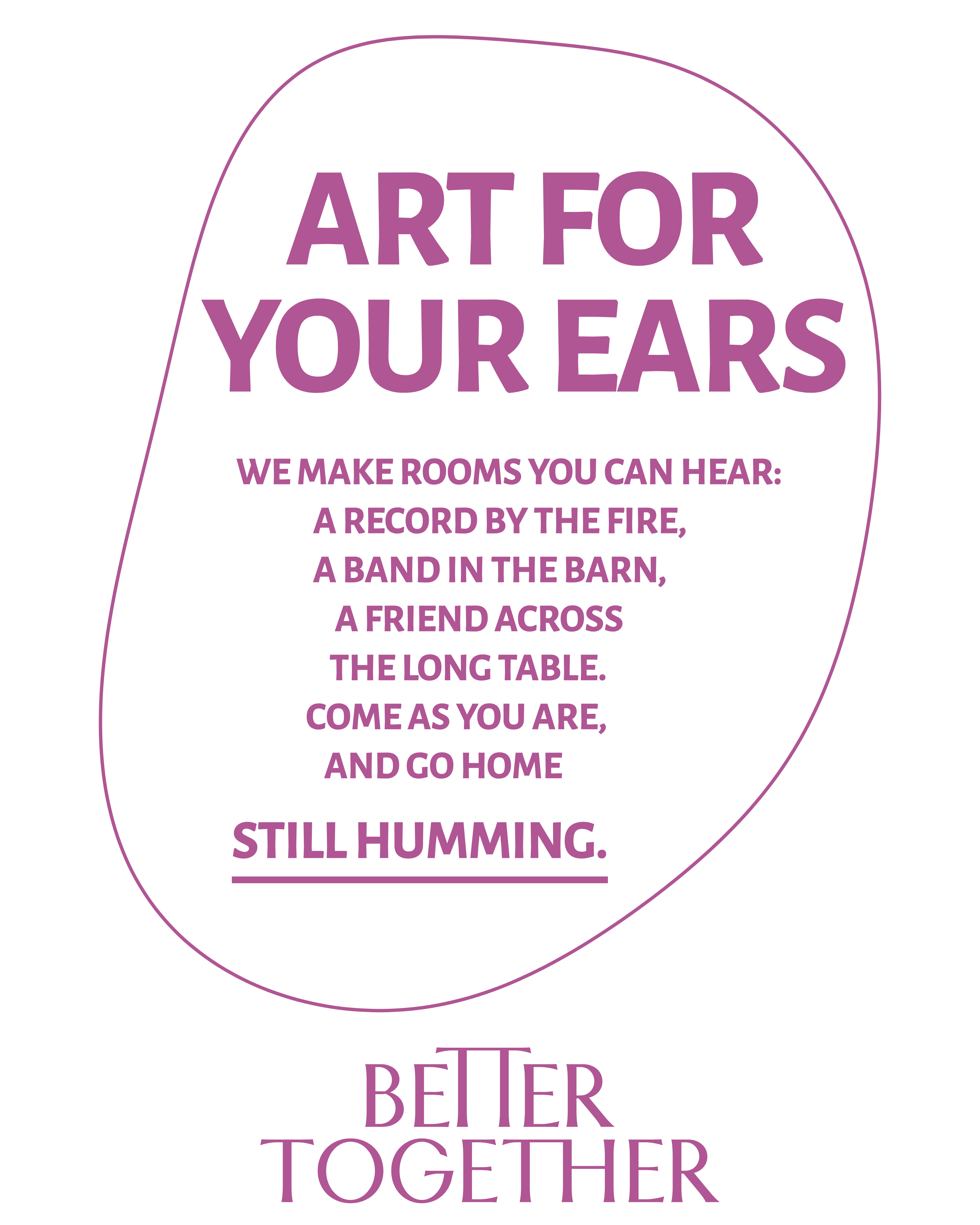
01 · The egg
The words sit inside it and lean with it, down to the tip.
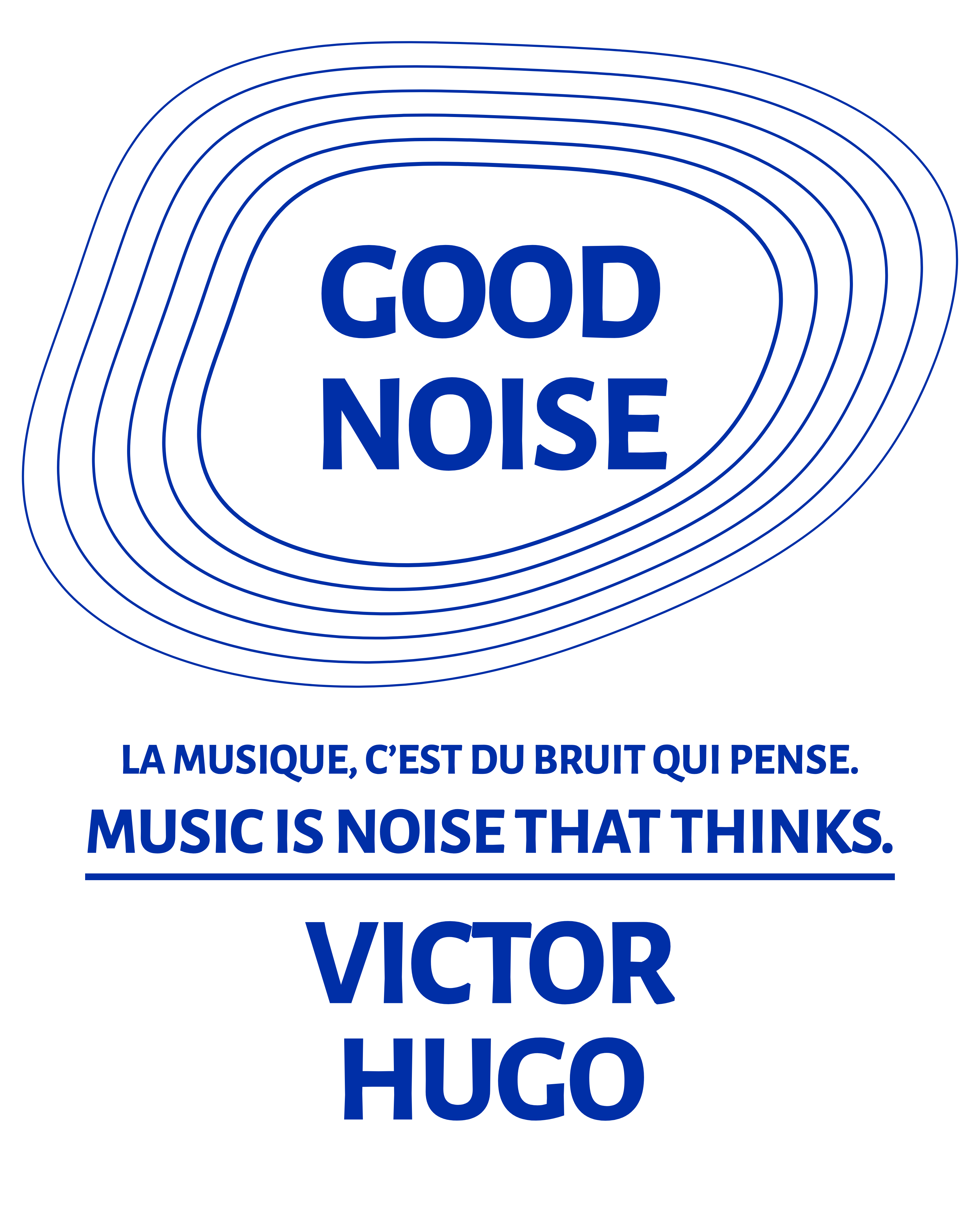
02 · The wide room
Drawn outward six times around the title: sound spreading, Rooms for Creatives.
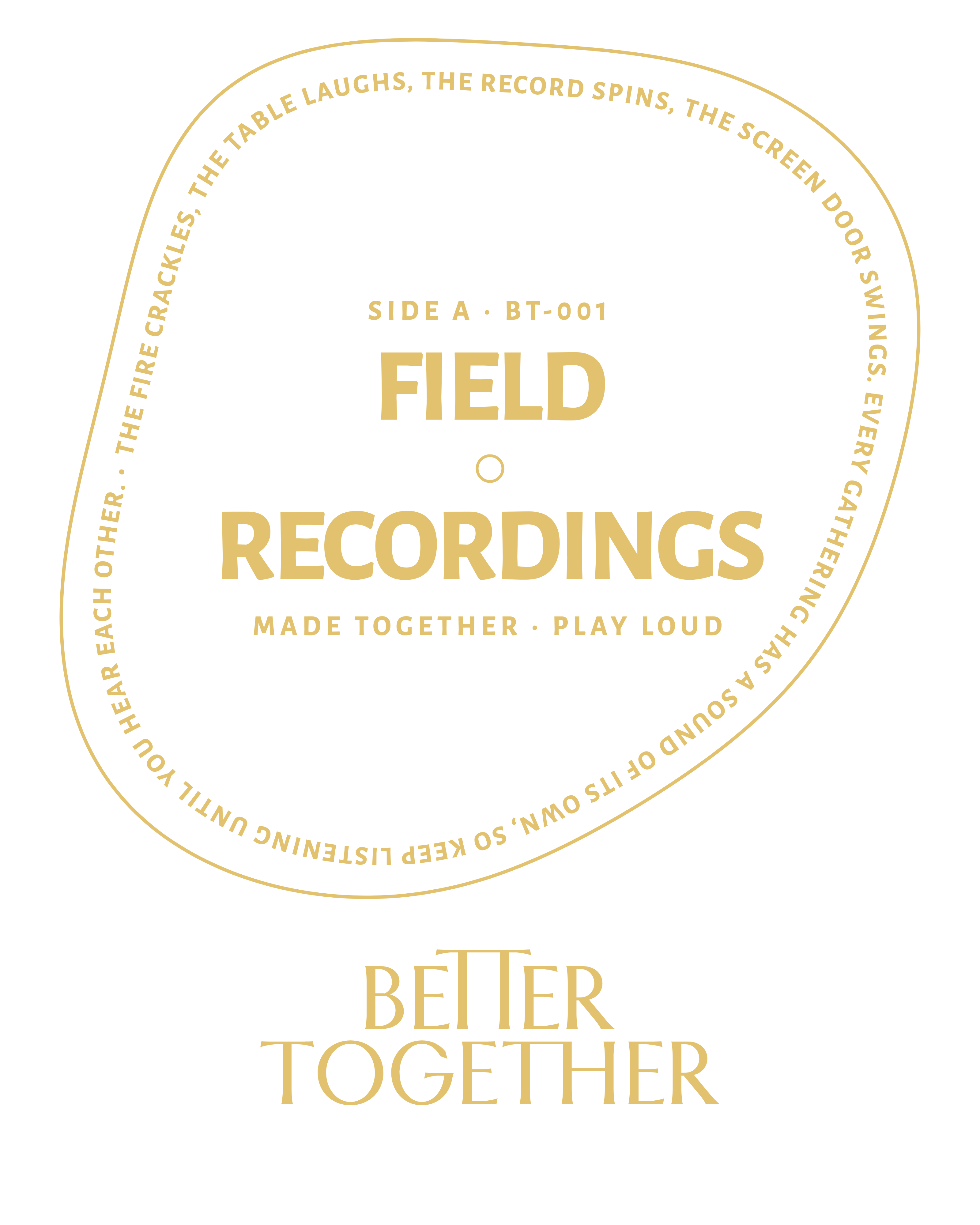
03 · The round room
A record label, with the words running once round its edge.
Better Together · Brand Guidelines
08 · In the world
Vol. 01 · October 2026
084
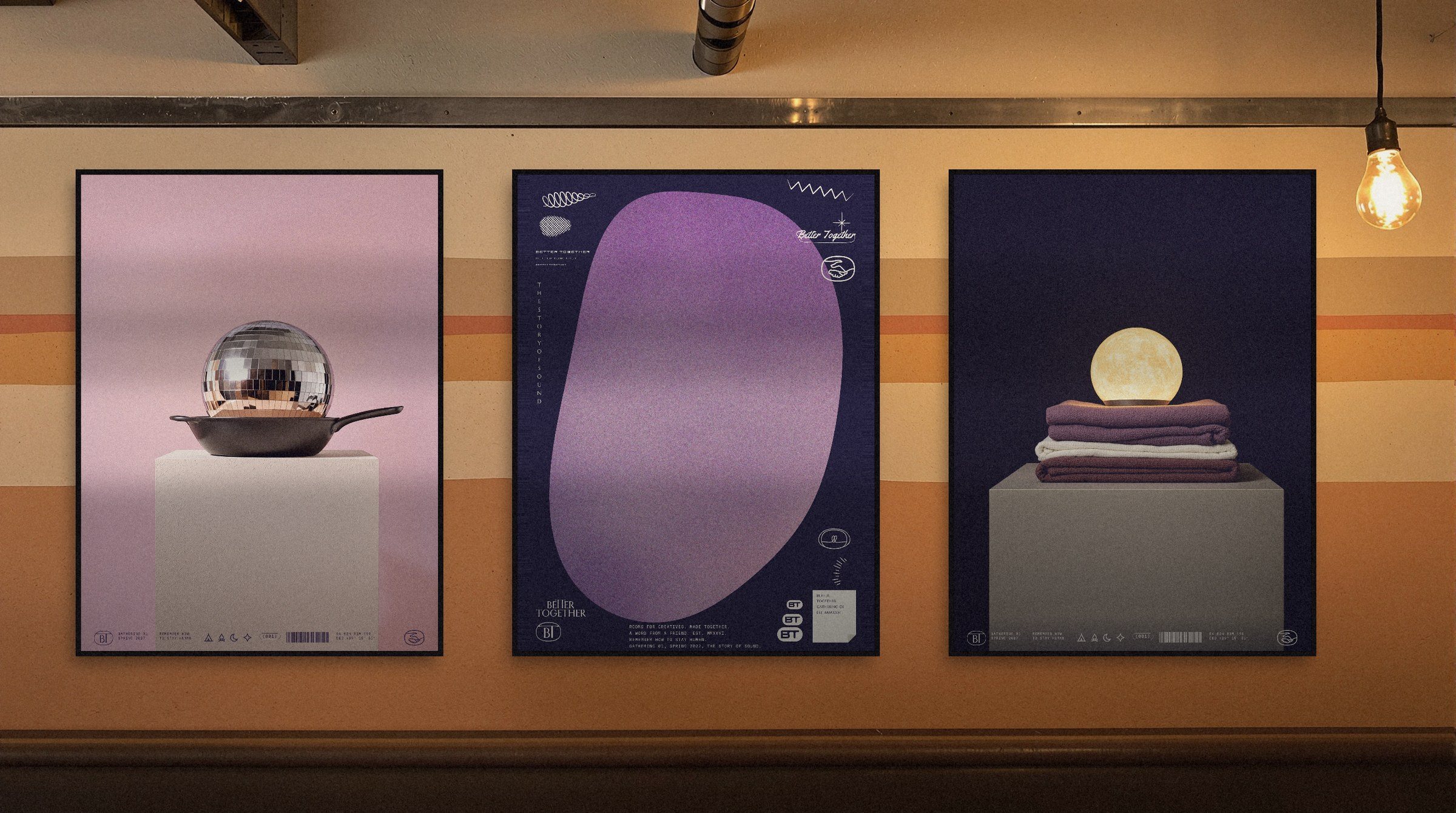
08.23 · The supper room
085

Rooms for Creatives.
Better Together · Brand Guidelines · Vol. 01 · October 2026